Proya Bottle Design Ocean Energy
DownloadTopics
Details
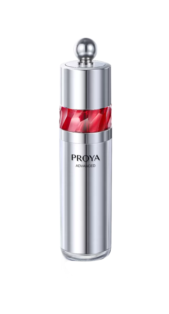
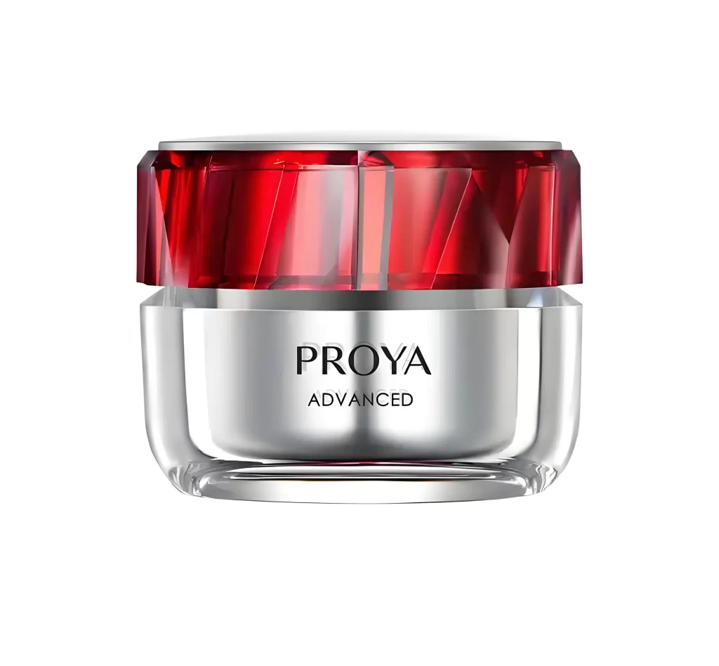
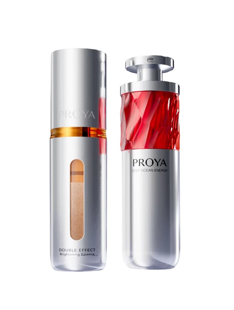
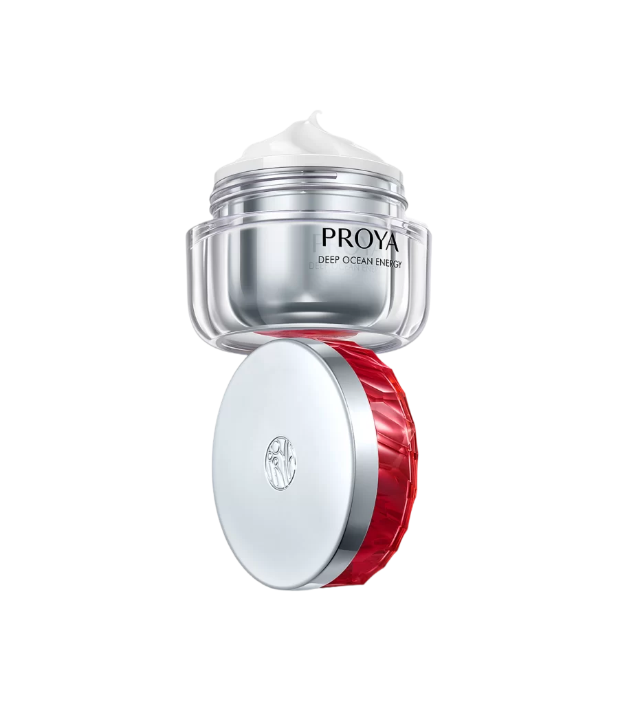
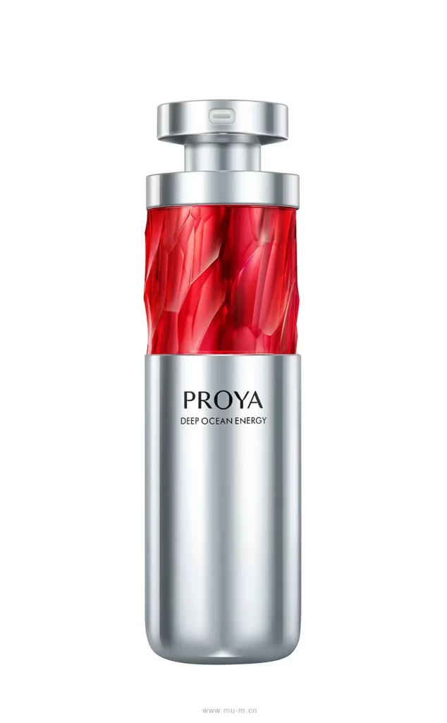
A cylindrical silver vessel dominates the frame, featuring a vibrant crimson upper section with faceted, crystalline textures that catch the light. The lower half presents a smooth metallic finish bearing the brand name PROYA in bold black typography above the smaller DEEP OCEAN ENERGY designation. A two-tiered silver cap with a subtle rectangular indentation sits atop the bottle, while the entire object is photographed straight-on against a neutral backdrop that emphasizes its reflective surfaces.
The visual tension between the organic, gem-like red glass and the industrial silver casing creates a compelling aesthetic that suggests both luxury and scientific precision. This specific iteration stands out through its dramatic color blocking and the intricate geometric cuts on the red portion, which evoke underwater light refraction while maintaining a sleek, modern silhouette. Designers seeking to study premium cosmetic packaging can access the full-resolution file at no cost directly from this page.
Product photographers and 3D modelers will find this reference particularly useful for analyzing how metallic and translucent materials interact under studio lighting conditions. Brand identity specialists might examine the typographic hierarchy and placement strategies used for international market appeal. Packaging engineers could also utilize these visuals when developing concepts for dual-material containers that require both structural integrity and visual drama.