Juicy Fruit Juice Branding D
Topics
Details
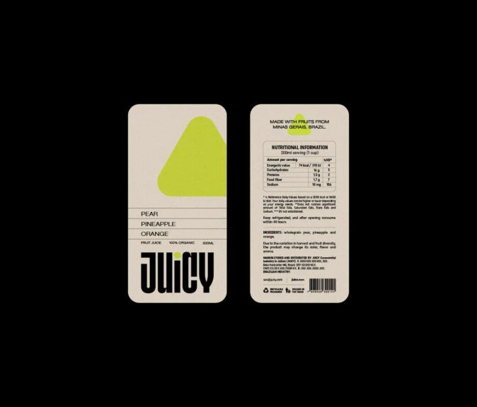
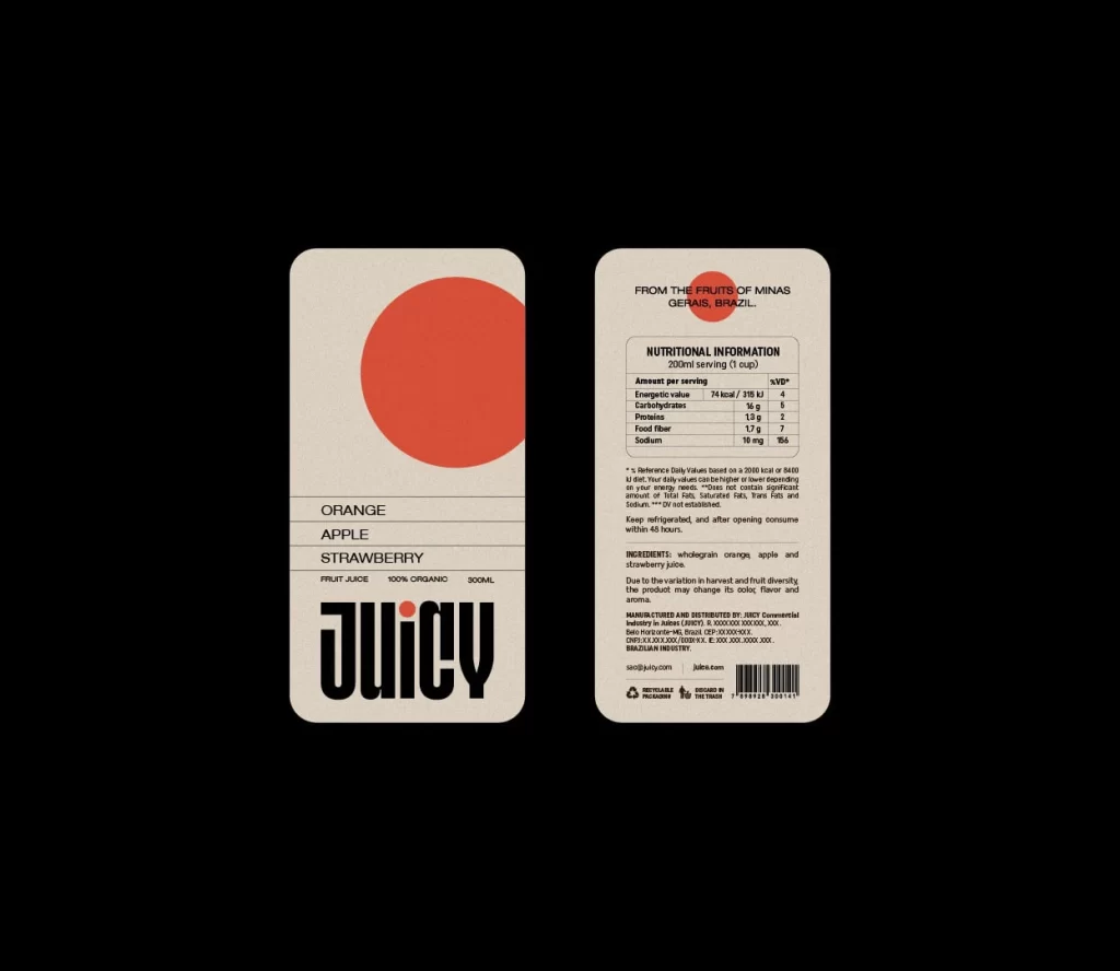
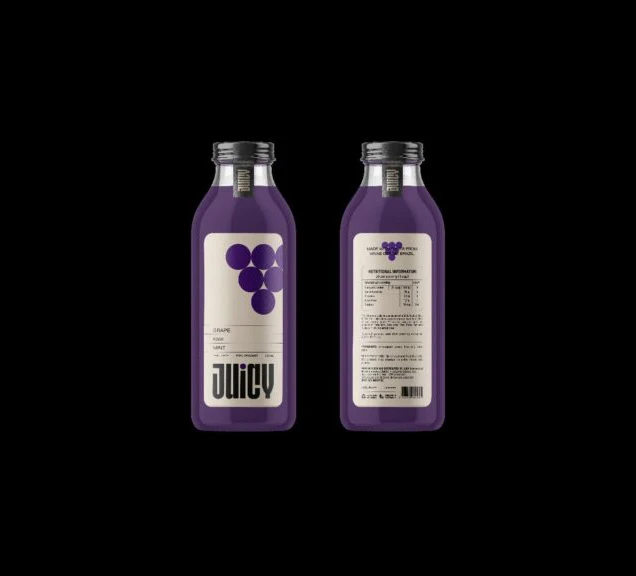
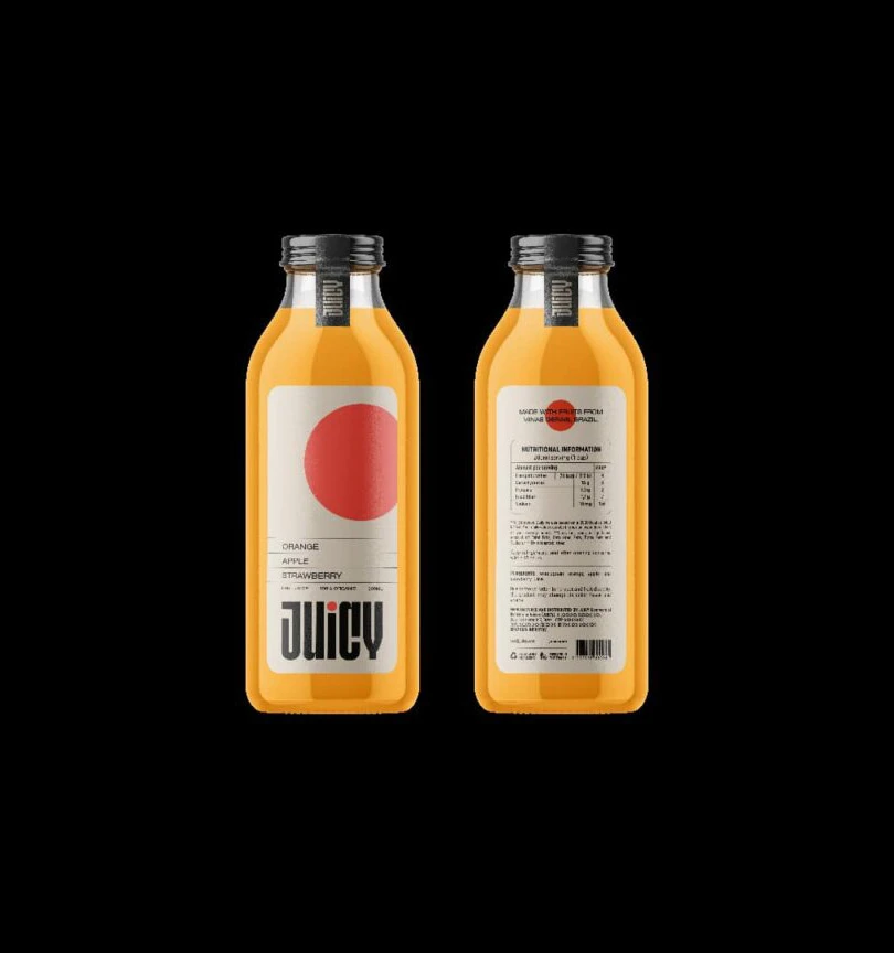
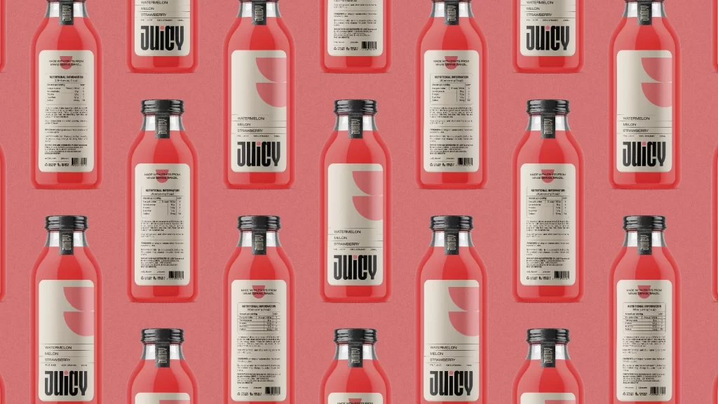
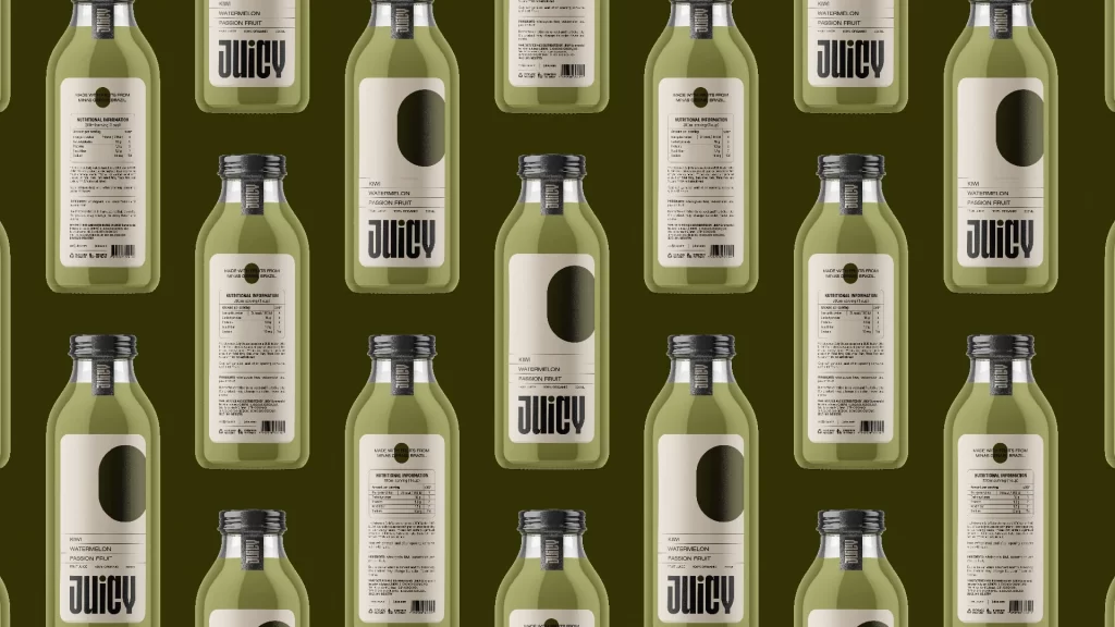
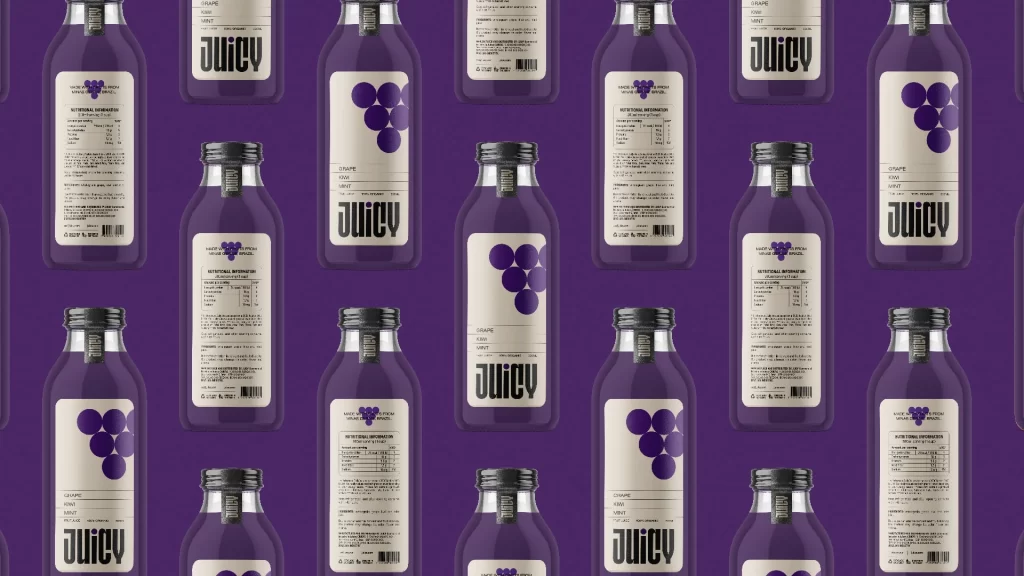
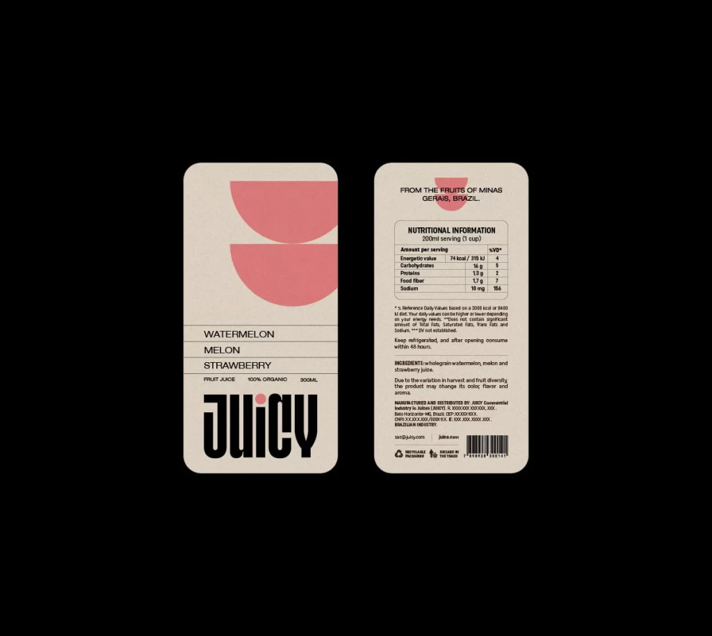
Two rounded rectangular labels showcase a minimalist juice brand identity in a flat, frontal view against a solid black void. The front panel features a warm beige background with two stacked, semi-circular pink shapes at the top, while the back panel presents a dense typographic layout containing nutritional data and ingredient lists. Bold black sans-serif typography spells out 'JUICY' at the bottom of the front label, accompanied by text identifying Watermelon, Melon, and Strawberry flavors.
Visual interest stems from the stark contrast between the generous negative space on the front label and the information-dense reverse side. The geometric abstraction of the fruit—rendered as simple pink arcs rather than realistic illustrations—gives the packaging a contemporary, editorial feel that prioritizes clean lines over clutter. This duality allows the design to function as both an artistic object and a functional consumer product, balancing aesthetic minimalism with necessary regulatory text.
Brand strategists developing organic beverage lines could utilize this layout to understand how to organize complex nutritional information without sacrificing visual appeal. Packaging engineers might study the rounded corner radius and vertical orientation to inform their own structural decisions for similar liquid containers. Typography specialists will find value in analyzing how the varying weights of the sans-serif font create a clear hierarchy between the product name, flavor ingredients, and legal disclaimers.