Juicy Fruit Juice Branding B
Topics
Details
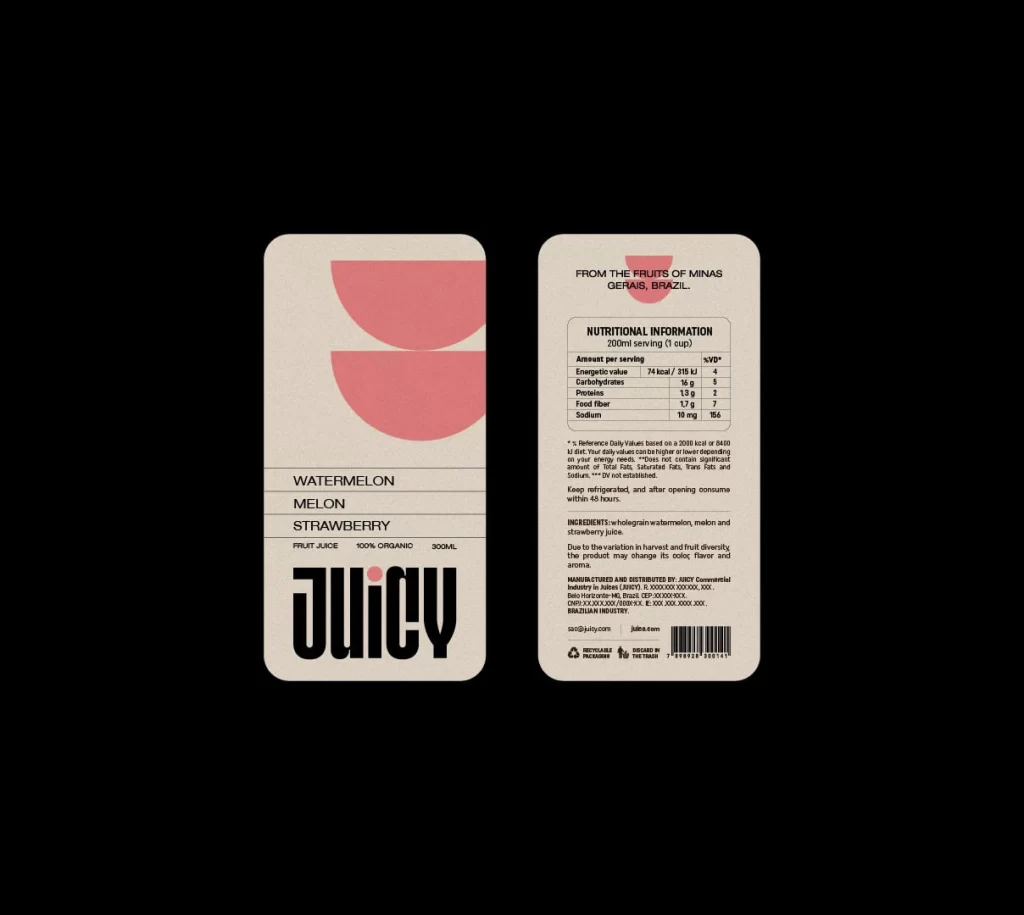
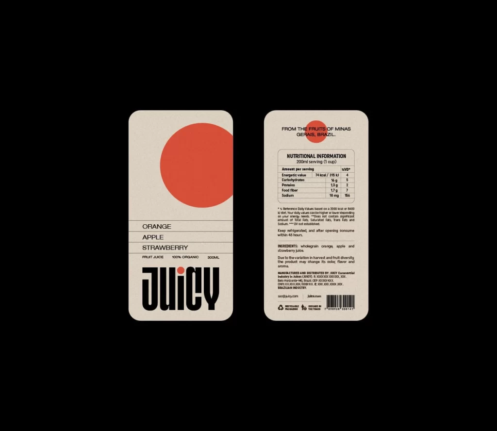
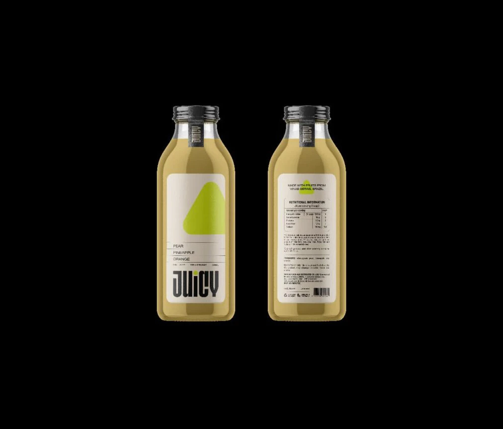
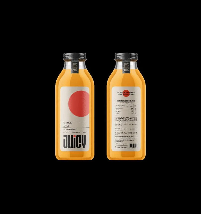
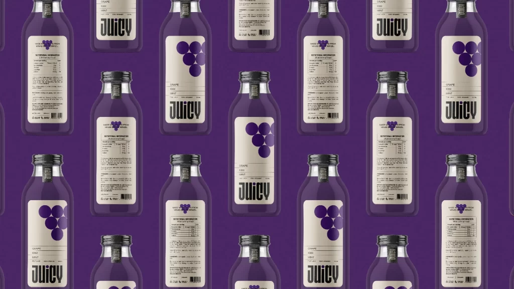
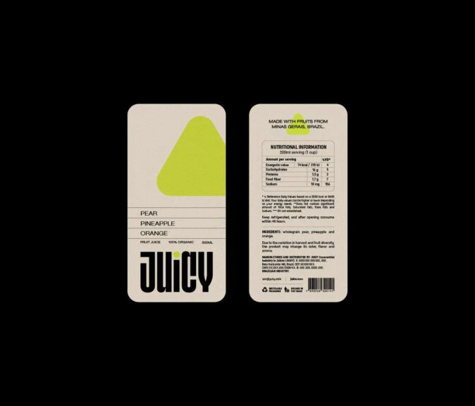
Two rectangular juice labels with rounded corners display a minimalist, modernist aesthetic on a deep black background. The front label features a pale cream base dominated by a large, vibrant lime-green triangle in the upper right quadrant, with the ingredients 'PEAR', 'PINEAPPLE', and 'ORANGE' listed in clean sans-serif typography above the bold, condensed brand name 'JUICY'. The reverse label presents dense nutritional information and sourcing details in small text, noting the product is made with fruits from Minas Gerais, Brazil.
Visual interest here stems from the stark juxtaposition of minimalist geometry with utilitarian information density. The oversized lime triangle acts as a powerful color-blocking element that immediately draws the eye, while the heavy weight of the primary brand name provides a solid typographic anchor. By balancing such a bold, abstract graphic on one side with a highly structured, data-heavy layout on the other, the design achieves a modern aesthetic that feels both artistic and functionally transparent.
Brand strategists and packaging designers would utilize this layout to study how to effectively organize complex nutritional data without sacrificing visual impact. Art directors might reference the specific use of negative space and the integration of abstract shapes to inform identity systems for organic or health-focused product lines. Furthermore, typographers could analyze the hierarchy between the delicate ingredient list and the aggressive branding to understand how varying font weights guide consumer attention across a physical surface.