Carrot Apple Juice Drink Packaging
DownloadTopics
Details
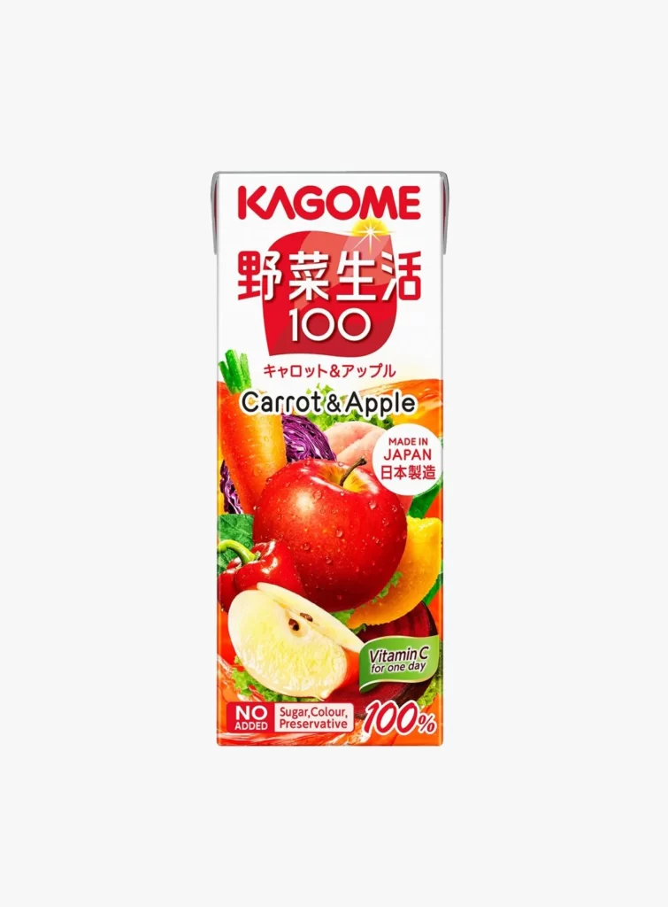
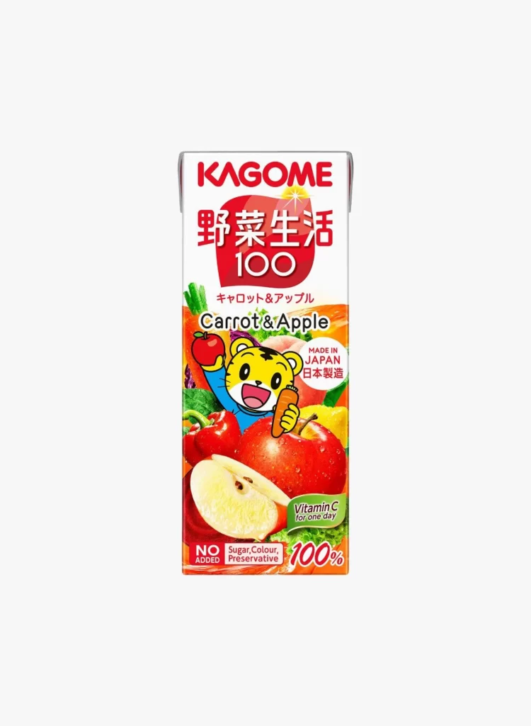
A rectangular paperboard carton stands vertically, its surface dominated by a vibrant palette of red, orange, and green. The brand name KAGOME appears in bold red sans-serif at the top, followed by large Japanese characters and the number 100 inside a rounded red badge. Below this, English text identifies the flavor as Carrot & Apple, while a cheerful yellow tiger mascot holds an apple and carrot amidst photographic renderings of fresh produce. The composition balances typographic elements with illustrative graphics, all set against a clean, light-toned backdrop that emphasizes the packaging's saturated colors.
Visual interest stems from the juxtaposition of serious nutritional claims with playful character design, creating a family-friendly aesthetic that feels both trustworthy and approachable. The layout strategically uses the tiger mascot to draw the eye toward the center, while the 'NO ADDED' badge and '100%' stamp provide immediate visual anchors for health-conscious consumers. Designers studying this piece will note how the dense information hierarchy remains legible through careful color coding and spatial separation.
Product photographers and packaging analysts might examine this reference to understand how beverage brands communicate purity through visual cues like water droplets on fruit and uncluttered label architecture. Brand strategists could deconstruct the mascot's role in softening the perceived severity of vegetable-based drinks for younger demographics. Anyone needing detailed visual assets for similar projects can access the full-resolution file without cost directly from the resource library.