Juicy Juice Packaging B
Topics
Details
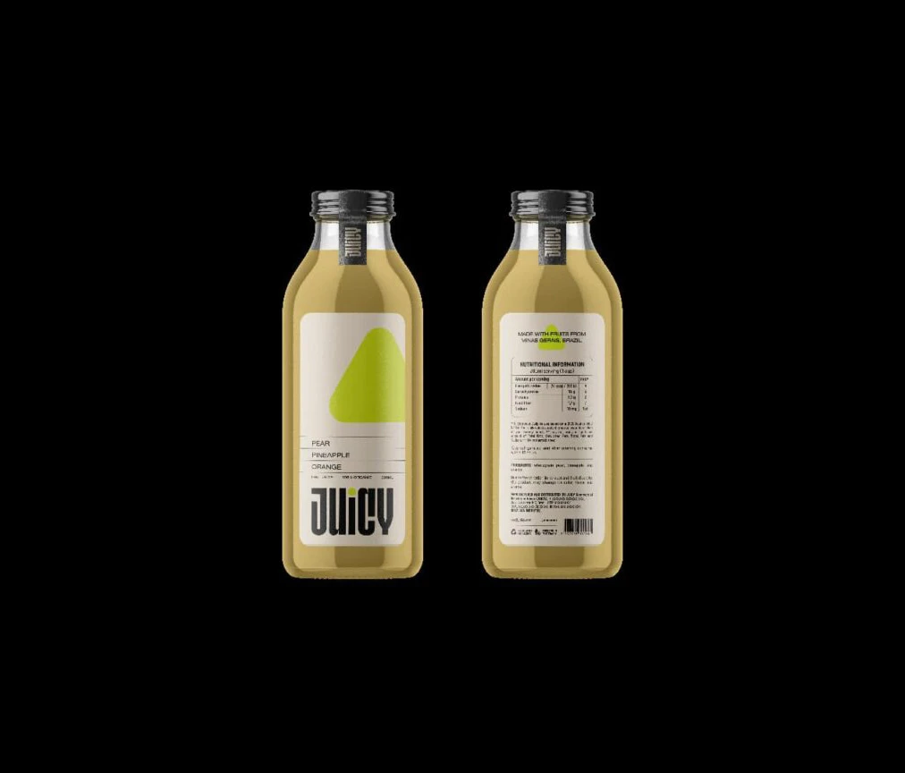
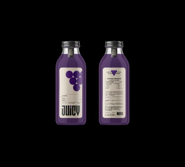
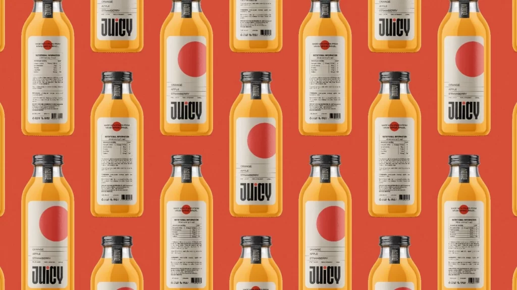
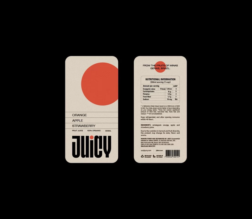
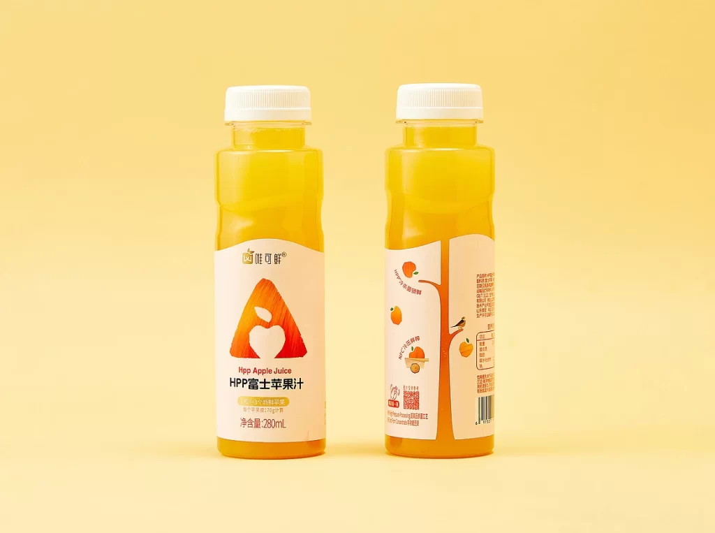
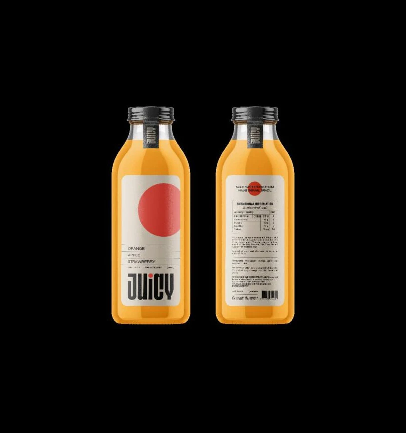
Two glass bottles filled with a vibrant, translucent orange liquid stand side-by-side in a symmetrical arrangement against a pitch-black void. The left bottle displays the front label, featuring a large, solid red circle positioned above the bold, black sans-serif wordmark 'JUICY' and a list of flavors including Orange, Apple, and Strawberry. On the right, the reverse side reveals
Visual interest is driven by the striking contrast between the warm amber hue of the juice and the cool, minimalist aesthetic of the off-white label design. The use of a massive geometric shape—a perfect red circle—creates an immediate focal point that balances the heavy typography below it. This specific iteration stands out due to its clean, modernist layout that prioritizes legibility and bold color blocking over complex illustrations.
Brand identity specialists might utilize this composition to study how minimal elements can effectively communicate product flavor profiles through color psychology alone. Packaging engineers could examine the way light interacts with the curved glass surface to plan their own label placements and material choices. Furthermore, art directors working on beverage campaigns will find the dual-view presentation invaluable for visualizing how front and back information hierarchies coexist on a single physical object.