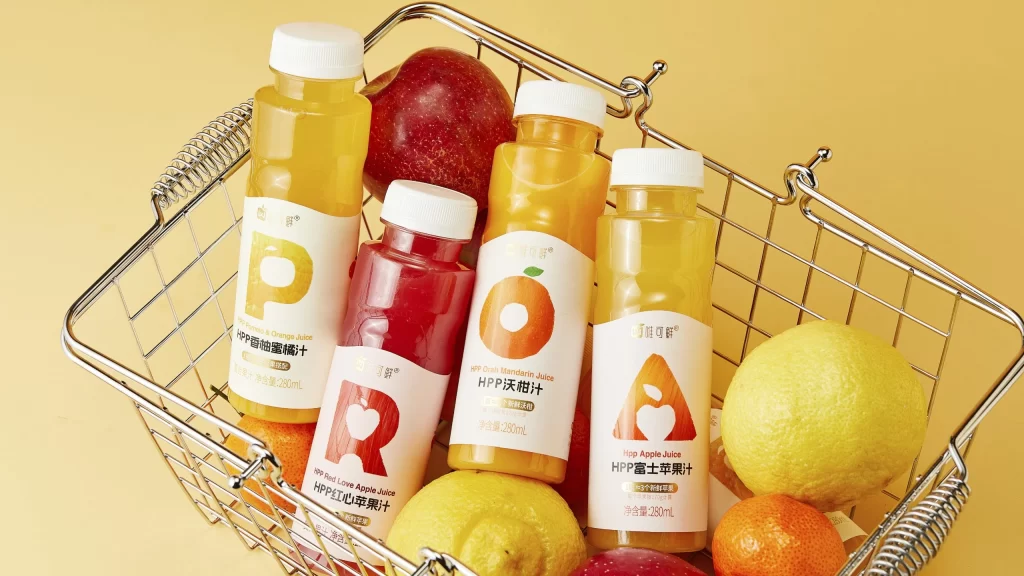
Weikexian Fruit Juice Bottle View
Topics
Details
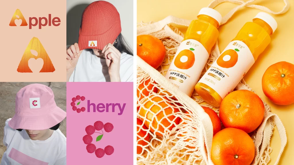
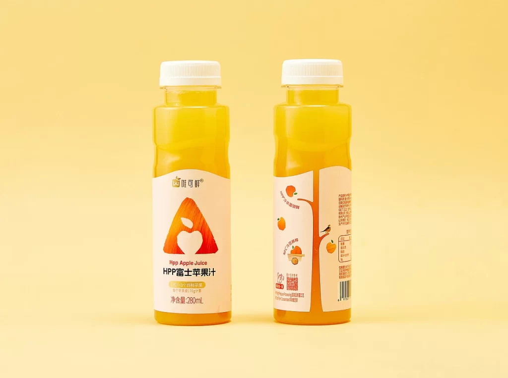
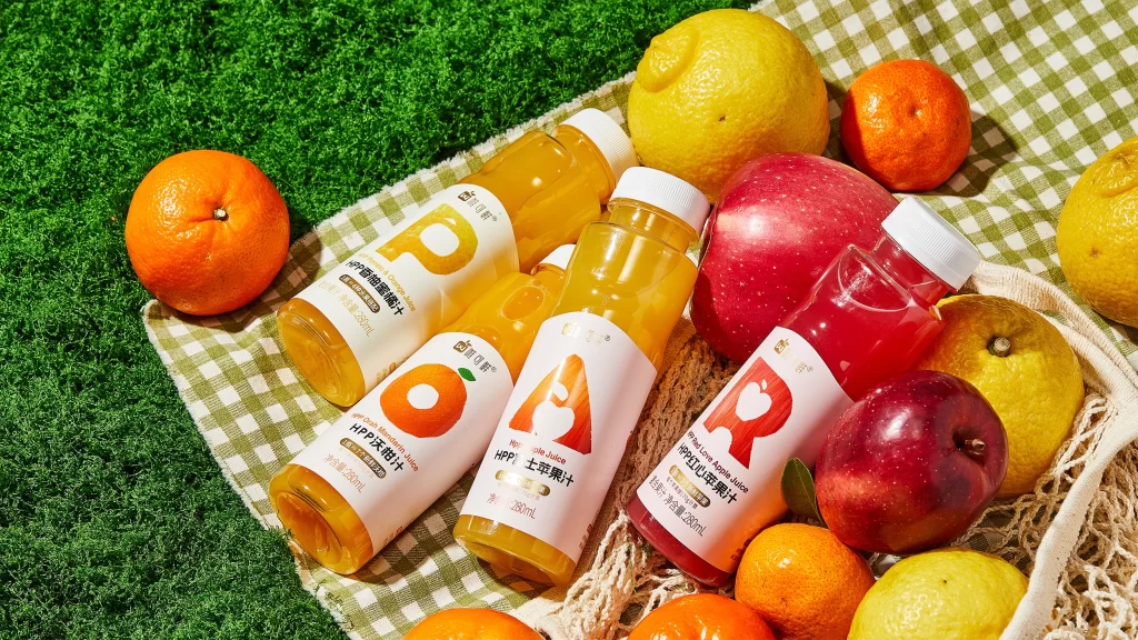
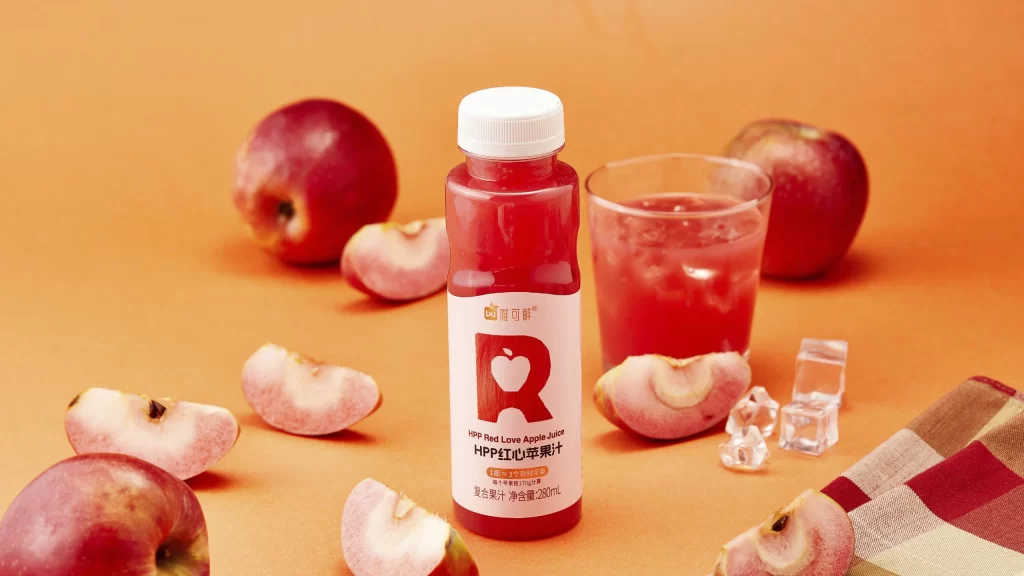
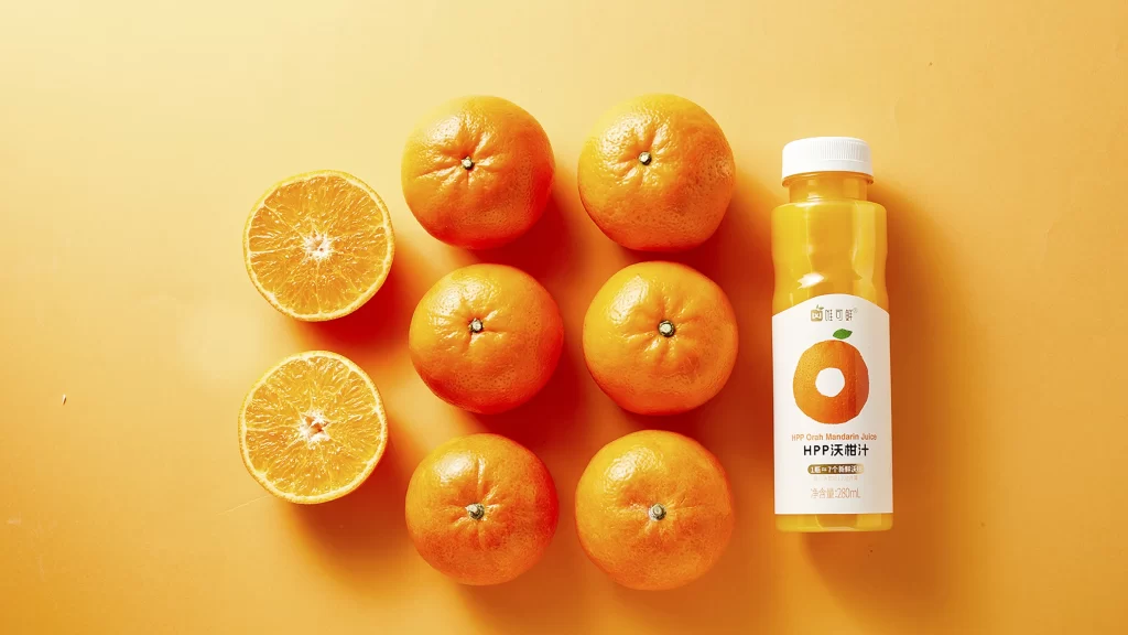
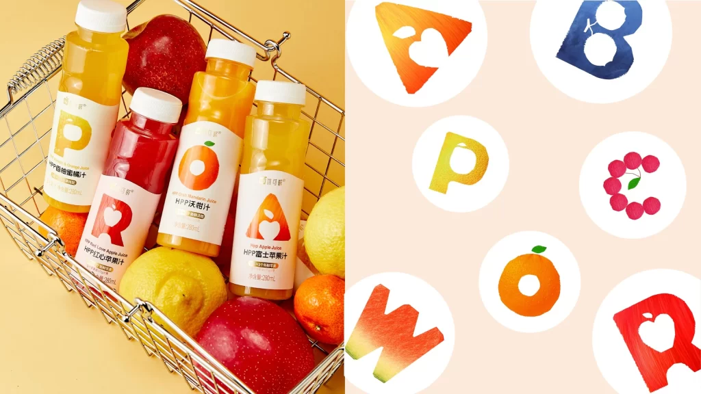
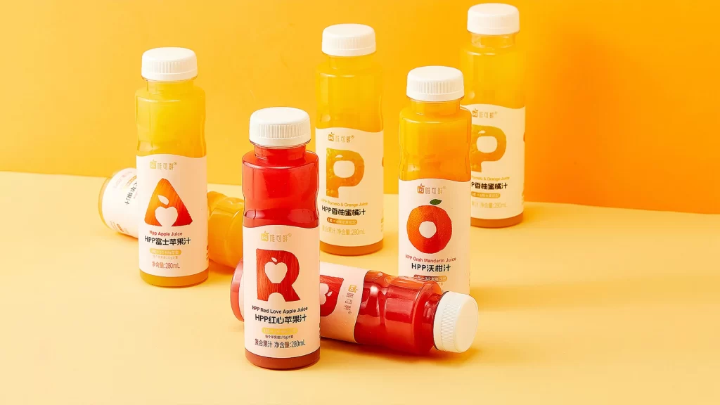
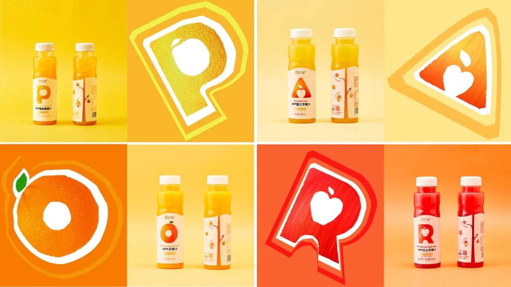
Against a solid pale yellow backdrop, a metallic wire shopping basket holds four translucent juice bottles alongside whole fruits. The bottles contain liquids ranging from golden yellow to deep crimson, each sealed with a white screw cap and wrapped in labels featuring oversized typographic letters—P, R, O, and A—rendered in textured, fruit-inspired hues. Chinese characters identifying flavors like pomelo-orange, red love apple, orah mandarin, and Fuji apple sit beneath the English product names, while fresh apples, oranges, and grapefruits nestle between the containers under soft, even studio lighting that eliminates harsh shadows.
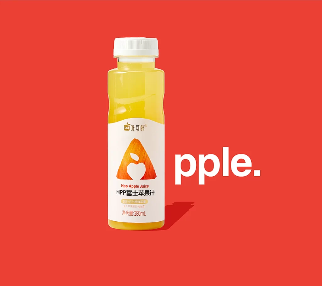
Visual distinction emerges from the bold graphic system where each label's dominant letterform doubles as a color-coded flavor indicator, creating immediate recognition without relying on photography of the actual fruit. The wire basket's industrial grid contrasts with the organic curves of both the produce and the rounded bottle silhouettes, establishing a tension between raw ingredients and packaged convenience. Subtle variations in liquid opacity across the four bottles demonstrate how transparency can communicate different juice concentrations and pulp contents within a unified brand family.
Packaging designers studying beverage branding might analyze how the oversized typography functions as a scalable visual language across multiple SKUs. Art directors planning grocery retail campaigns could reference the composition's balance between empty space and product density to optimize shelf appeal. Color theorists would find value in examining how the limited palette of citrus yellows, apple reds, and neutral whites maintains cohesion while distinguishing individual variants within the same product line.