Seven Pillars MOISTURISER Jar
Topics
Details
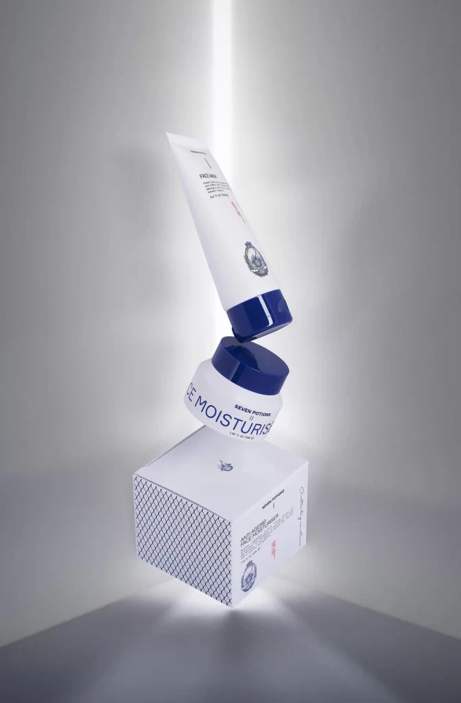
Suspended in a vertical column against a seamless pale gray backdrop, three skincare components appear to float in zero gravity. A white cylindrical tube with a navy blue cap hovers at the top, displaying the word 'PREMIUM' and a detailed crest logo above the cap's edge. Below it sits a squat white jar featuring 'SEVEN POTION' and 'MOISTURISER' in bold navy lettering, while a cubic white box with a diamond-grid pattern on one side anchors the composition from beneath, all illuminated by a soft central spotlight that creates gentle shadows.
Visual distinction emerges from the precise color blocking between crisp white containers and deep navy accents, creating a medical-luxury aesthetic that feels both clinical and premium. The floating arrangement transforms standard packaging into a sculptural moment, emphasizing the geometric contrast between the tube's elongated cylinder, the jar's low profile, and the box's sharp angularity. Subtle branding elements like the intricate crest emblem and minimal typography reinforce a sophisticated identity without visual clutter.
Product photographers studying suspension techniques for cosmetic campaigns will find valuable guidance in how the lighting interacts with reflective surfaces. Packaging designers evaluating color palette effectiveness for skincare lines can analyze how the navy-and-white scheme communicates trust and cleanliness. Art directors planning unboxing sequences might reference the spatial relationships between primary container, secondary packaging, and ancillary products to choreograph their own product reveals.