Anti-Stress Organic Juice Bottle
Topics
Details
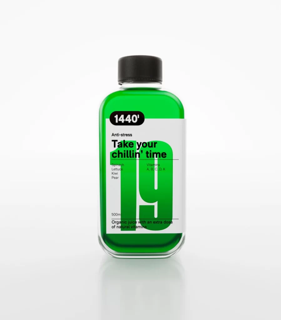
Centered within a seamless white void, a rectangular glass bottle filled with translucent emerald liquid sits at a slight three-quarter angle. A matte black screw cap seals the container, while the label features a stark white background interrupted by bold black typography and an oversized, bright green numeral '19'. Visible text includes '1440'' in a rounded black badge, the phrase 'Take your chillin' time', and ingredient lists for spinach, lettuce, kiwi, and pear alongside vitamins A through K.
Visual hierarchy dominates this composition through extreme scale contrast between the massive background digit and the smaller functional text elements. The limited palette of forest green, jet black, and crisp white creates immediate legibility while the geometric label structure balances negative space with dense information. Such typographic layering allows the product name to remain prominent without obscuring essential nutritional details or volume measurements.
Brand identity specialists might study this layout to understand how oversized numerals can function as secondary logos across packaging lines. Packaging engineers could reference the specific proportions between the cap width and bottle shoulder when drafting technical specifications for similar beverage containers. Marketing teams analyzing wellness sector trends would find value in how the 'Anti-stress' positioning integrates with the organic ingredient callouts.