Juicy Fruit Juice Branding A
Topics
Details
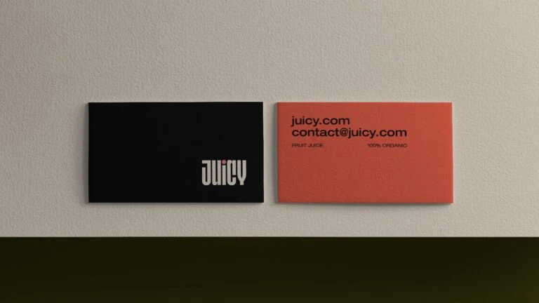
Two business cards sit side by side on a textured off-white wall, casting subtle shadows from soft directional lighting above. The left card features a deep matte black surface with the word 'juicy' in bold white geometric sans-serif typeface positioned toward the lower right quadrant. Its coral-red counterpart on the right displays 'juicy.com' and 'contact@juicy.com' in black text, with smaller print reading 'FRUIT JUICE' and '100% ORGANIC' beneath.
Visual tension emerges from the stark chromatic contrast between the somber black panel and the energetic red information card, creating a balanced yet dynamic pairing. Typography plays a crucial role here, with the stylized logo on the dark card utilizing negative space effectively, while the contact details employ straightforward legibility. Material textures appear distinctly different—the black card seems to absorb light completely, whereas the red surface exhibits a slight grain that catches illumination differently, adding tactile depth to the composition.
Brand identity developers examining minimalist packaging strategies would find this arrangement particularly useful for studying color blocking and typographic weight distribution. Print production specialists might reference these specific hue values and layout proportions when constructing similar dual-sided collateral for beverage or lifestyle companies. Art directors composing mood boards for organic product launches could extract the sophisticated interplay between bold branding elements and essential contact information demonstrated here.