Juicy Juice Packaging D
Topics
Details
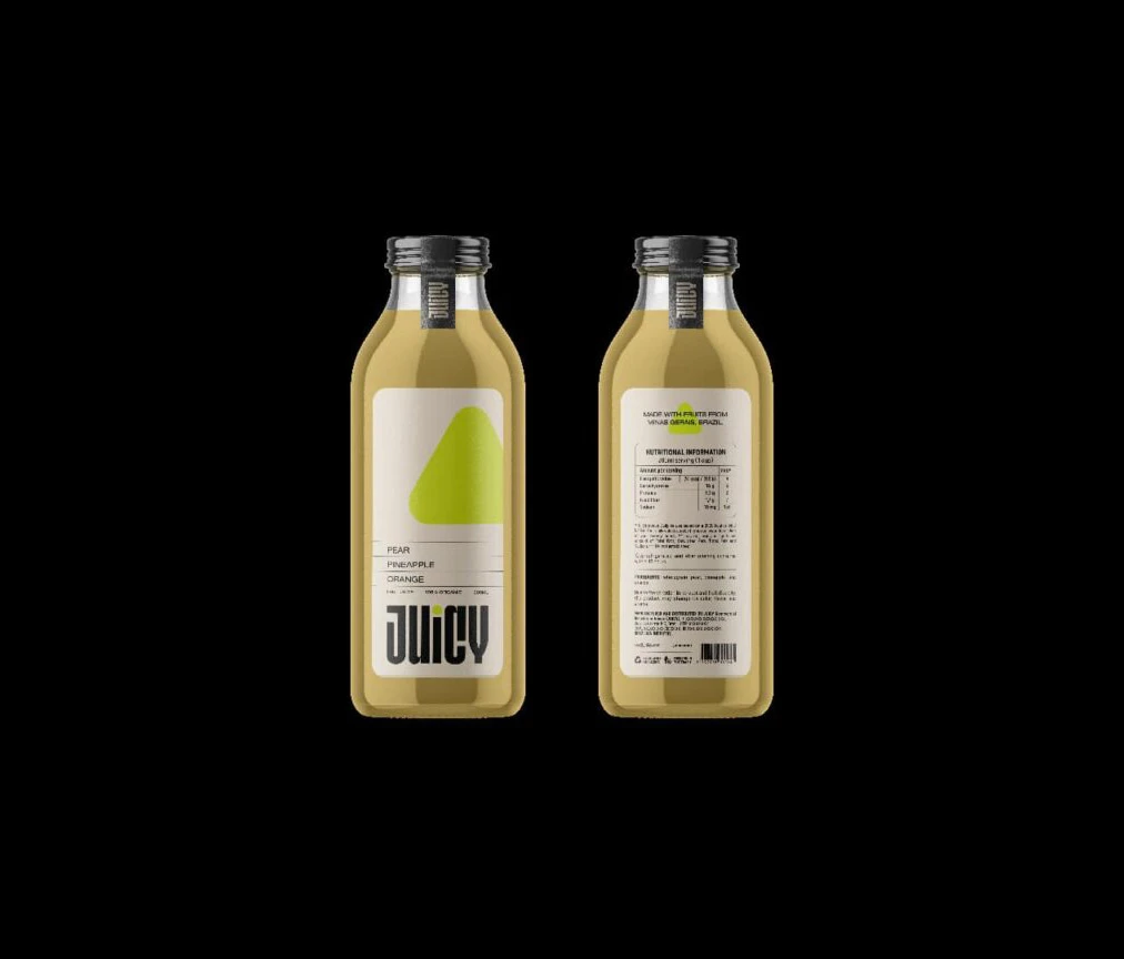
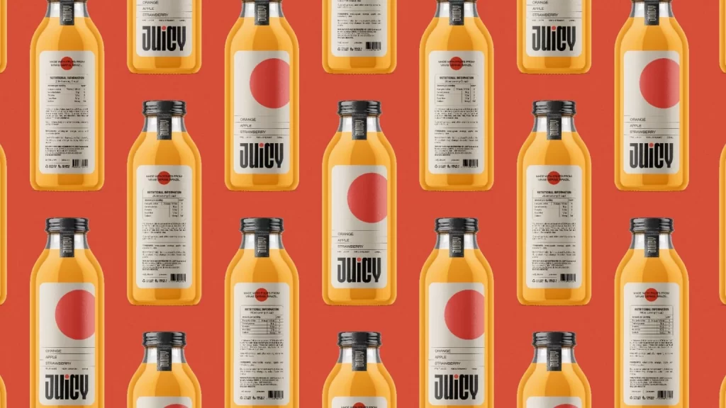
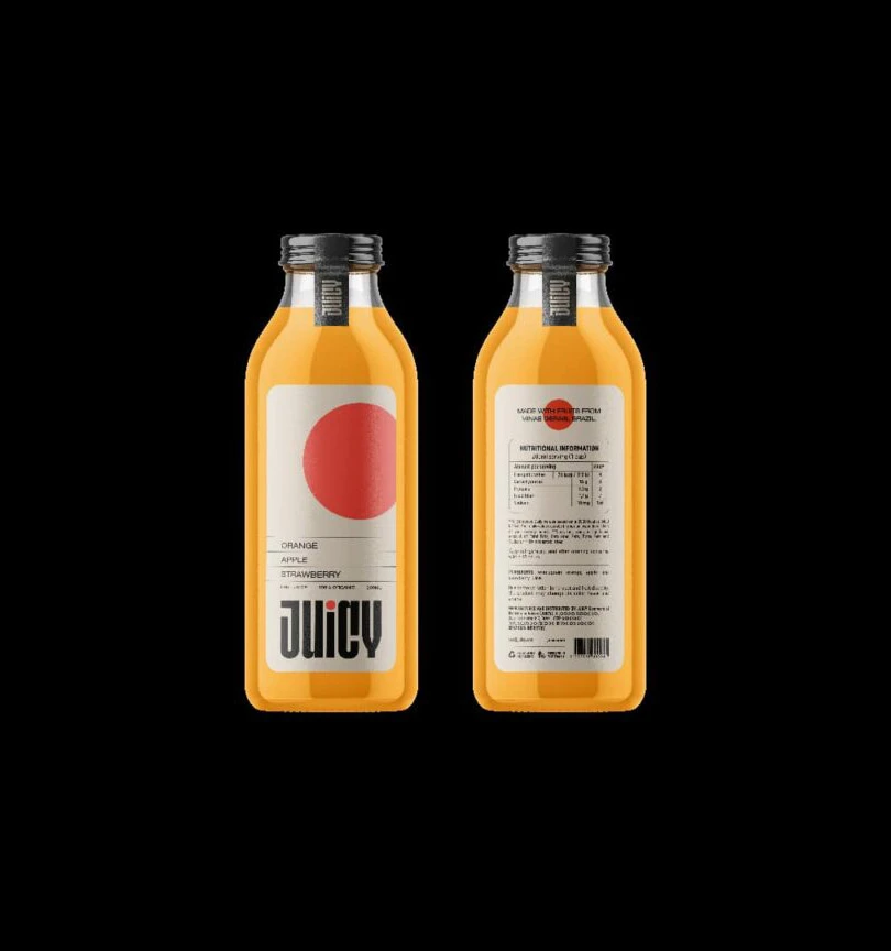
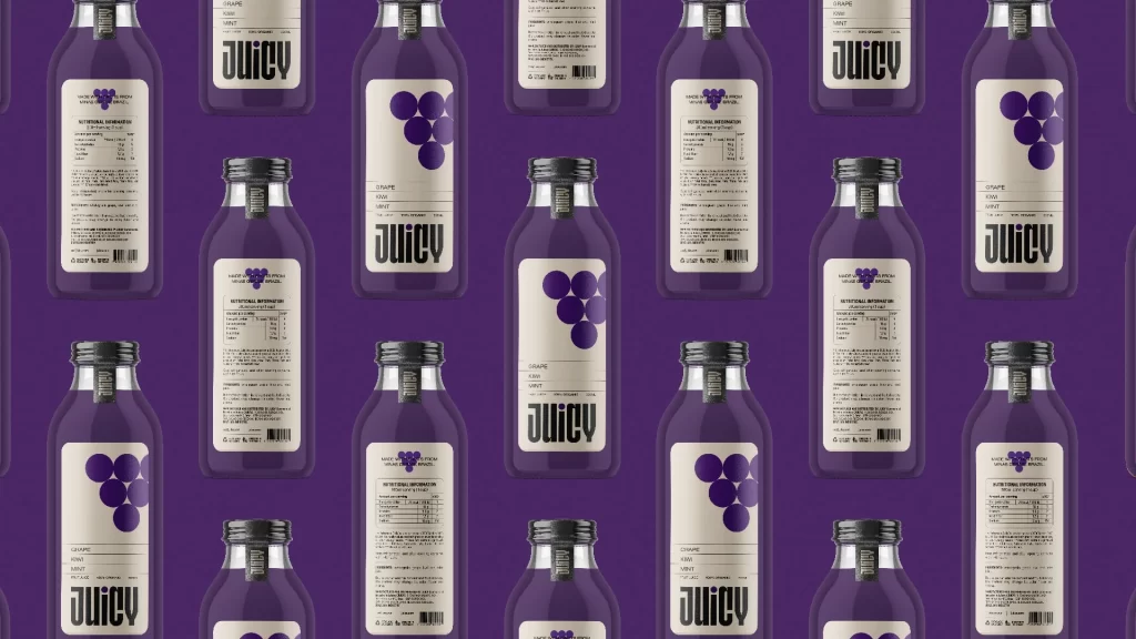
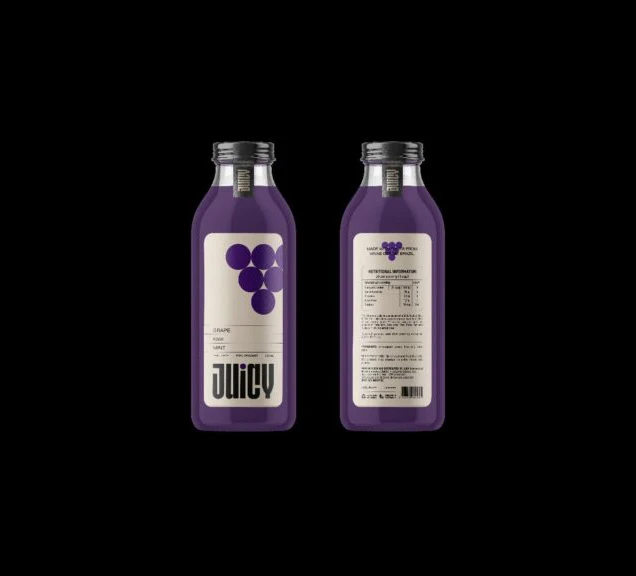
Two translucent purple bottles filled with deep violet liquid stand side-by-side, revealing both front and rear label designs. Each container features a metallic screw cap and a cream-colored rectangular label, with the front displaying a cluster of dark purple circles above the bold 'JUICY' text. The packaging is set against a void-like black background that emphasizes the minimalist aesthetic of the design.
Visual interest is generated through the stark contrast between the saturated purple fluid and the neutral off-white labeling area. The geometric arrangement of the fruit graphic provides a modern, abstract representation of the flavor without relying on photorealism. Furthermore, the symmetrical presentation allows for an immediate comparison between branding elements and mandatory regulatory text, highlighting how typography scales differently across the same physical surface.
Brand identity specialists can utilize this composition to study the balance between playful graphics and serious nutritional data on beverage containers. Packaging engineers might examine the specific proportions of the label relative to the bottle’s curvature to plan their own print layouts. Additionally, color theorists will find value in analyzing how the monochromatic purple scheme influences consumer perception of flavor profiles in retail environments.