Juicy Juice Packaging E
Topics
Details
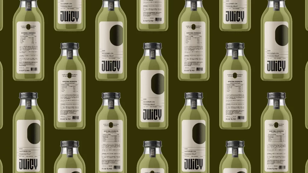
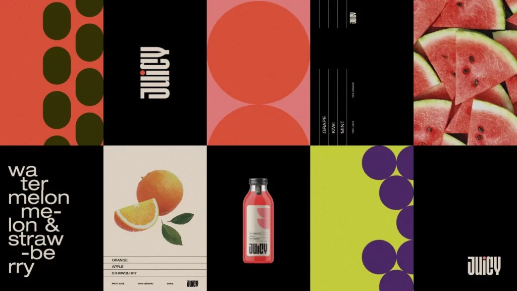
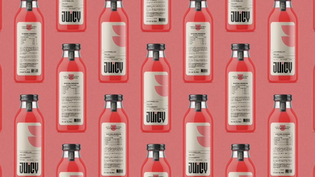
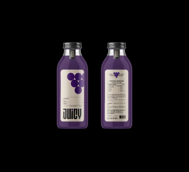
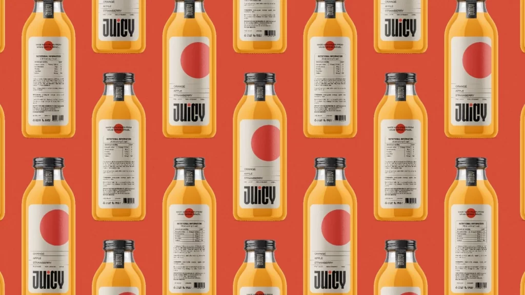
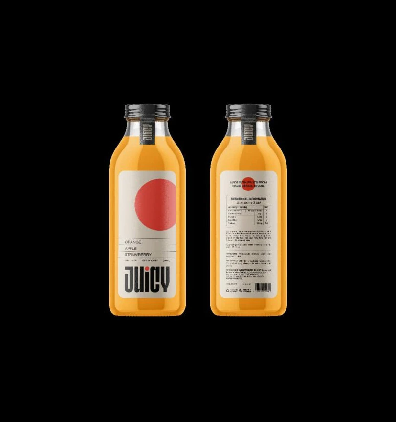
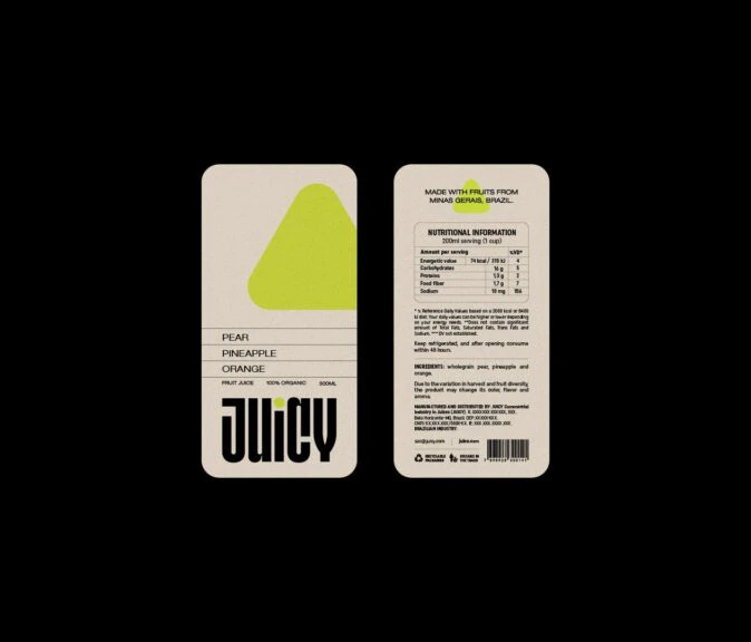
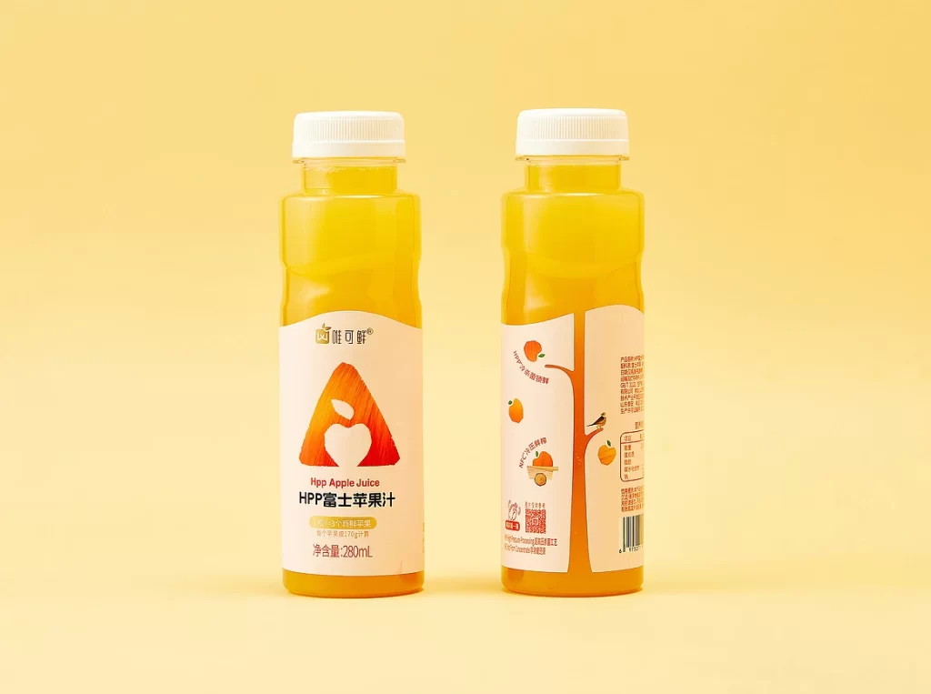
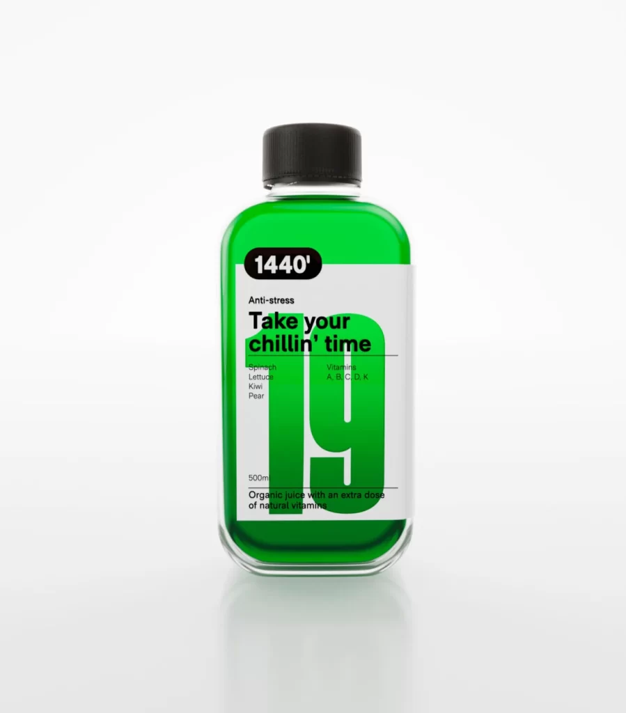
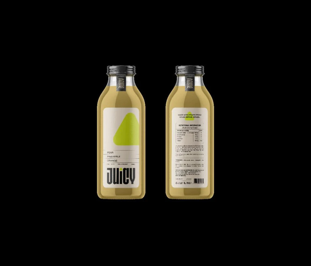
Two glass bottles filled with translucent golden-yellow liquid stand side-by-side against a pitch-black void. The front label displays a clean white background with a large, vibrant lime-green triangle positioned above the bold, black sans-serif word 'JUICY', while 'PEAR', 'PINEAPPLE', and 'ORANGE' appear in smaller text above the brand name.
What truly sets this packaging apart is its masterful use of negative space combined with that singular, eye-catching green graphic element. The typography strikes a perfect balance between modern industrial styling and approachable consumer branding, making the flavor profile immediately legible without visual clutter. Such a restrained color palette—limited to white, black, gold, and that specific shade of chartreuse—demonstrates how impactful minimalism can be when applied to beverage marketing.
Brand identity specialists might study this composition to understand how geometric shapes can effectively communicate freshness and organic ingredients. Packaging engineers could utilize this as a baseline for testing how different label layouts perform under studio lighting conditions. Even students of commercial photography would find value in analyzing how the dark background isolates the subject to create a premium, gallery-like presentation for everyday consumer goods.