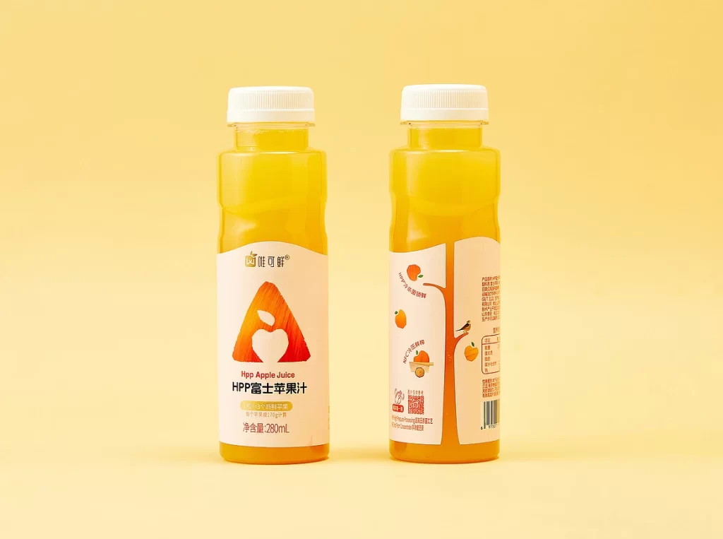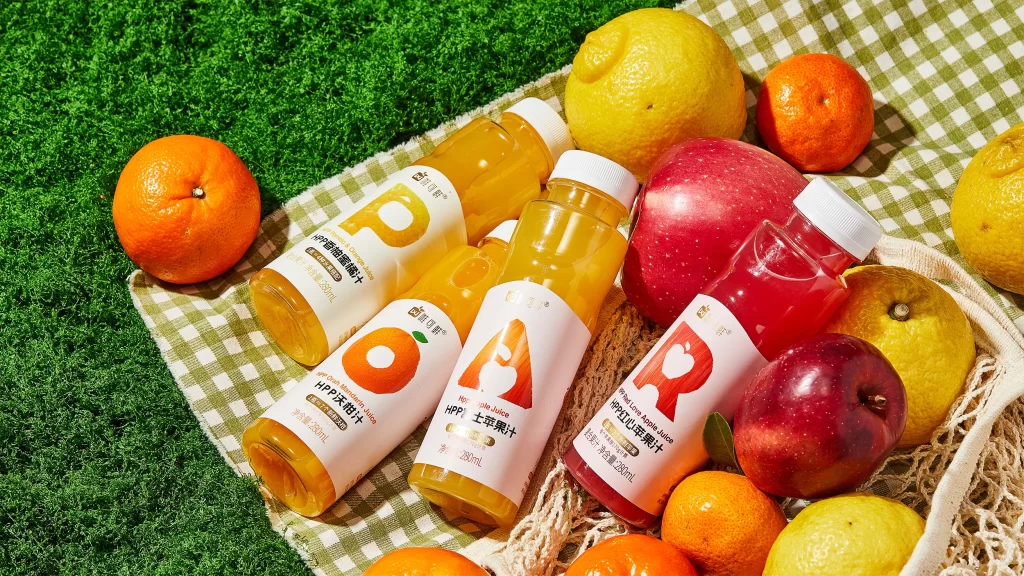
HPP Fruit Juice Drink Bottle
Topics
Details
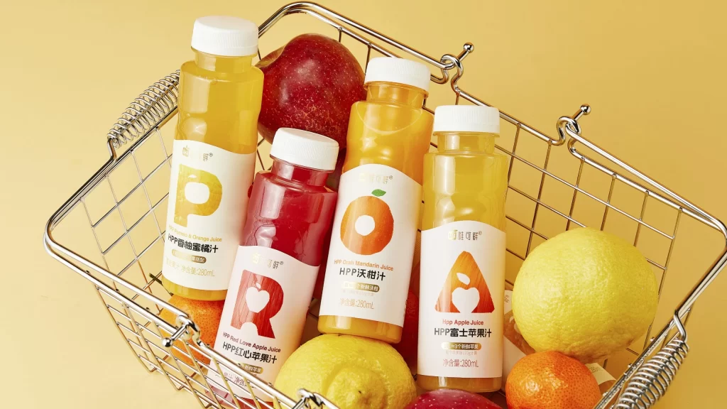
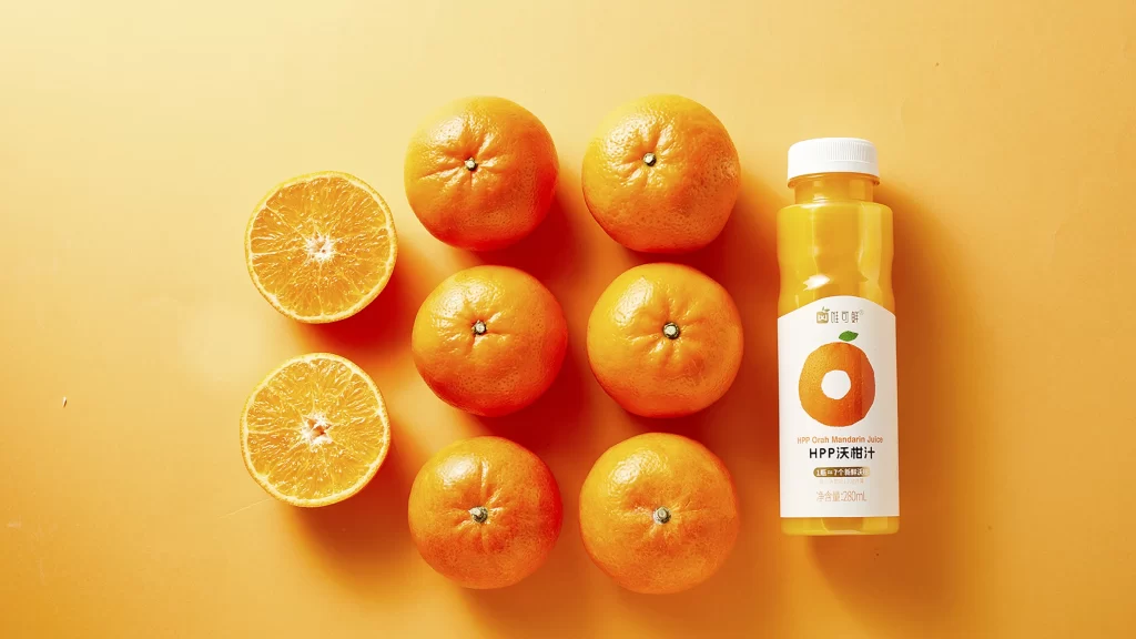
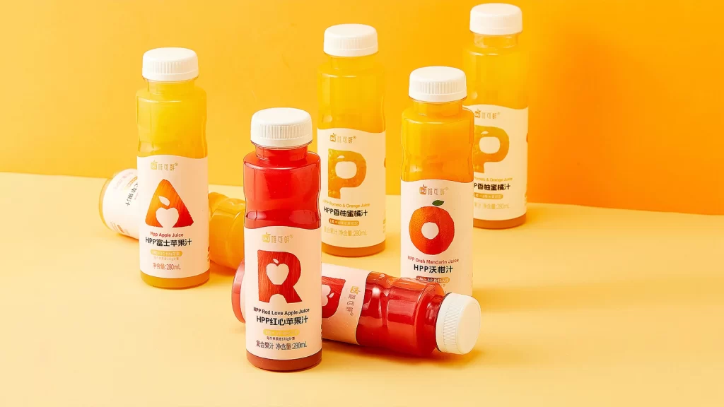
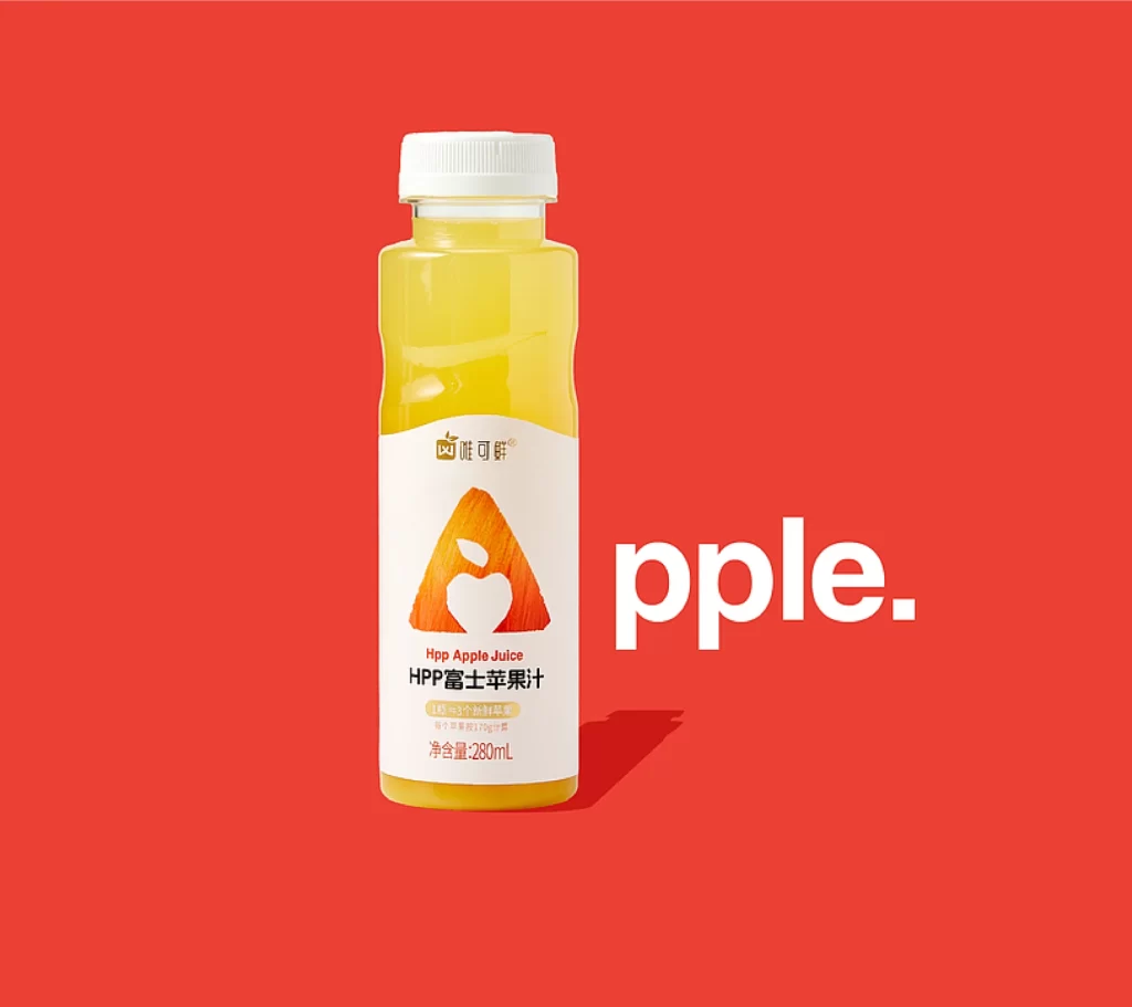
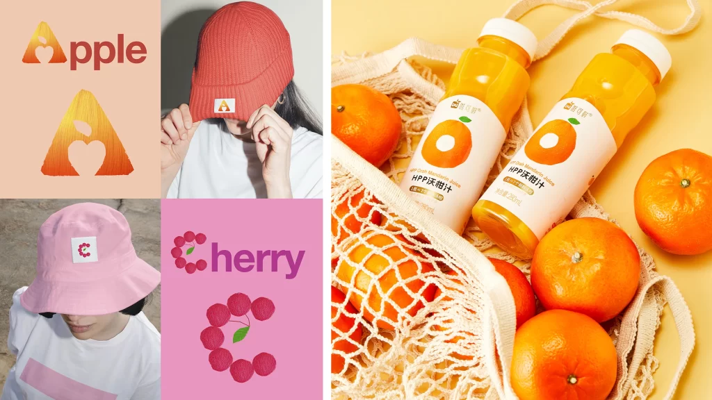
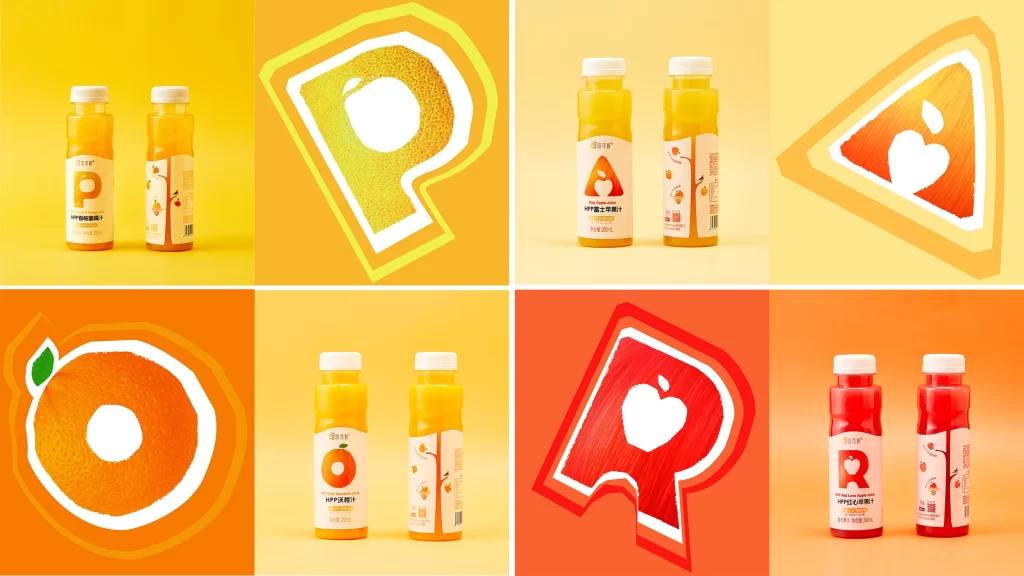
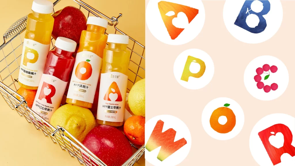
A wire shopping basket filled with fresh produce and four plastic juice bottles sits against a warm peach background, photographed from a high-angle perspective. The bottles feature white caps and labels dominated by large, colorful letters—P, R, O, and A—each incorporating fruit silhouettes like apples, oranges, or cherries. Surrounding the basket are whole fruits including red apples, yellow lemons, and bright orange citrus, all illuminated by soft, even lighting that highlights the glossy surfaces of the packaging.
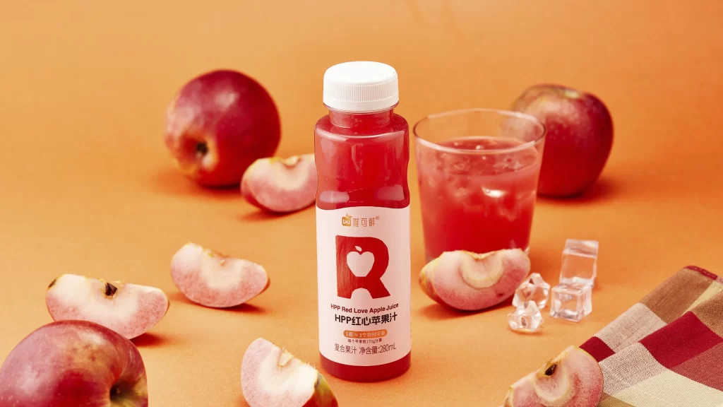
Visual interest centers on the typographic system where each letterform doubles as a container for fruit-specific iconography and texture. The 'P' carries a golden-yellow gradient suggesting pomelo peel, while the red 'R' embeds an apple shape within its counter, creating immediate flavor recognition before reading the text. Beside the product shot, isolated circular icons demonstrate how these characters decompose into standalone brand marks with watercolor-style fills and organic edges.
Packaging designers studying beverage category conventions would examine this for strategies in integrating typography with ingredient imagery. Brand identity teams could reference the isolated letterforms when developing scalable logo systems that maintain legibility across bottle sizes. Art directors planning e-commerce photography might note the composition's balance between transparent liquid visibility and opaque label graphics to guide their own prop styling decisions.