Fruit Juice With Fruit Shapes Bottle
Topics
Details
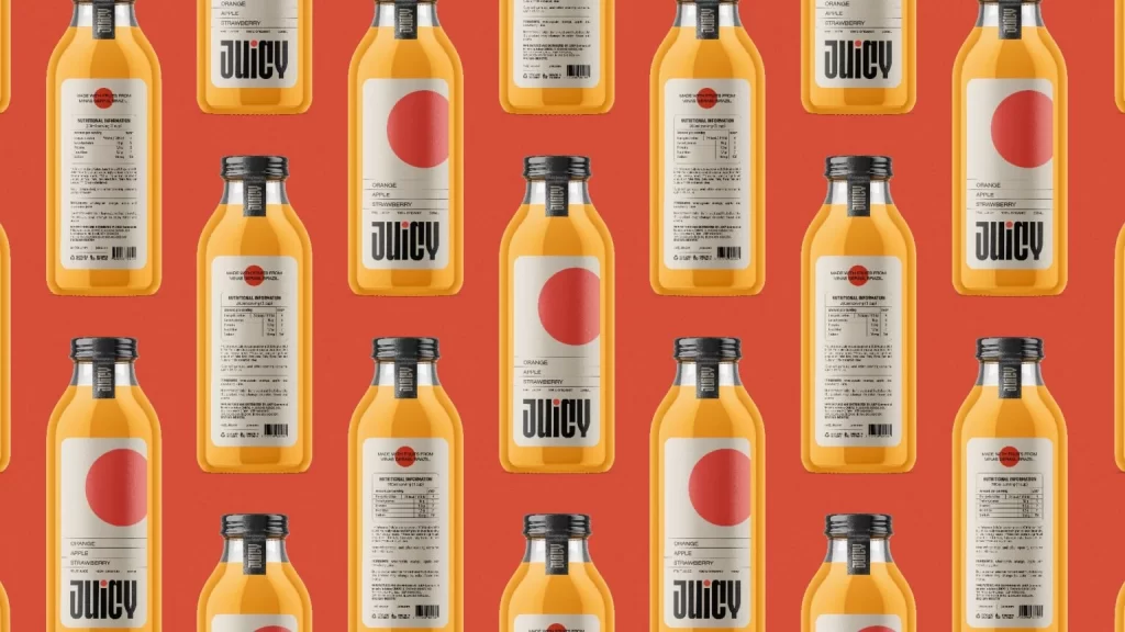
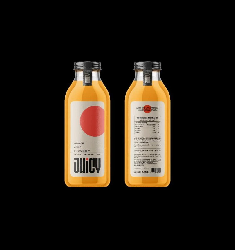
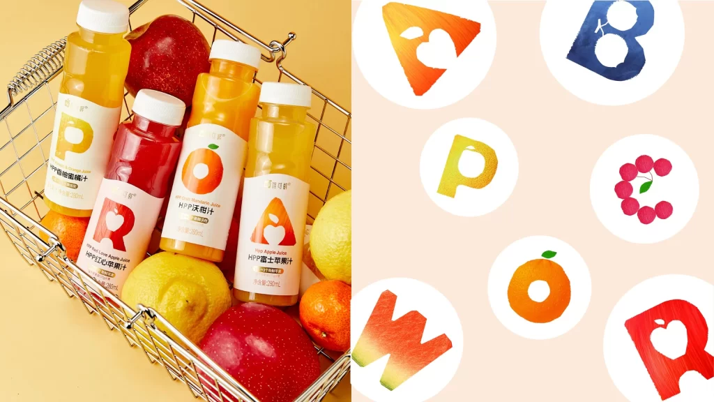
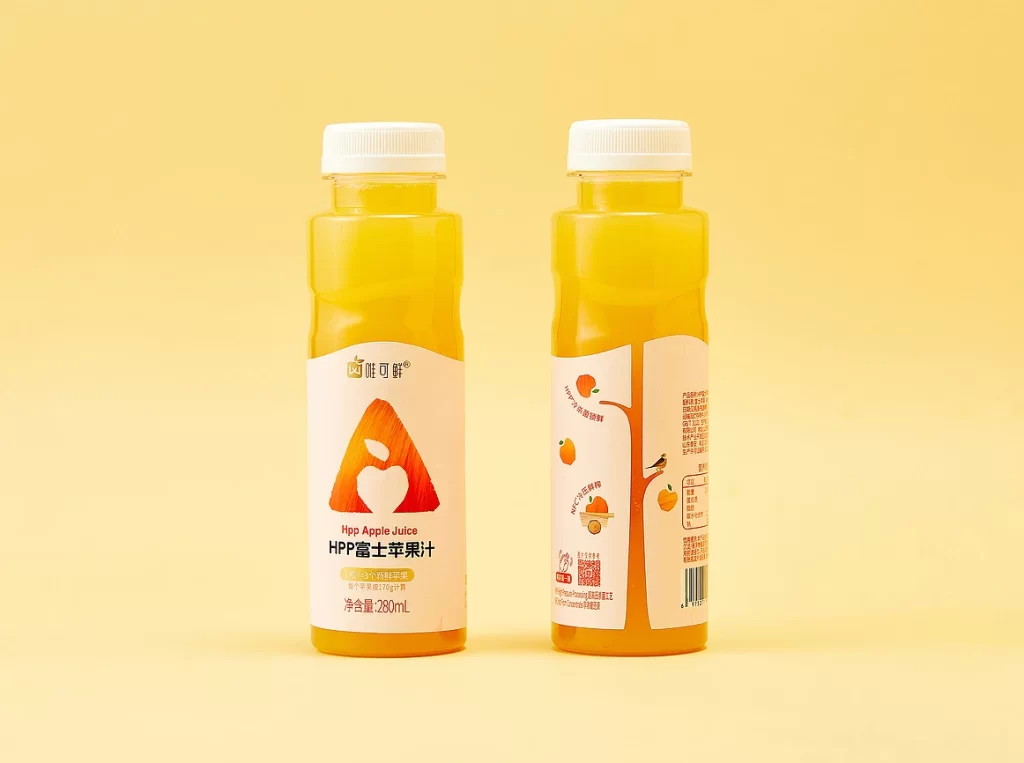
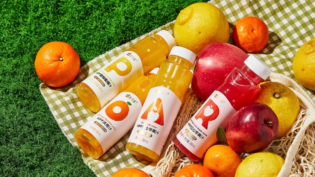
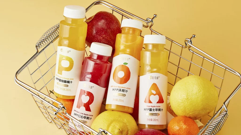
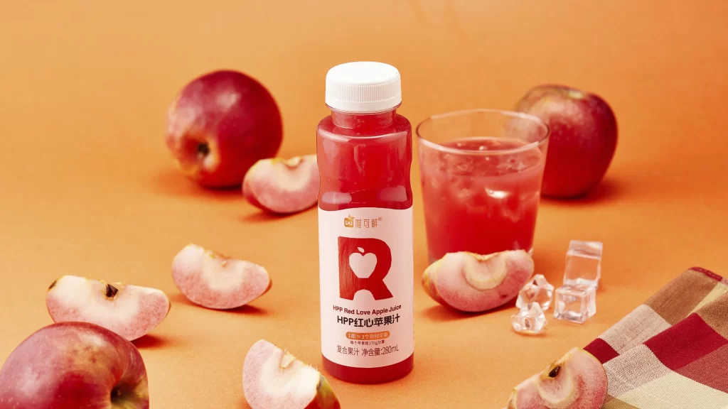
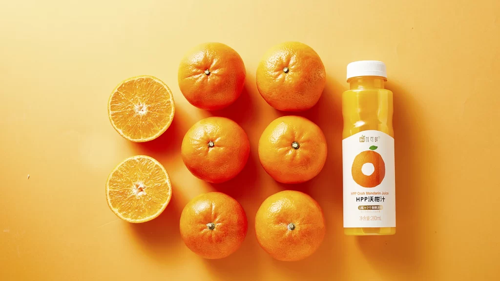
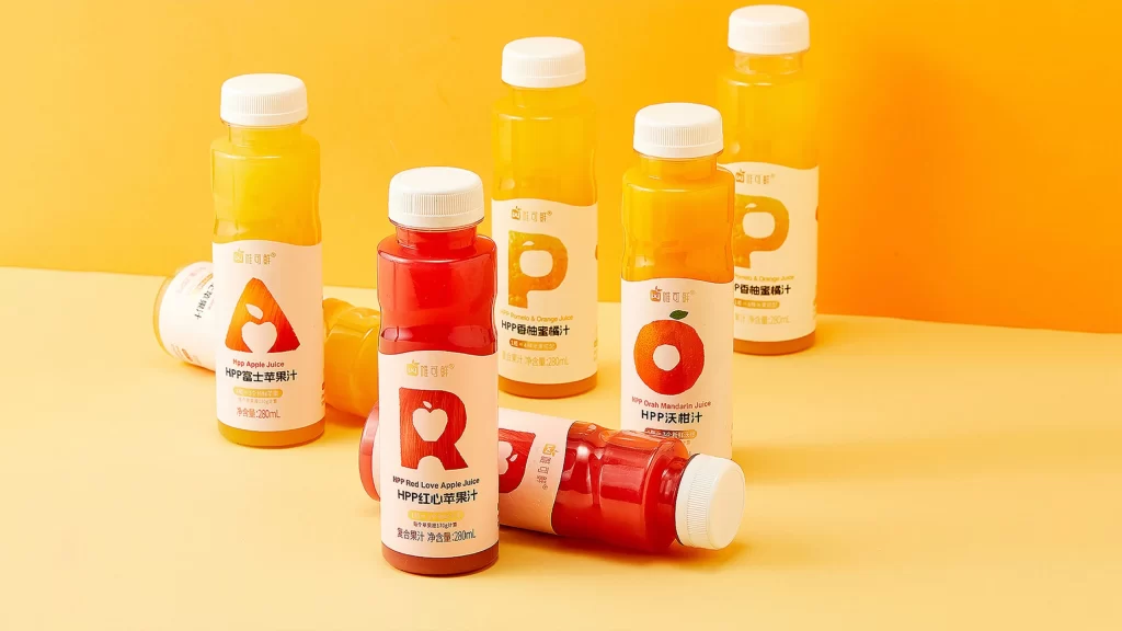
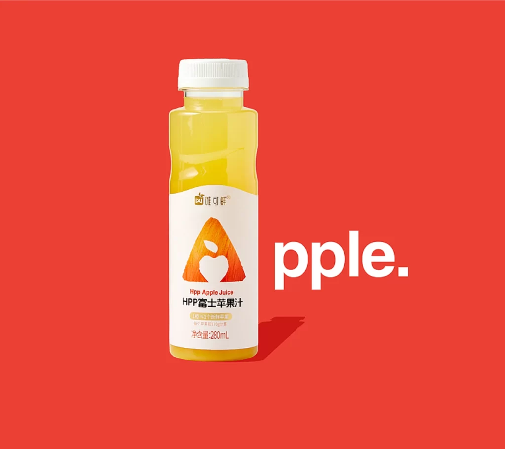
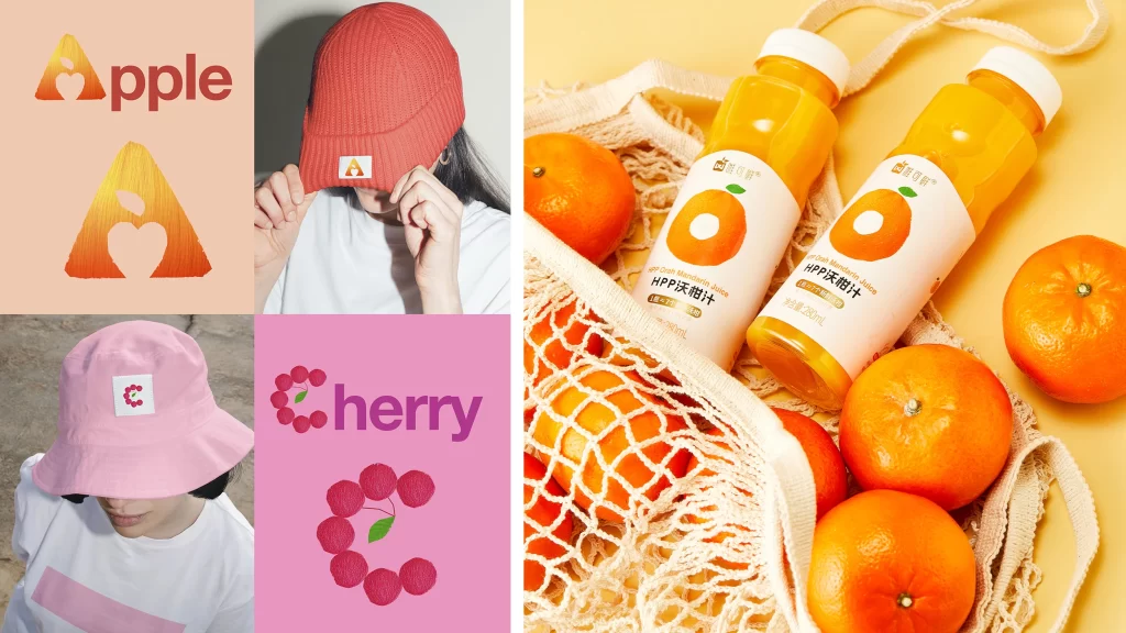
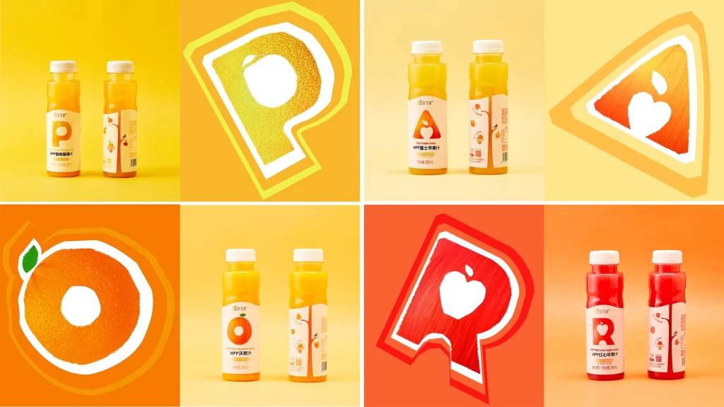
Six panels display juice bottles paired with oversized fruit-shaped letters—P, A, O, and R—each filled with textured pulp or solid color matching the beverage inside. Warm gradients of yellow and orange dominate the background, while the bottles feature white caps, minimalist labels with bold typography, and clean studio lighting that highlights their translucent plastic material.
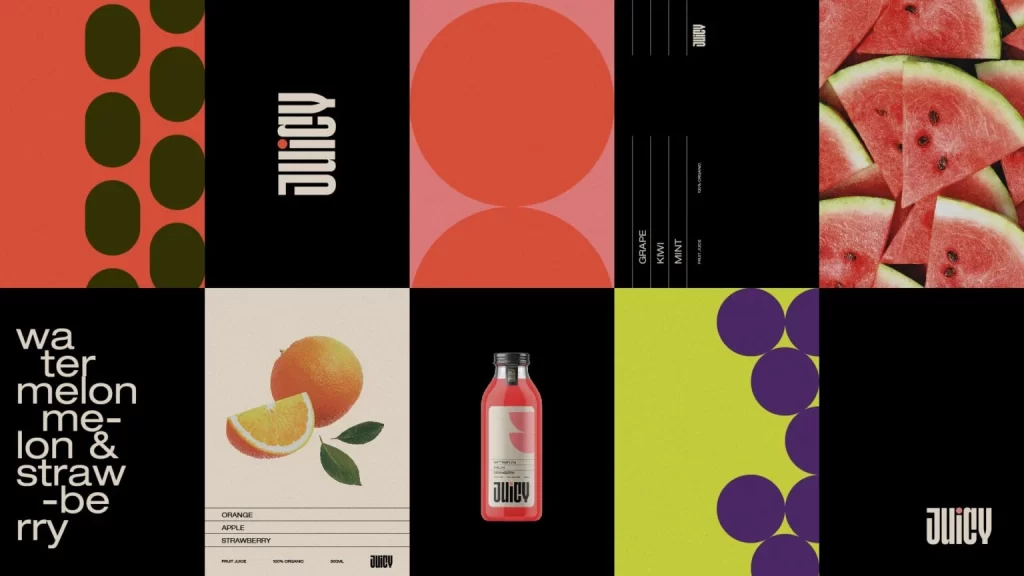
Clever integration of organic textures into rigid typography defines the visual appeal of this packaging system. Rather than placing fruit imagery adjacent to the text, the designers have carved the actual shapes of oranges, apples, and love apples out of the letterforms themselves, creating negative space that simultaneously communicates flavor and brand identity. This approach transforms standard alphabetical characters into mnemonic devices, where the rough, painted texture of the fruit interiors contrasts sharply against the clean white outlines and solid color fields of the background graphics.
Brand strategists developing beverage identities for health-conscious markets will find immediate value in studying how these icons bridge the gap between literal illustration and abstract logo design. Packaging engineers can reference the bottle proportions and label placement to understand how minimal text integrates with oversized graphical elements on curved surfaces. Meanwhile, editorial illustrators might adapt this technique of embedding object silhouettes within typefaces for food-magazine headlines or menu systems requiring both legibility and appetizing visual cues.