HPP Fruit Juice Bottle
Topics
Details
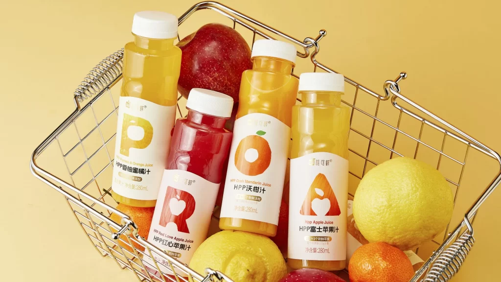
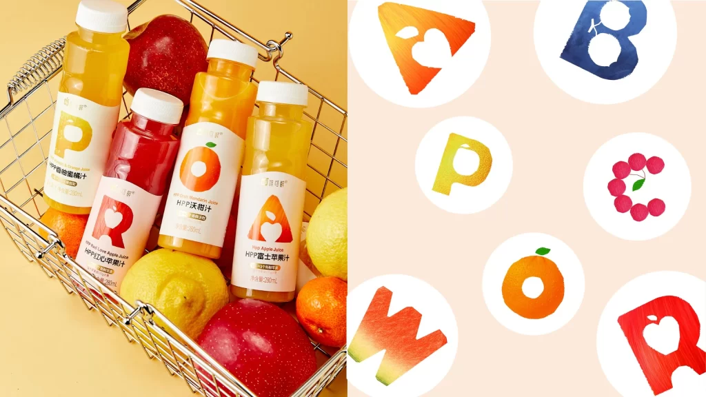
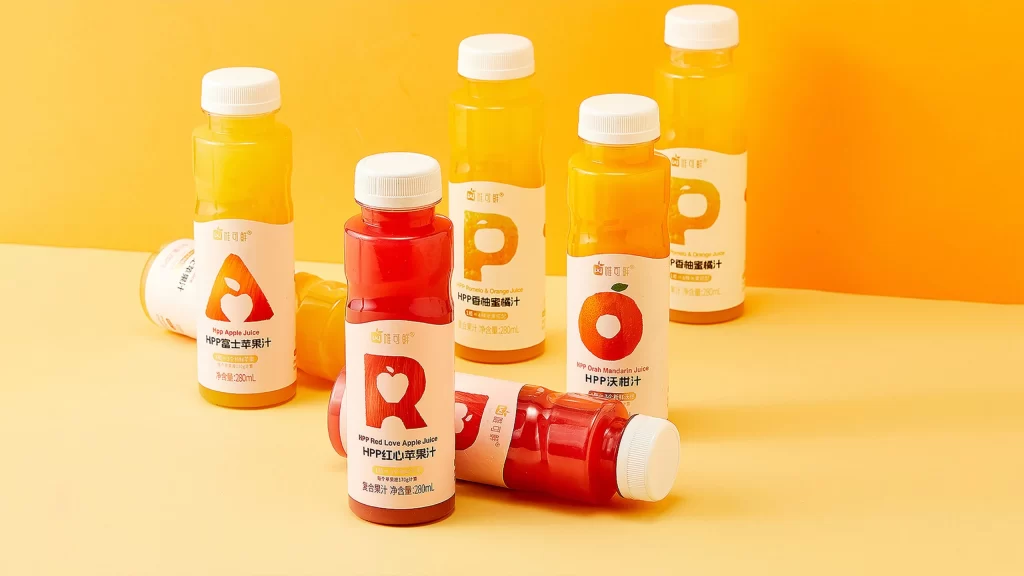
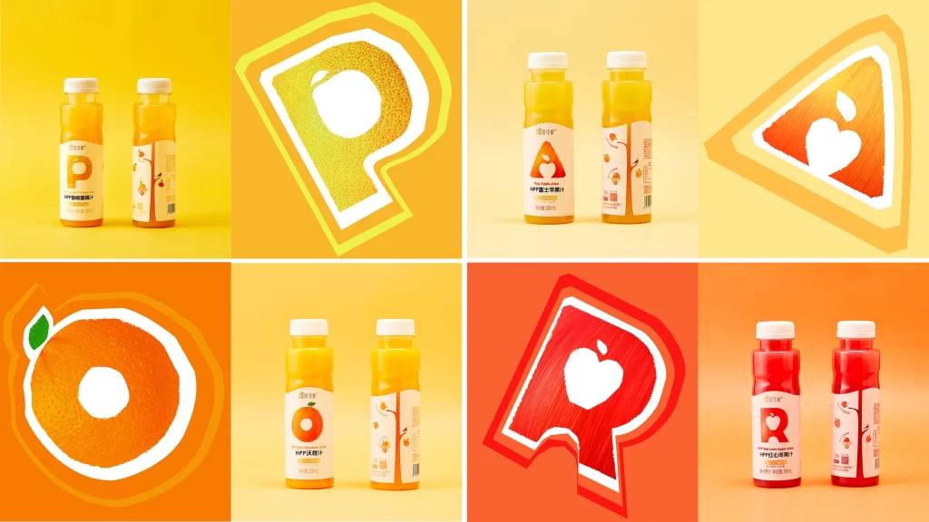
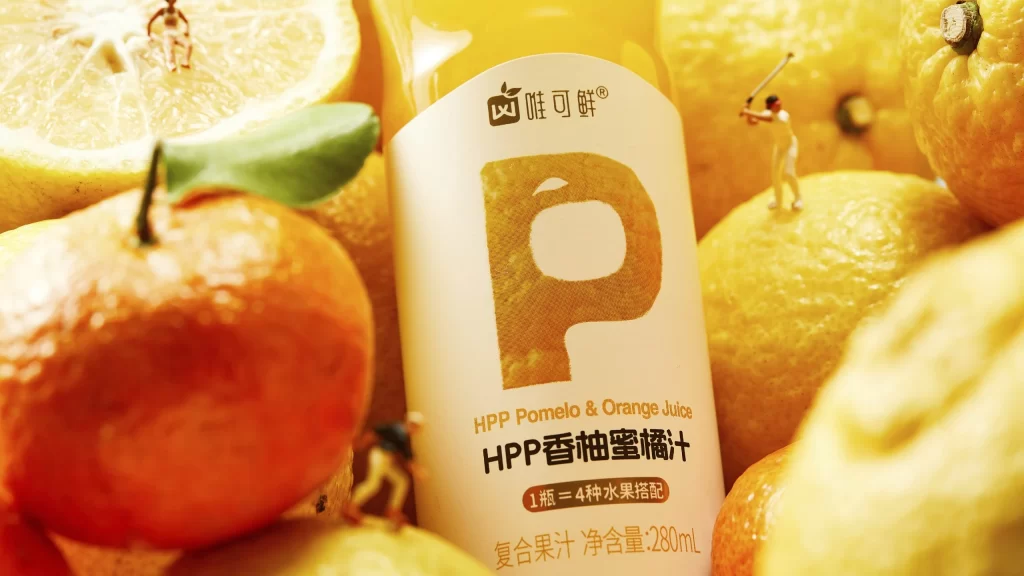
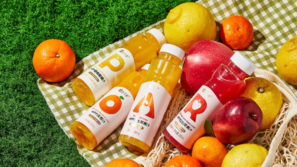
Arranged diagonally across a green and white gingham cloth, four transparent bottles of HPP fruit juice display their contents against a backdrop of artificial grass and fresh produce. The collection includes a golden-yellow Pomelo & Orange Juice, a bright orange Mandarin Juice, a pale yellow Apple Juice, and a deep red Love Apple Juice, each featuring a large, stylized letter on its white label that corresponds to the fruit inside. Natural sunlight illuminates the scene from the upper right, casting soft shadows and highlighting the glossy skins of the surrounding lemons, mandarins, and apples that frame the products.
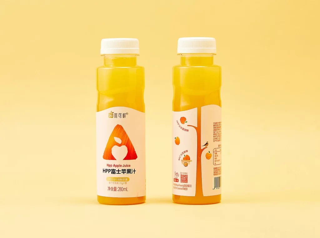
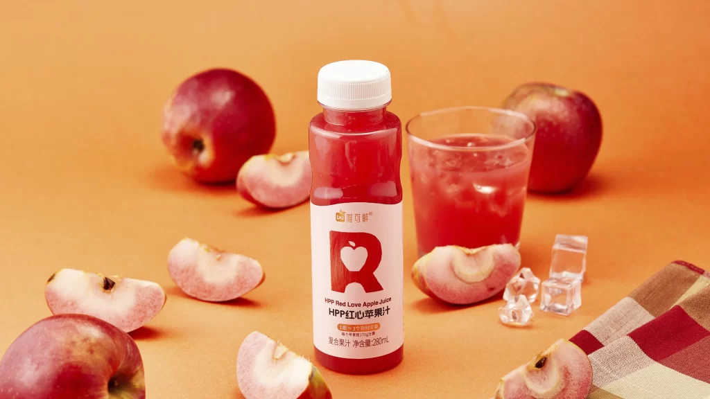
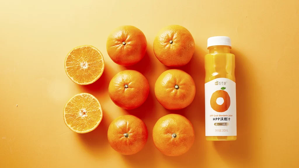
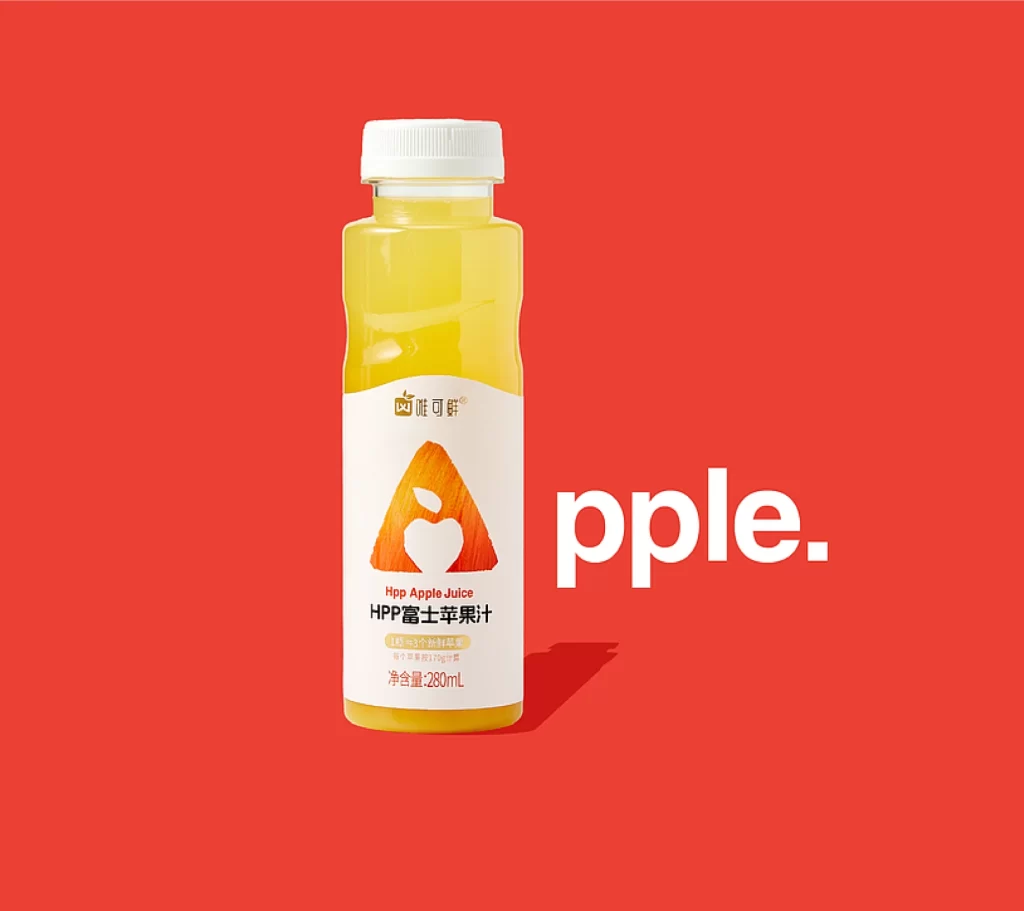
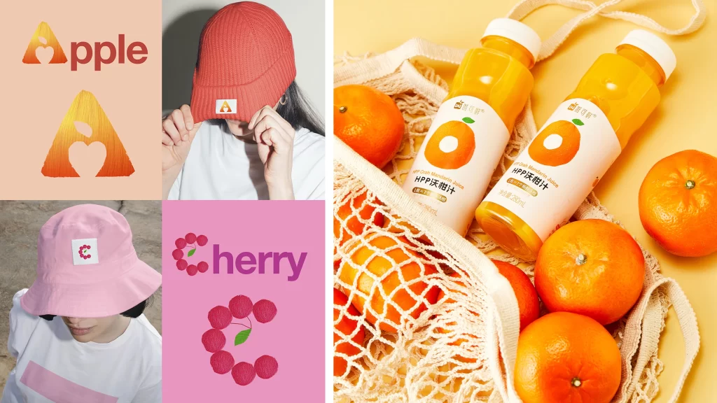
Visual distinction comes from the clever integration of typography and iconography, where the oversized 'P', 'O', 'A', and 'R' serve as both brand identifiers and literal representations of the pomelo, orange, apple, and red love apple. The minimalist label design relies on high contrast between the clean white background and the vibrant juice colors, ensuring immediate flavor recognition even from a distance. Furthermore, the consistent use of 280ml clear plastic bottles allows the natural hues of the cold-pressed liquids to act as a primary design element, reinforcing the product's promise of purity and freshness.
Product photographers can utilize this setup to study effective prop styling techniques for beverage launches, specifically noting how raw ingredients are used to validate flavor claims without cluttering the composition. Packaging designers might examine the spatial relationship between the bold letterforms and the smaller Chinese text to understand how to balance visual impact with regulatory information. Marketing teams planning outdoor or picnic-themed campaigns will find the color palette and textile textures particularly useful for developing cohesive seasonal branding materials.