Juicy Fruit Juice Branding C
Topics
Details
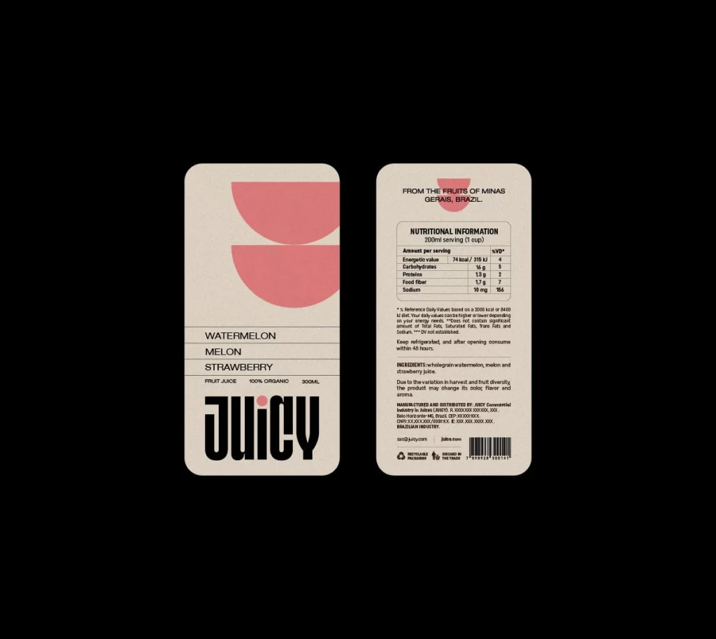
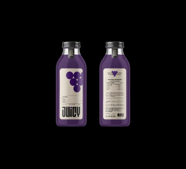
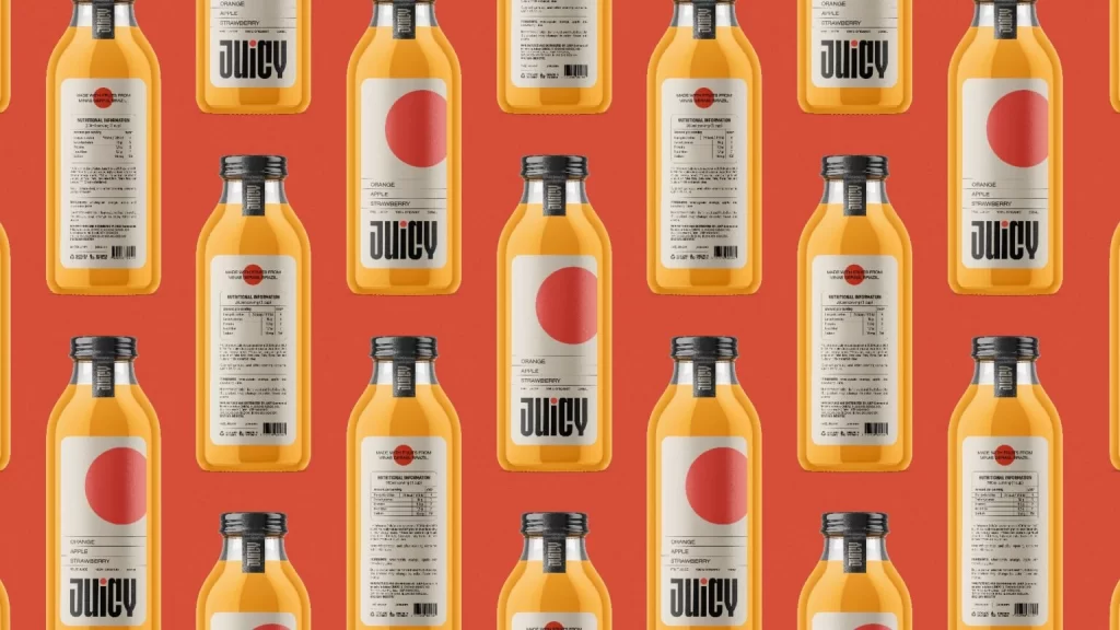
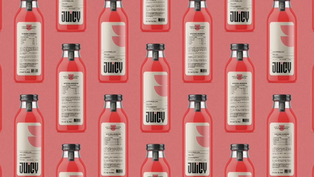
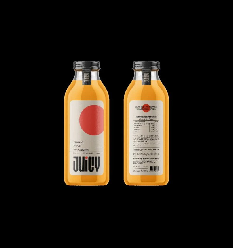
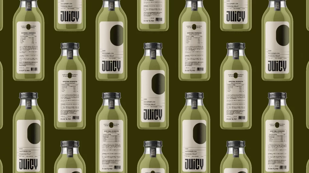
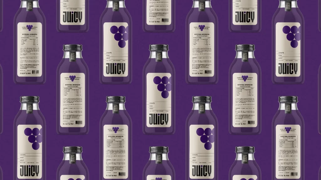
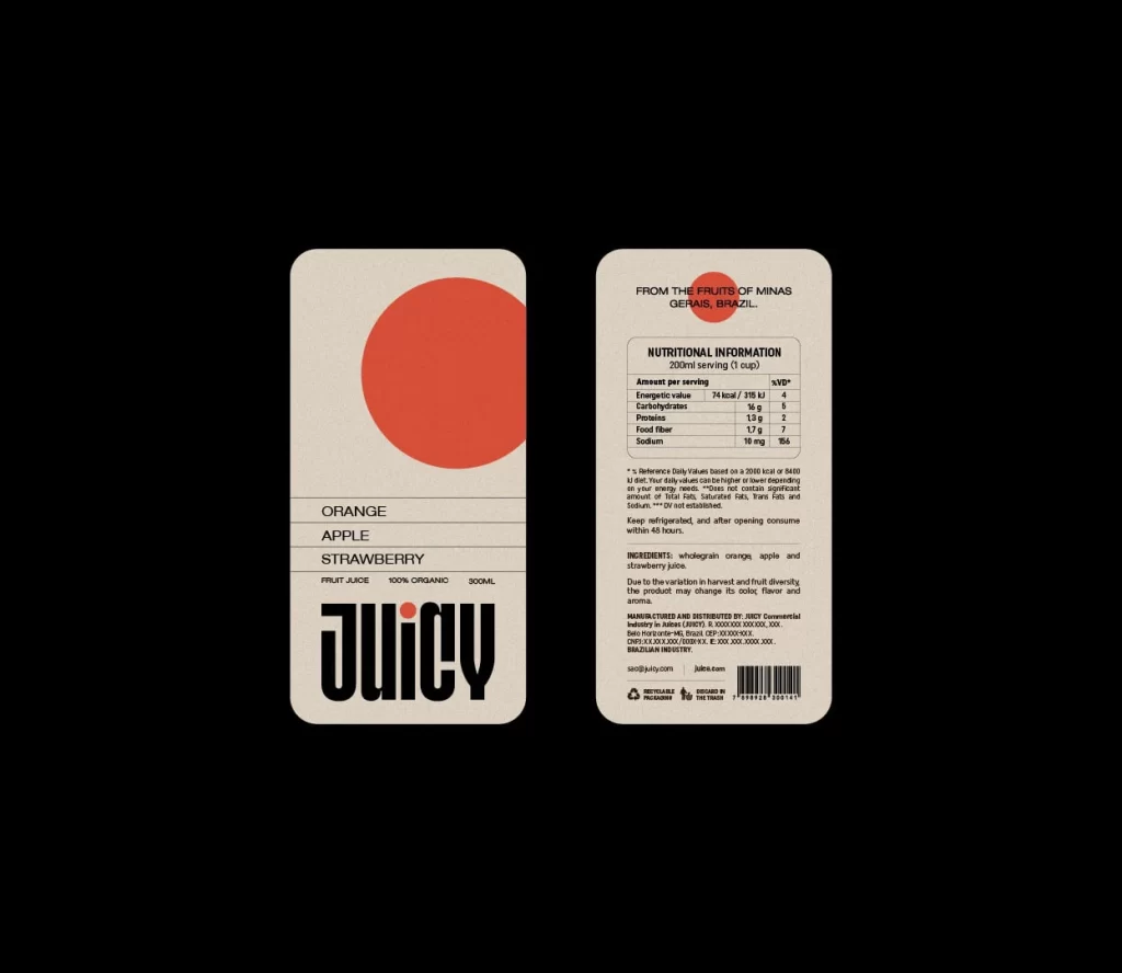
Two rounded rectangular labels with a cream, textured finish showcase a minimalist juice brand identity on a black background. The front panel features a large, solid coral-red circle positioned above a clean typographic list of flavors—Orange, Apple, and Strawberry—while the word 'JUICY' anchors the bottom in heavy, black sans-serif lettering. Its reverse side presents a structured nutritional grid, ingredients list, and manufacturing details beneath a smaller coral circle.
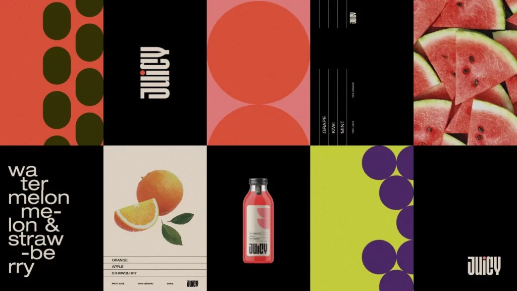
Visual interest stems from the stark contrast between the warm, textured off-white background and the bold, geometric red shape that dominates the composition. The layout balances generous negative space with dense informational blocks, creating a hierarchy that feels both modern and utilitarian. By restricting the palette to black, white, and a single vibrant accent, the design achieves a memorable, high-impact aesthetic that stands out through its sheer simplicity.
Brand strategists might examine this layout to understand how to organize complex regulatory information without sacrificing visual appeal. Packaging engineers could reference the proportions to determine optimal placement for mandatory labeling versus marketing copy. Art directors seeking a retro-modern aesthetic for beverage lines would find the typographic weight and color blocking particularly useful for developing their own identity systems.