Weikexian Apple Juice Bottle Design
Topics
Details
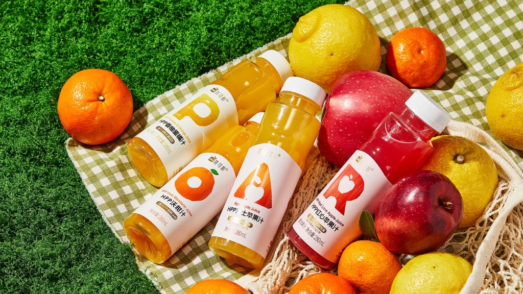
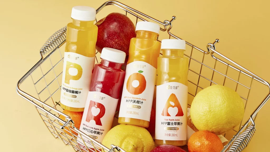
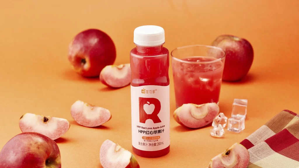
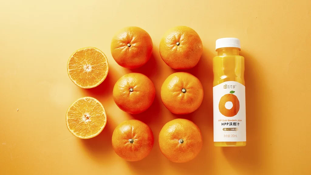
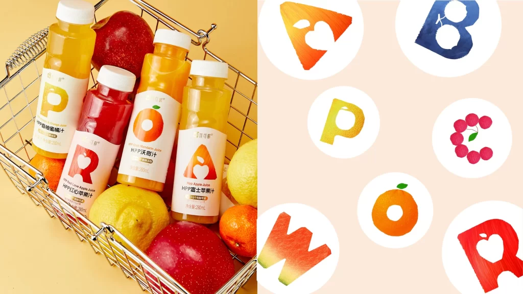
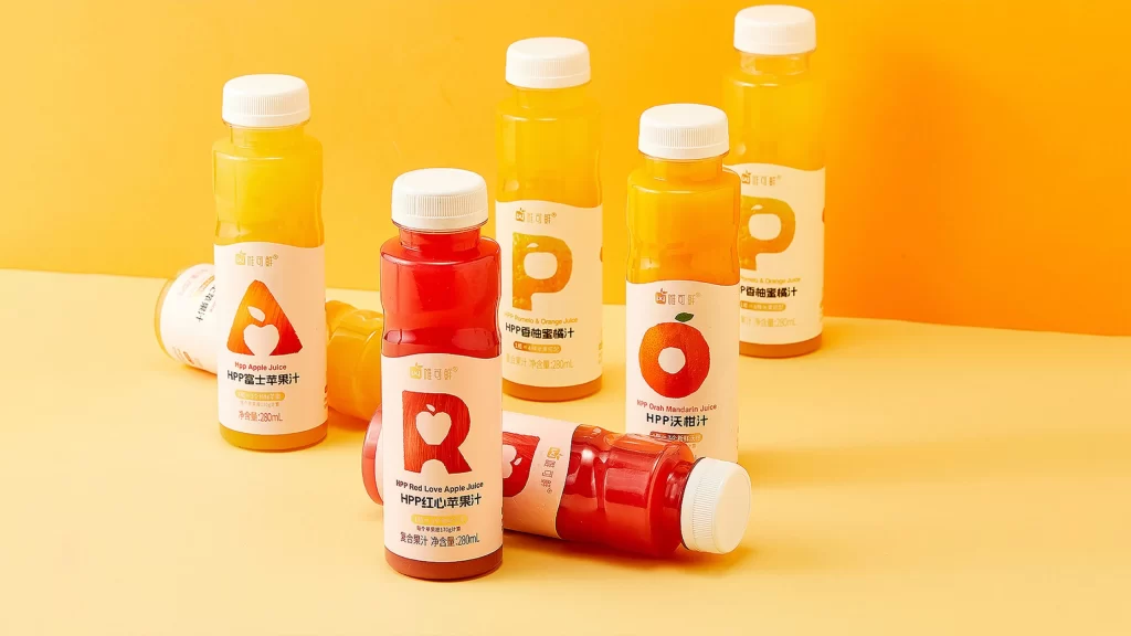
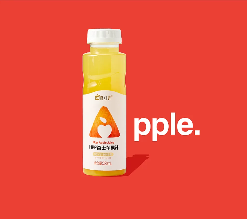
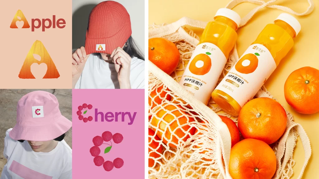
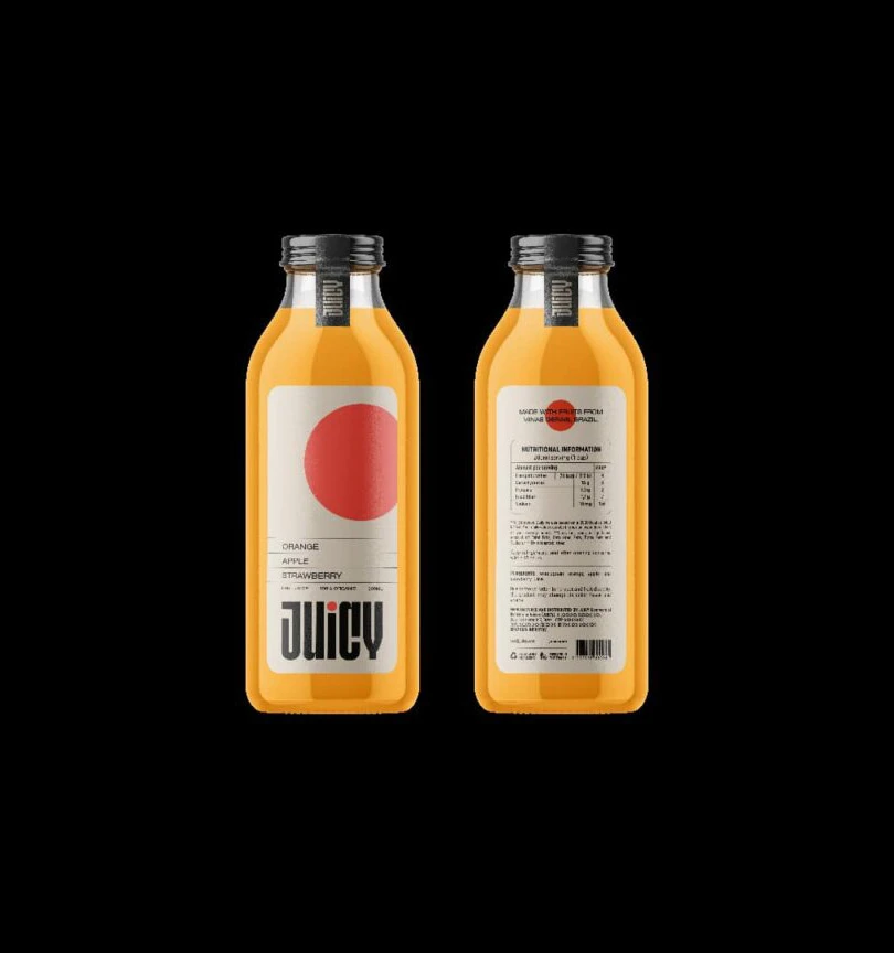
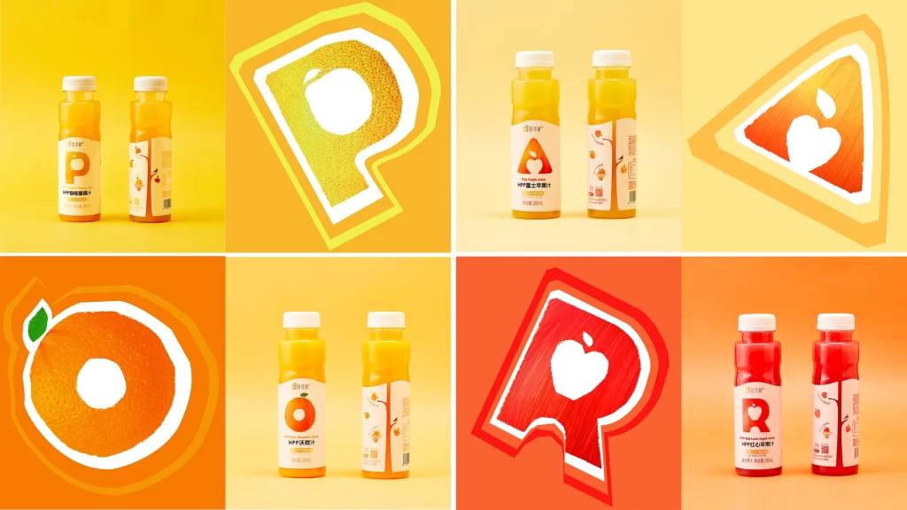
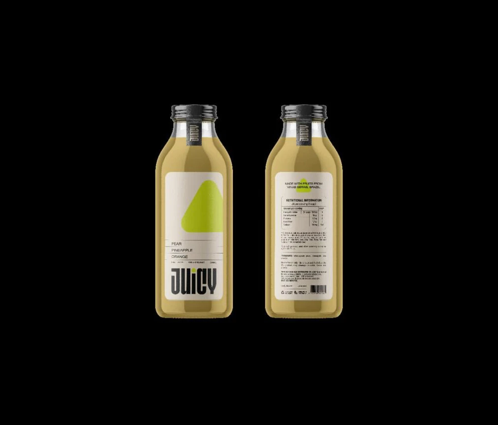
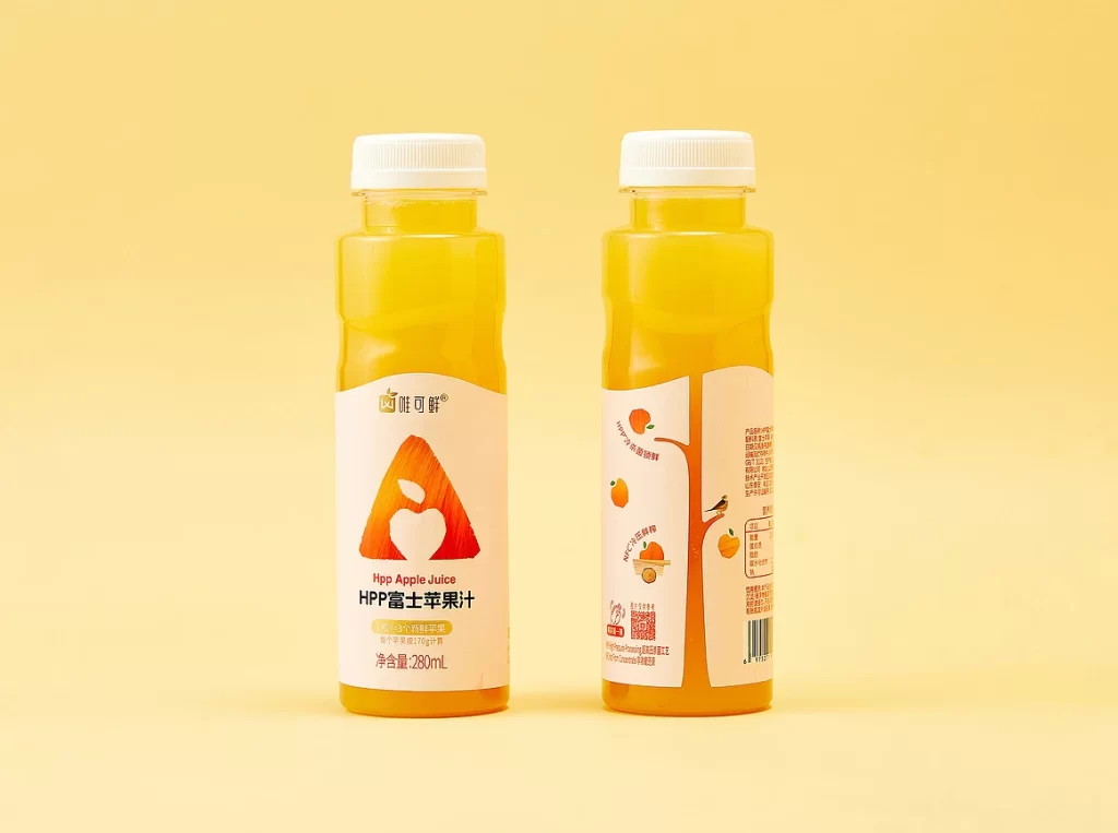
Set against a uniform, pale yellow backdrop, two plastic bottles of HPP apple juice stand side-by-side, showcasing both the front and back of the packaging. The liquid inside glows with a vibrant, translucent orange-gold hue, visible through the clear PET material and sealed with simple white screw caps. The front label features a minimalist white background dominated by a large, stylized red triangle containing an apple silhouette, while the reverse side displays a playful tree illustration with fruit icons and detailed nutritional text in Chinese characters.
Visual interest is generated through the clever use of negative space on the primary label, where the bold geometric 'A' logo creates immediate brand recognition without cluttering the view. A warm color palette bridges the gap between the fresh juice content and the earthy reds of the branding, suggesting natural ingredients and premium quality. Furthermore, the juxtaposition of the serious, modern typography on the front with the whimsical, hand-drawn tree graphic on the rear adds a layer of personality that appeals to health-conscious yet fun-loving consumers.
Product photographers might utilize this composition to study how soft, diffused lighting eliminates harsh reflections on curved plastic surfaces while maintaining color accuracy. Brand strategists could analyze the balance between informational density and aesthetic whitespace when planning labels for premium beverage lines. Additionally, packaging engineers may examine the structural contours of the bottle to understand how shape influences grip and shelf presence in a retail environment.