Juicy Juice Packaging F
Topics
Details
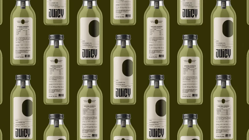
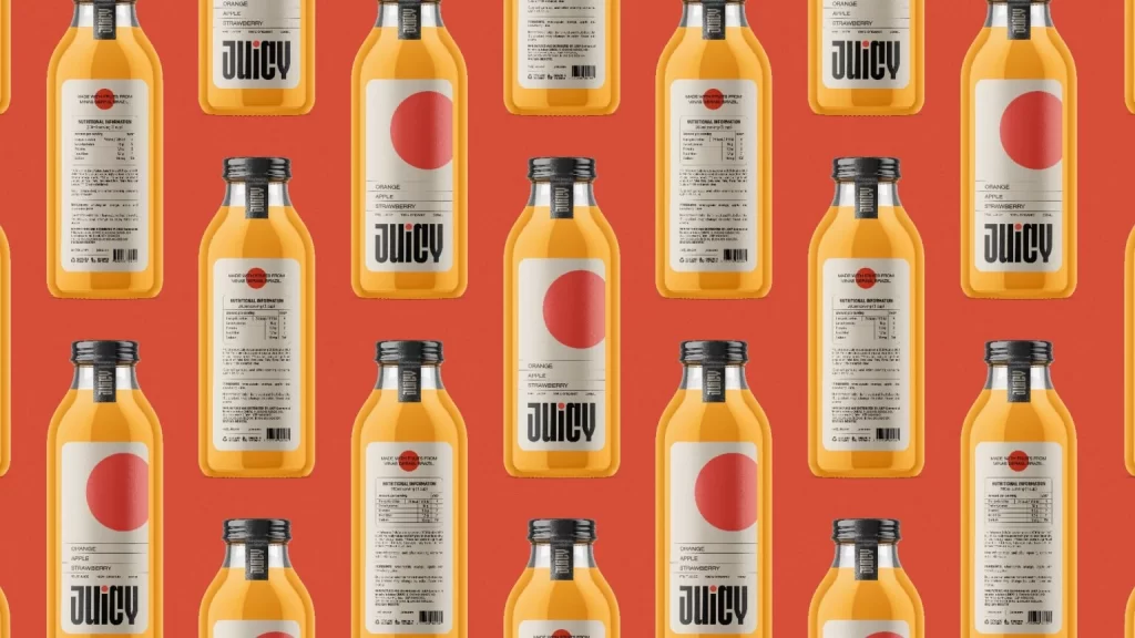
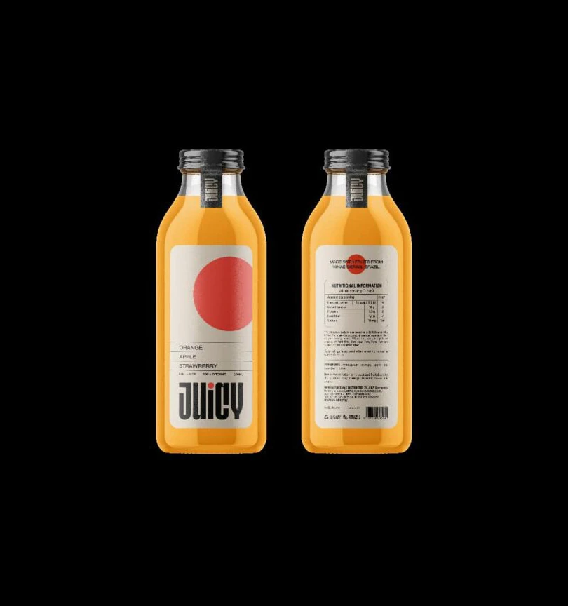
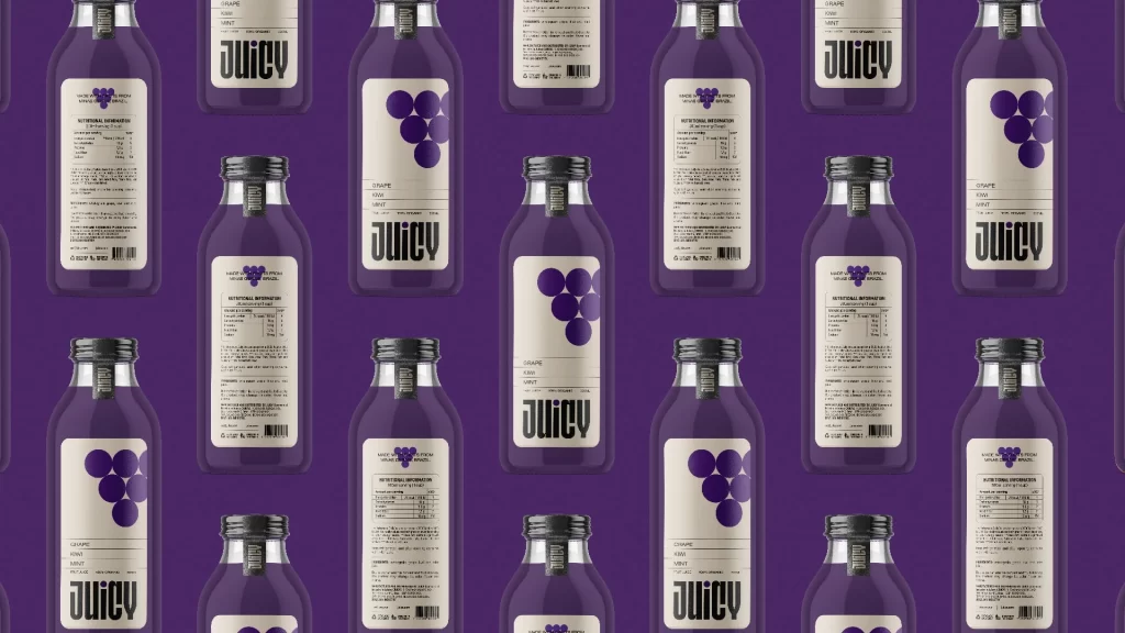
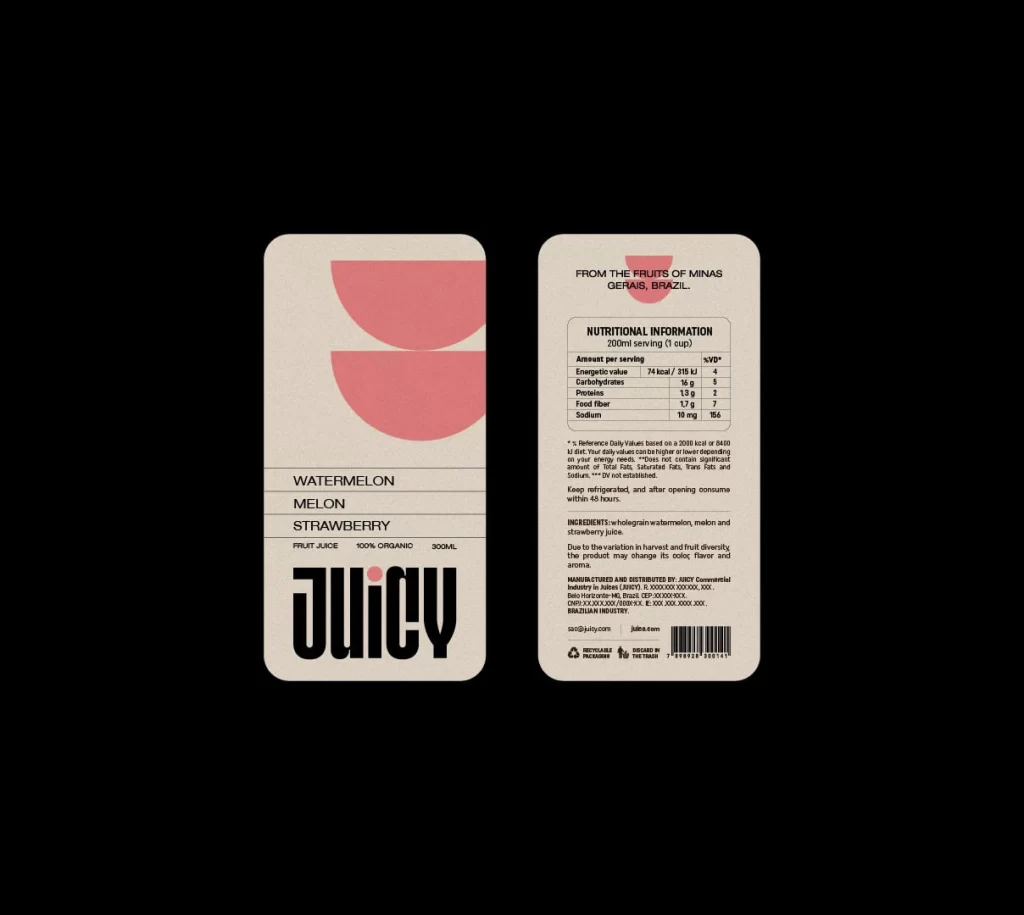
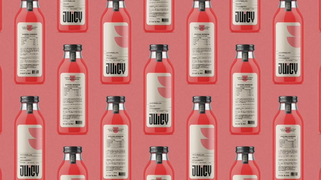
Translucent red PET bottles filled with vibrant crimson liquid repeat in staggered rows across a uniform salmon-pink backdrop. Each container features a minimalist cream-colored label displaying 'JUICY' in bold black sans-serif typography, with smaller text identifying the flavor as watermelon and strawberry. The clear material catches light through the liquid while black screw caps seal the tops of every bottle in the grid.
Visual rhythm emerges from the systematic repetition of form and color, where the alternating orientation of front-facing and rear-facing labels creates a dynamic tessellation across the frame. The contrast between the organic fluidity of the red contents and the rigid geometric precision of the label layout establishes a compelling tension between natural product and industrial packaging design. Notably, the semi-transparent quality of the bottles allows the background hue to modulate the perceived saturation of the liquid, demonstrating sophisticated color interaction within a controlled commercial aesthetic.
Brand developers studying modern beverage identity systems would examine this arrangement to understand how typographic hierarchy functions across multiple viewing angles in retail environments. Packaging engineers might reference the material interplay between glossy caps, matte label surfaces, and translucent container walls when specifying print finishes for similar product lines. Additionally, art directors planning e-commerce photography could analyze the grid-based composition to develop efficient shot lists for catalog imagery requiring consistent product presentation across variant flavors.