Big Easy Bucha Kombucha Bottle
Topics
Details
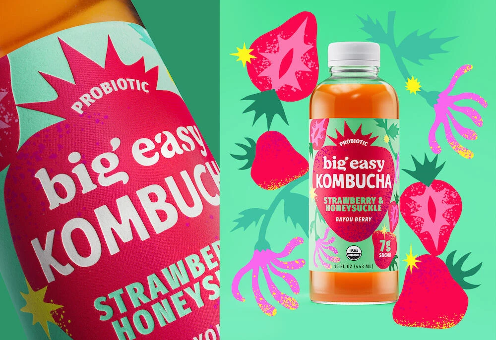
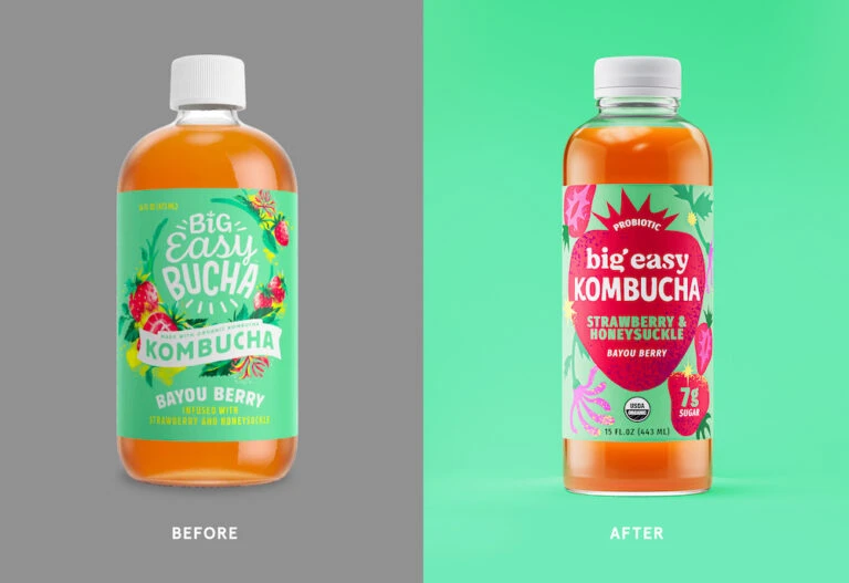
Two 15-fluid-ounce kombucha bottles stand side-by-side, each filled with amber-orange liquid and sealed with white screw caps. The left bottle displays a mint-green label with scattered strawberry and floral illustrations, while the right features a bold magenta heart-shaped graphic containing the brand name against a bright teal background. Both labels showcase rounded sans-serif typography with the product name 'Big Easy Bucha' prominently displayed above the Bayou Berry flavor designation.
Visual interest lies in the stark typographic and chromatic evolution between the two iterations of the packaging. The initial design relies on an organic, illustrative approach with softer pastels and flowing letterforms that suggest a craft-market aesthetic. Conversely, the revised version employs a bold, geometric heart shape and high-contrast magenta to create immediate shelf presence, signaling a move toward a more modern, energetic brand identity that prioritizes legibility and punchy color blocking over delicate botanical rendering.
Brand managers and packaging designers might examine this side-by-side comparison to evaluate the effectiveness of visual rebranding strategies on consumer perception. Marketing teams could utilize these distinct aesthetic directions to test which graphical language—whimsical illustration versus bold geometry—resonates more strongly with target demographics seeking probiotic beverages. Furthermore, label layout artists can study the hierarchy of information, noting how the placement of organic certifications and sugar content shifts in prominence between the two design philosophies.