Juicy Juice Packaging A
Topics
Details
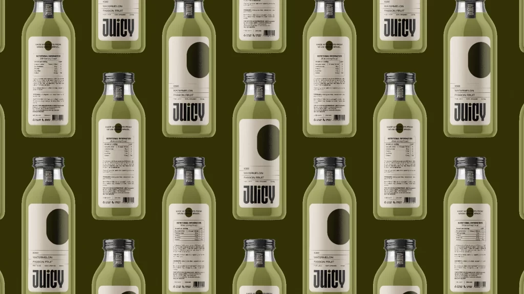
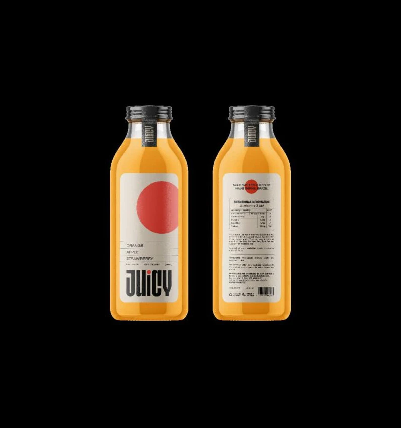
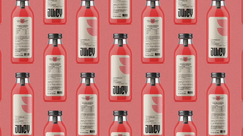
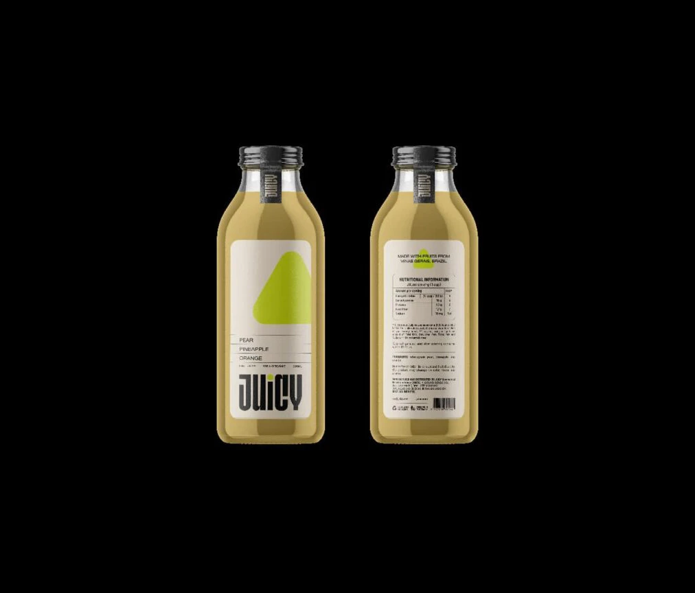
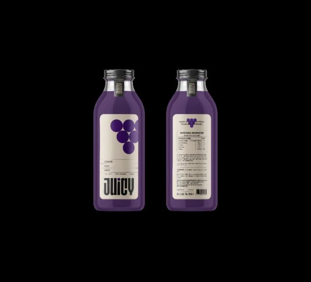
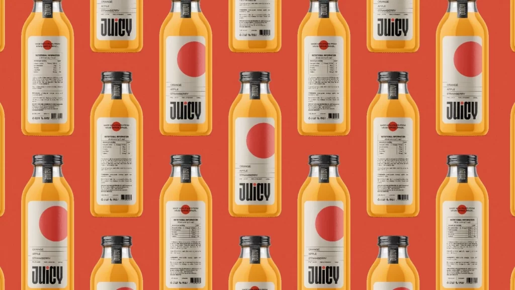
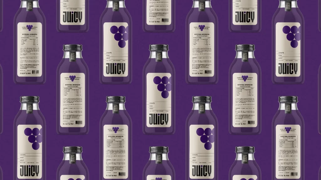
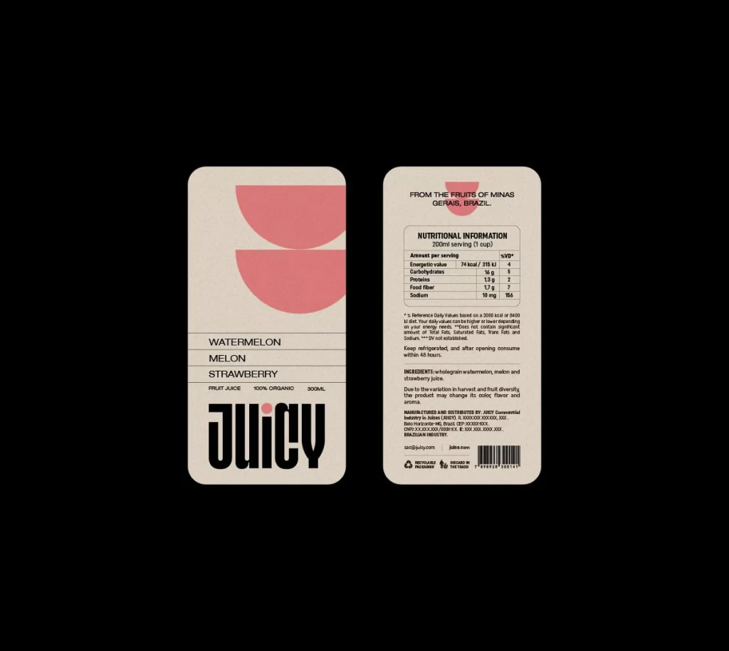
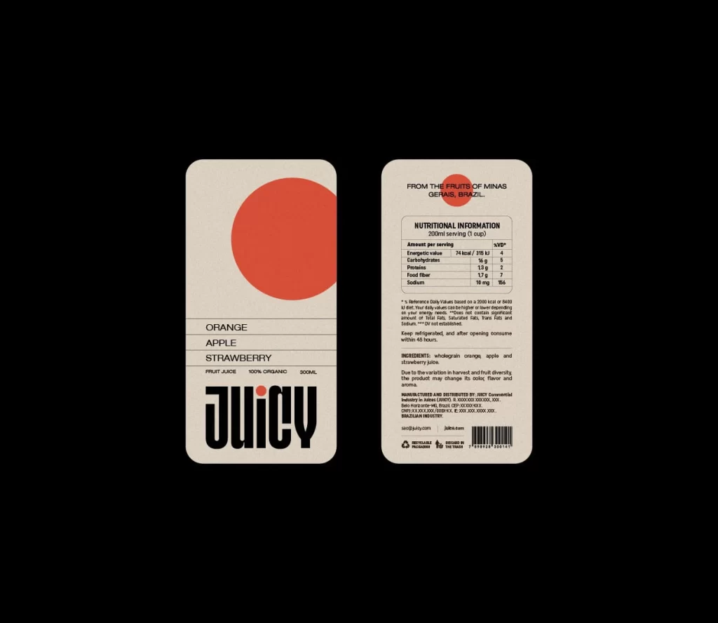
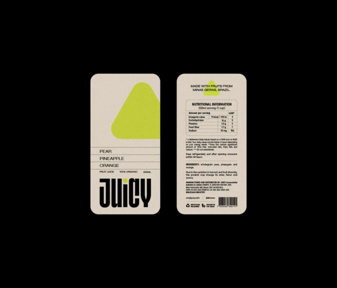
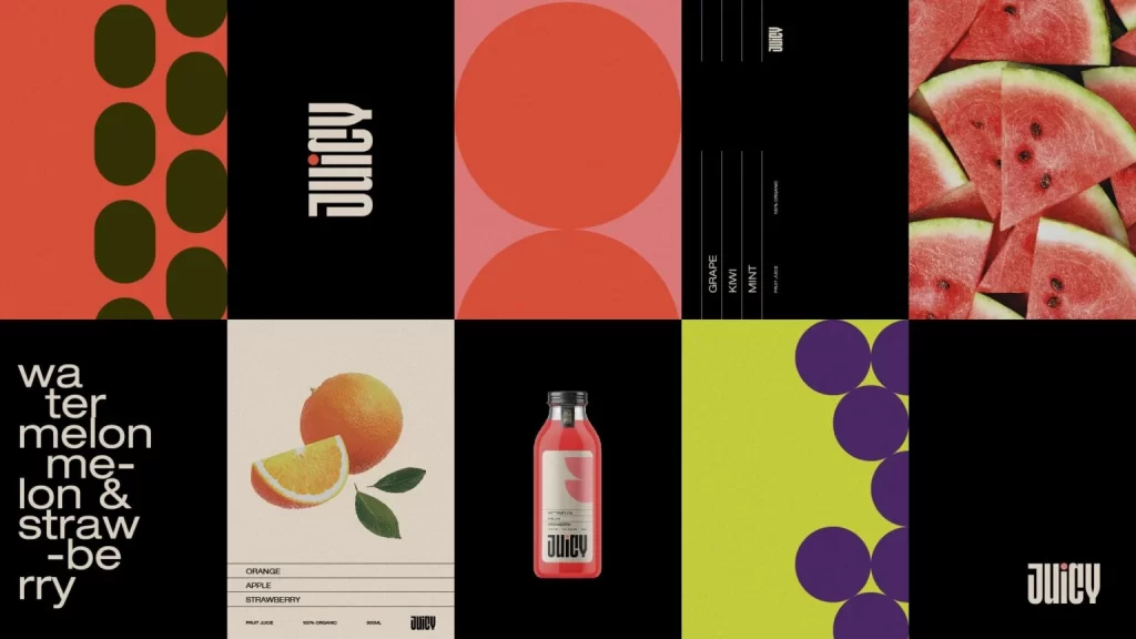
Eight rectangular panels form a grid showcasing a bold juice brand identity system, featuring high-contrast color fields of coral red, lime green, and cream alongside photographic elements including sliced watermelon and a whole orange with leaves. A pink glass bottle bearing the word 'JUICY' in heavy, condensed white typography anchors the center of the composition. The layout incorporates dark green oval patterns on red, large coral circles on pink, purple circles on lime green, and black panels displaying vertical text lists for flavors like Grape, Kiwi, and Mint.
Visual tension arises from the interplay between rigid typographic grids and organic fruit photography, creating a dynamic rhythm across the modular arrangement. The design leverages extreme scale contrast between the oversized brand name and delicate flavor listings like ‘GRAPE,’ ‘KIWI,’ and ‘MINT.’ Circular motifs repeat in varying sizes and saturations, unifying the disparate panels while the diagonal text treatment on the lower left panel breaks the orthogonal structure with kinetic energy.
Brand strategists might analyze this grid to understand how modular systems maintain cohesion across diverse product variants while allowing for individual flavor expression. Packaging designers could study the bottle’s label hierarchy to inform their own work on beverage containers requiring clear ingredient communication. Art directors developing refreshment campaigns would find the color palette and compositional balance particularly useful for mood board development or client presentations.