Title

Minute Maid 100% Orange Juice Beverage Packaging


Topics

BeverageMinute Maid

Details

Uploaded user: Leo

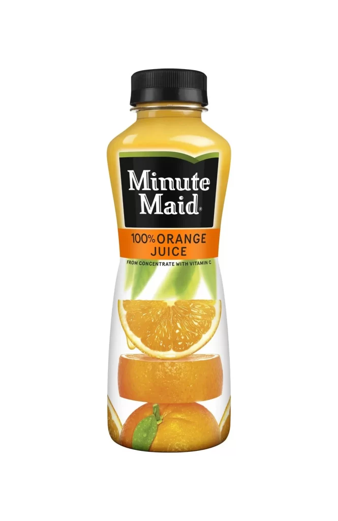
A contoured plastic bottle of Minute Maid 100% Orange Juice stands upright, featuring a black screw-on cap and a translucent yellow-orange body that reveals the liquid within. The container displays a prominent black label with white serif typography for the brand name and an orange band identifying the product as orange juice from concentrate with Vitamin C. Realistic imagery of sliced oranges and whole fruit decorates the lower portion of the bottle against a white background.
What distinguishes this packaging is its clever use of transparency and layered imagery to convey natural authenticity without relying solely on abstract color blocks. The integration of high-quality fruit photography directly onto the curved surface creates a three-dimensional effect that makes the product feel tangible and ripe. By placing the vibrant citrus imagery at the bottom third of the design, the layout draws the eye downward from the authoritative branding to the sensory promise of the flavor inside.

Product photographers might study this composition to understand how to balance typography with food styling on cylindrical surfaces. Packaging designers could reference the specific way the label elements align with the bottle’s curves to ensure their own text remains legible on similar containers. Illustrators looking to practice rendering translucent materials and organic textures will find the interplay between the plastic sheen and the printed fruit details particularly instructive for commercial work.