Minute Maid Lemonade Beverage Packaging
Topics
Details
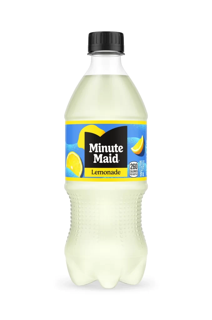
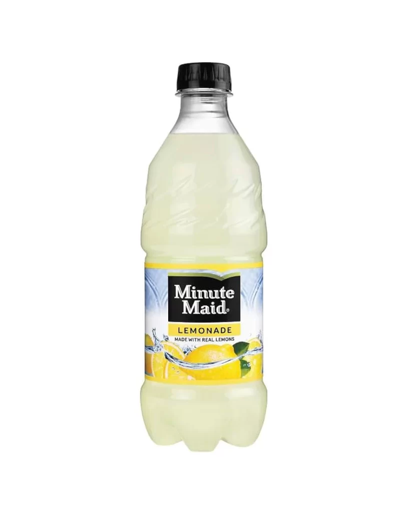
A clear, textured PET bottle stands upright with its black ribbed cap pointing directly toward the viewer, revealing the pale, translucent yellow liquid within. The label wraps around the upper third in a vibrant band of cyan and golden yellow, where bold white sans-serif lettering spells out 'Minute Maid' above the word 'Lemonade' in smaller text. The entire container sits on a white surface, with lemon slice graphics flanking the central black brand panel and a nutrition facts box visible on the right edge.
Visual hierarchy on this packaging relies heavily on the contrast between the deep black brand block and the bright, citrus-inspired background hues. Realistic lemon slice graphics flank the central logo, anchoring the flavor identity without cluttering the composition, while the yellow border creates a clean frame that separates the artwork from the bottle’s physical contours. Such deliberate color blocking ensures immediate shelf recognition even when viewed from a distance or in peripheral vision.
Product photographers might study this setup to understand how studio lighting eliminates unwanted reflections on curved plastic surfaces. Brand strategists could analyze the typographic weight and placement to gauge how established beverage companies balance regulatory information with marketing visuals. Additionally, 3D modelers often use such straightforward compositions as baselines for texturing practice, focusing on how printed materials conform to cylindrical geometries.