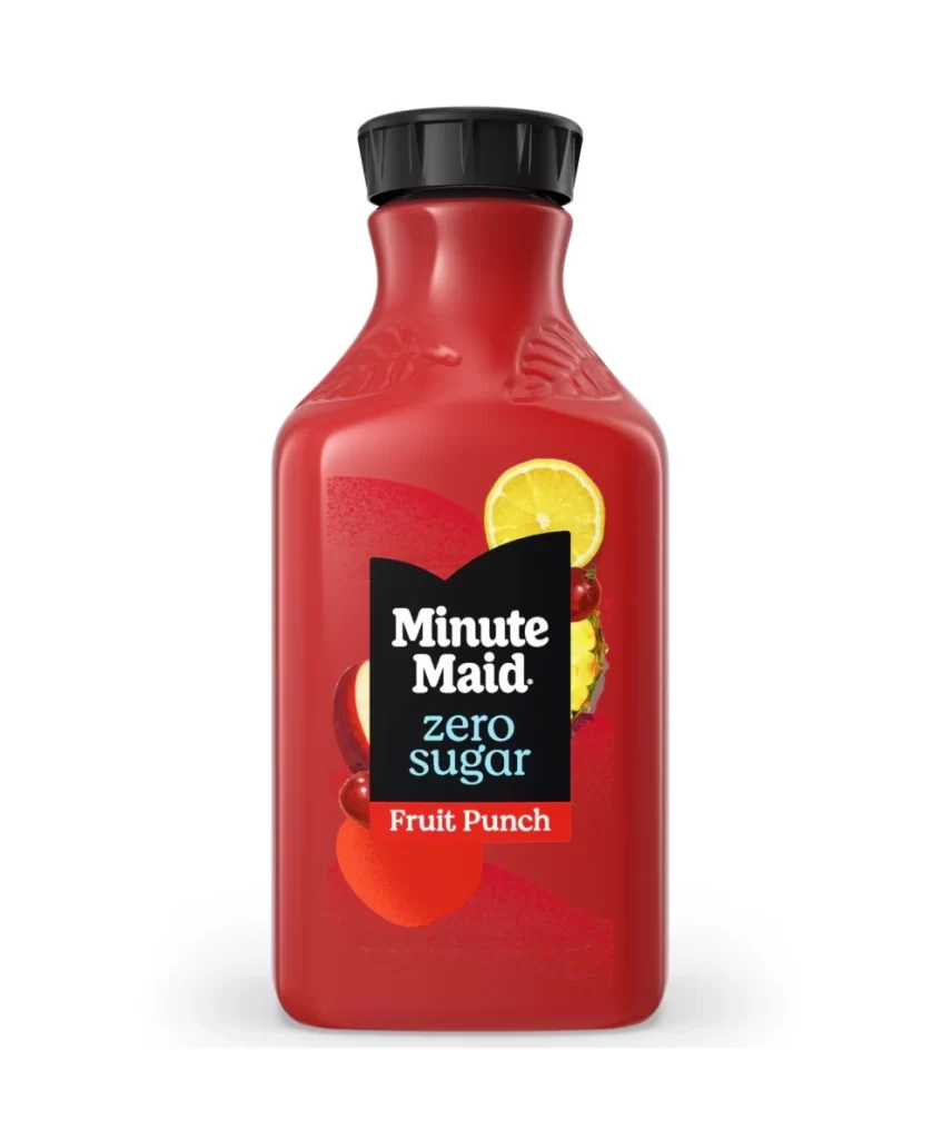
Minute Maid Zero Sugar Fruit Punch Bottle Packaging
Topics
Details
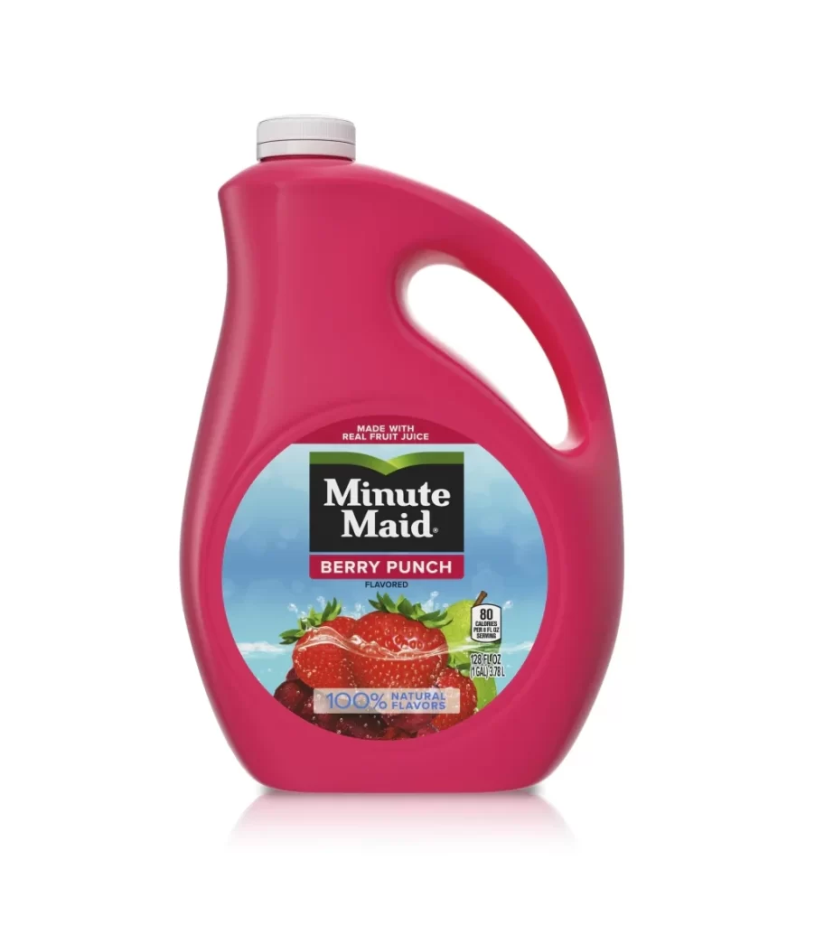
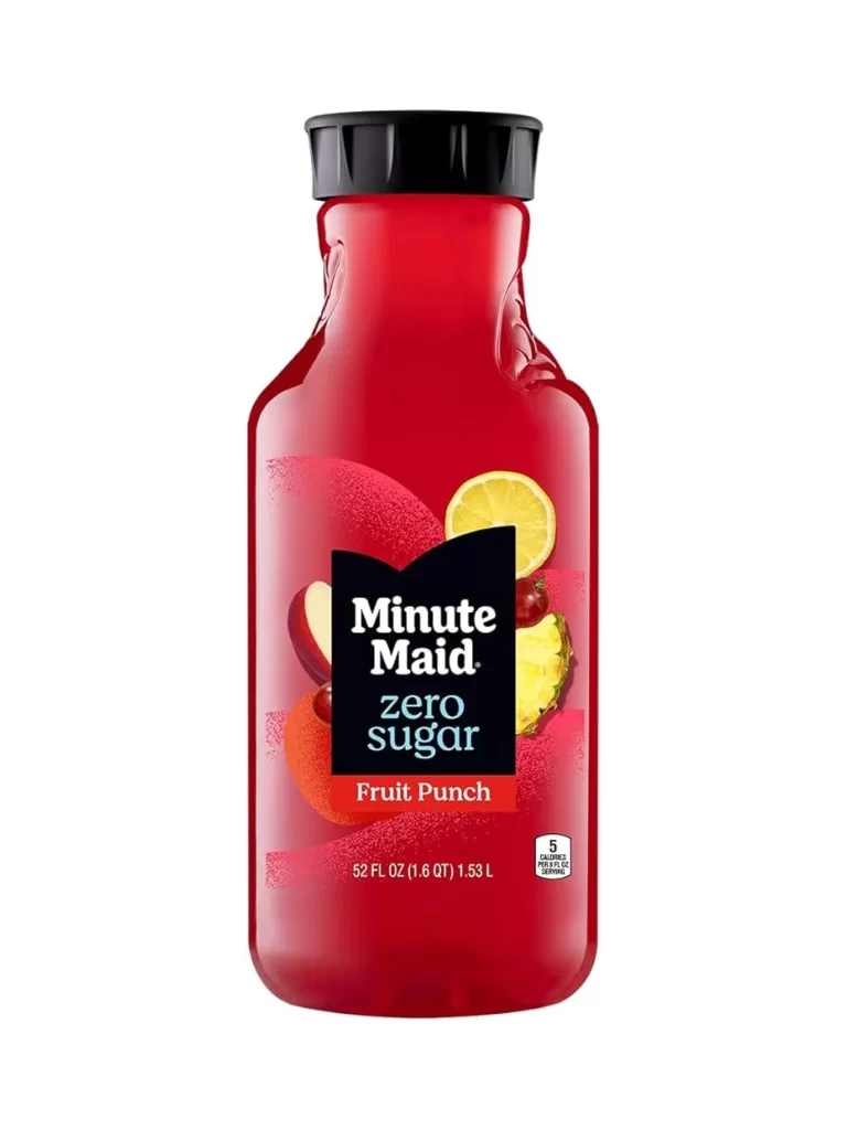
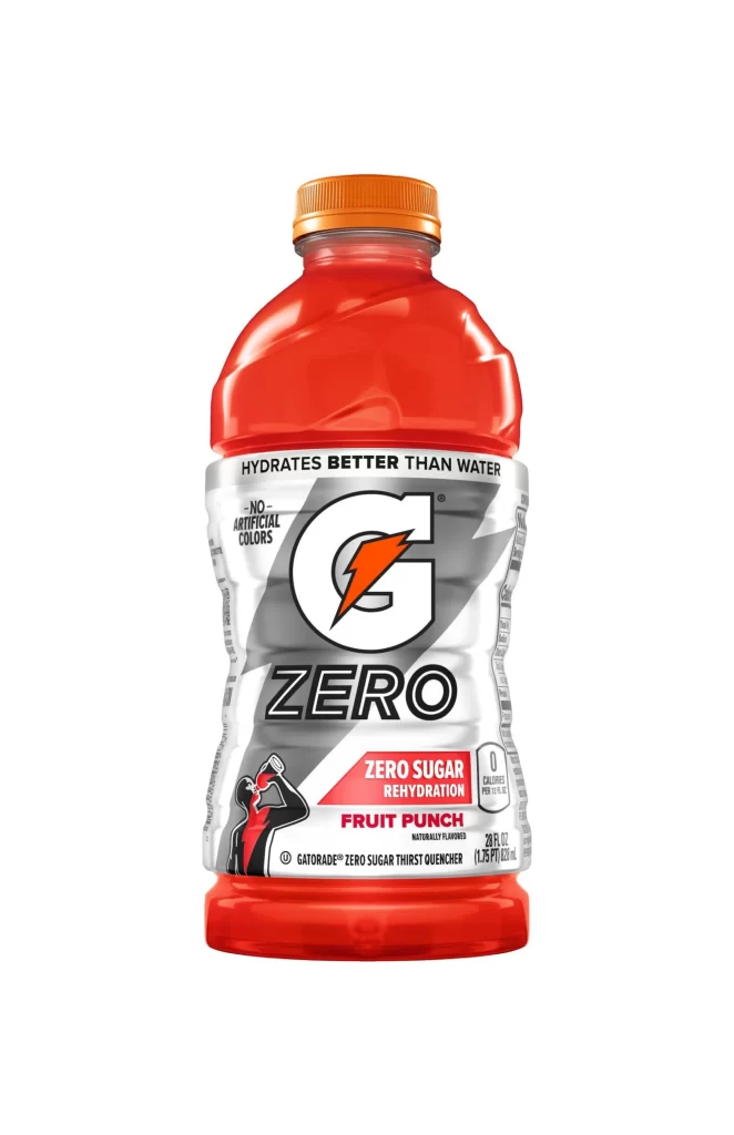
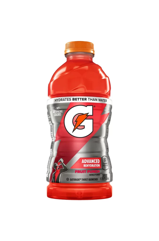
Minute Maid's zero-sugar fruit punch arrives in a crimson plastic bottle whose glossy, light-reflective surface catches a single studio highlight. A flared neck flows into a shaped label panel that carries the flavor name in white and yellow lettering. The saturated red reads as fruit-forward on the shelf while the sculpted contour signals a modern, lightweight container.
Visual hierarchy operates through aggressive color blocking, where the deep red substrate creates maximum contrast against the black label field. The typographic juxtaposition of traditional serif branding with modern, lowercase cyan lettering signals a contemporary health-conscious product line while maintaining heritage recognition. Photorealistic fruit renderings provide tactile authenticity that balances the artificiality of the zero-sugar positioning, creating a sophisticated tension between natural ingredients and manufactured beverage technology.
Brand strategists analyzing sugar-free market positioning would examine this composition for color psychology applications in reduced-calorie product lines. Packaging engineers might study the shoulder embossing techniques and label-to-surface ratios for structural reference in PET bottle design. Commercial illustrators could deconstruct the fruit rendering styles to understand how photographic elements integrate with flat graphic systems on curved substrates.