VitaminC Kiwi Sparkling Drink
DownloadTopics
Details
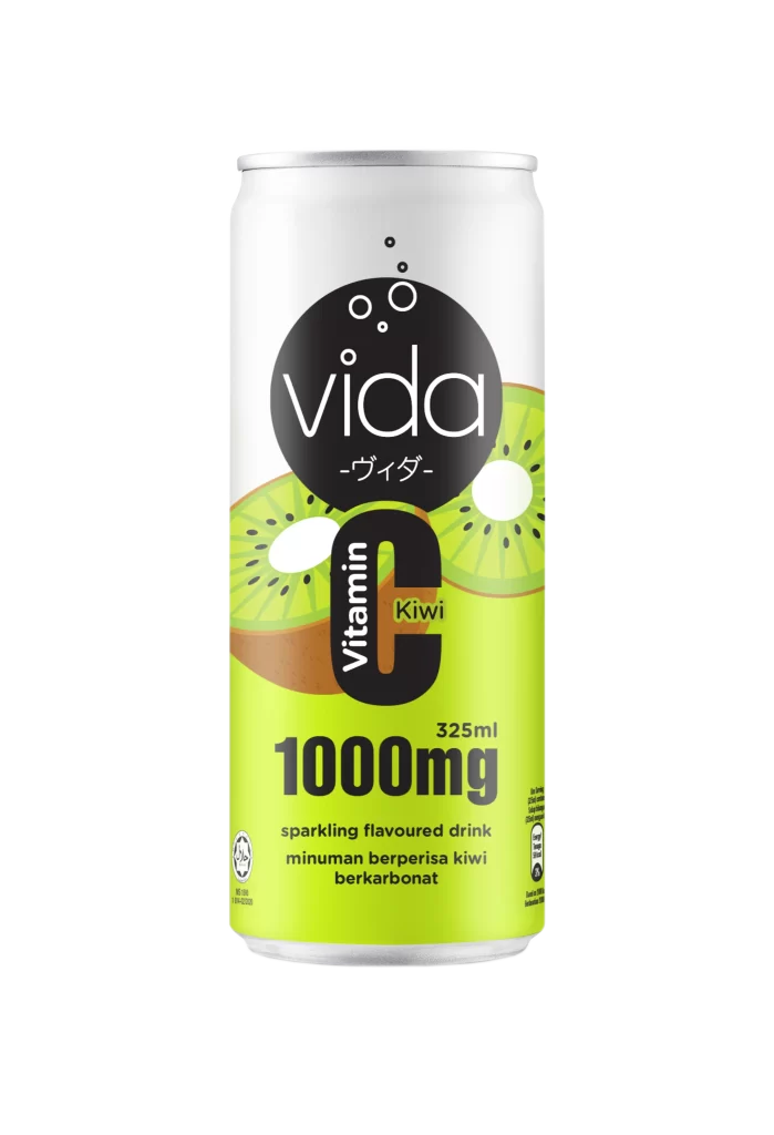
A cylindrical aluminum beverage can stands vertically, its surface divided between a white upper field and a vibrant lime-green lower zone. The brand name 'vida' appears in white lowercase sans-serif within a solid black circle, accompanied by Japanese katakana '-ヴィダ-' and three ascending bubble graphics. Below this, a massive black 'C' dominates the composition, containing the word 'Vitamin' in vertical white text and 'Kiwi' in smaller green lettering, while '1000mg' and '325ml' anchor the bottom section alongside bilingual product descriptions.
Graphic hierarchy operates through aggressive scale contrast, particularly the oversized vitamin identifier that doubles as a flavor container. The sliced kiwi illustrations introduce organic texture against the geometric type system, creating a visual tension between photographic realism and flat vector elements. Designers studying beverage packaging can examine how the black circular logo anchors the white space while the green base provides immediate flavor recognition. The complete high-fidelity asset is accessible at no cost for detailed inspection of typography and color separation.
Packaging engineers and brand identity specialists might analyze the typographic weight distribution across the curved surface to understand legibility at retail distances. Color theorists could reference the specific lime-green value against the neutral aluminum top when developing complementary palettes for health-oriented product lines. Marketing teams reviewing competitive sparkling drink positioning would benefit from deconstructing how nutritional claims integrate with playful illustration styles without compromising premium presentation.