RIO Strawberry Beverage Alcohol Drink
DownloadTopics
Details
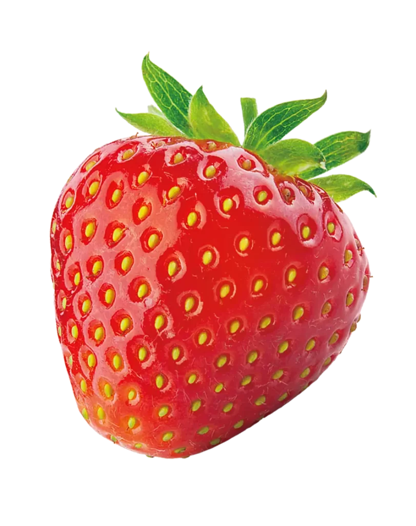
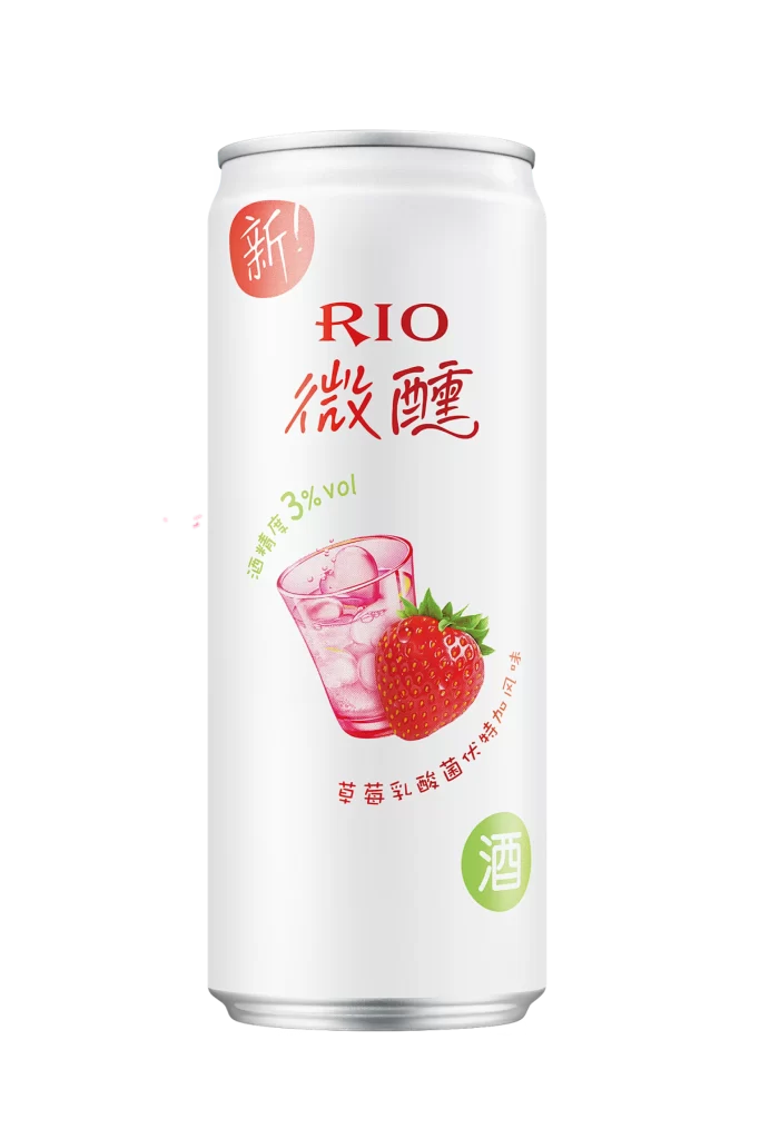
A cylindrical aluminum can with a silver metallic rim dominates the frame, its surface wrapped in a clean white label that serves as a canvas for vibrant red and green typography. The brand name 'RIO' appears in bold red serif lettering above the stylized Chinese characters '微醺', while a circular red badge containing the character '新' anchors the upper left corner. Centered on the lower half, an illustration depicts a translucent glass filled with ice cubes beside a detailed strawberry, both rendered in soft pink and red gradients that suggest freshness and chill.
Visual hierarchy is established through strategic color placement, where the 3% alcohol volume notation in lime green creates a secondary focal point that balances the dominant red palette. The curved arrangement of smaller Chinese text beneath the fruit illustration guides the eye in an organic flow, preventing the composition from feeling too rigid despite the container's geometric form. Designers seeking to study contemporary Asian beverage packaging aesthetics will find the full-resolution asset useful for examining how hand-drawn elements integrate with digital typography.
Product photographers might reference this shot to understand standard e-commerce lighting setups for reflective metallic surfaces and matte printed labels. Marketing teams analyzing flavor-specific visual language could utilize this example when developing campaigns for fruit-infused alcoholic beverages targeting younger demographics. Packaging engineers reviewing print registration accuracy across curved substrates would also benefit from studying the alignment of text and graphics on this particular can format.