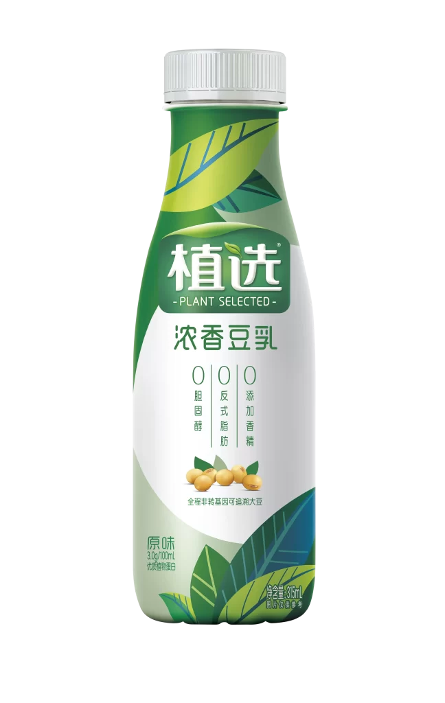
Plant Selected Soy Milk Beverage Zero Sugar Zero Fat
DownloadTopics
Details
A contoured plastic bottle of Plant Selected soy milk stands upright, capped with a ribbed white screw-top that contrasts against the deep green and lime leaf graphics wrapping the upper shoulders. The central white label panel features bold Chinese characters for the brand name above the English translation "PLANT SELECTED" and the product descriptor "浓香豆乳," while three vertical columns emphasize zero cholesterol, zero trans fat, and zero added flavoring. Golden soybean illustrations anchor the lower composition alongside text noting non-GMO traceable sourcing, with nutritional details and a 315ml volume indication printed in smaller type near the base.
Visual hierarchy emerges through the strategic layering of organic leaf motifs in varying green tones, which frame the clean white information zone without overwhelming the legible typography. The tripartite "zero" claims command immediate attention through their oversized circular numerals, establishing a health-conscious identity that distinguishes this variant from conventional dairy alternatives. Designers studying beverage packaging will appreciate how the curved bottle silhouette interacts with the diagonal leaf patterns to create dynamic movement across a relatively static product shot.
Brand strategists developing plant-based product lines could analyze this layout to understand how minimalist color palettes communicate natural ingredient sourcing to health-aware consumers. Packaging engineers might reference the label proportions when balancing regulatory text requirements with aesthetic whitespace on similarly shaped containers. Anyone needing to examine the typographic weight distribution or color values can access the full-resolution file at no cost directly from the resource library.