coffee Bean Bag
Topics
Details
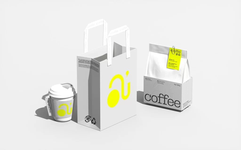
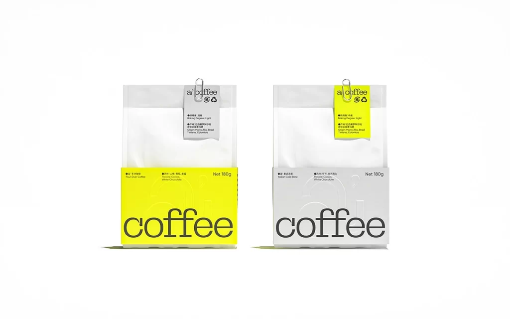
Two rectangular coffee pouches stand side-by-side against a seamless white void, each featuring a translucent upper body and a solid lower panel. The left specimen displays a vibrant lemon-yellow base with charcoal typography spelling 'coffee' in a bold, geometric sans-serif, while its counterpart inverts this scheme with a cool grey foundation and identical lettering. Suspended from silver metal clips, small paper tags bear the brand name 'ai coffee' alongside recycling symbols and fine-print specifications regarding roast levels and origin details.
Visual tension emerges from the deliberate chromatic inversion between the two variants, creating a modular system that communicates product differentiation through minimal graphic means. The oversized lowercase wordmark dominates the lower third of each package, establishing a typographic hierarchy that balances industrial functionality with contemporary aesthetic sensibilities. Such restrained color blocking—limited to yellow, grey, and black—demonstrates how limited palettes can achieve maximum brand recognition without decorative clutter.
Packaging designers studying sustainable materials would examine the matte finish and structural engineering of these stand-up pouches for cold-brew or specialty coffee applications. Brand identity consultants might reference this layout when developing visual systems requiring clear SKU differentiation across flavor profiles or roast intensities. Retail merchandisers could analyze the shelf-presence potential of such high-contrast color coding when planning product line extensions within minimalist store environments.