Nagatanien Seaweed Salt Furikake Rice Seasoning Packaging
Topics
Details
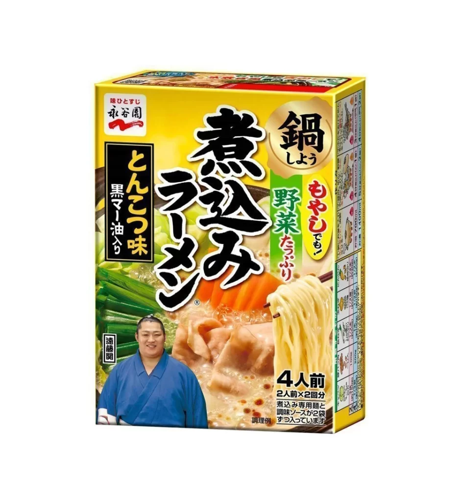
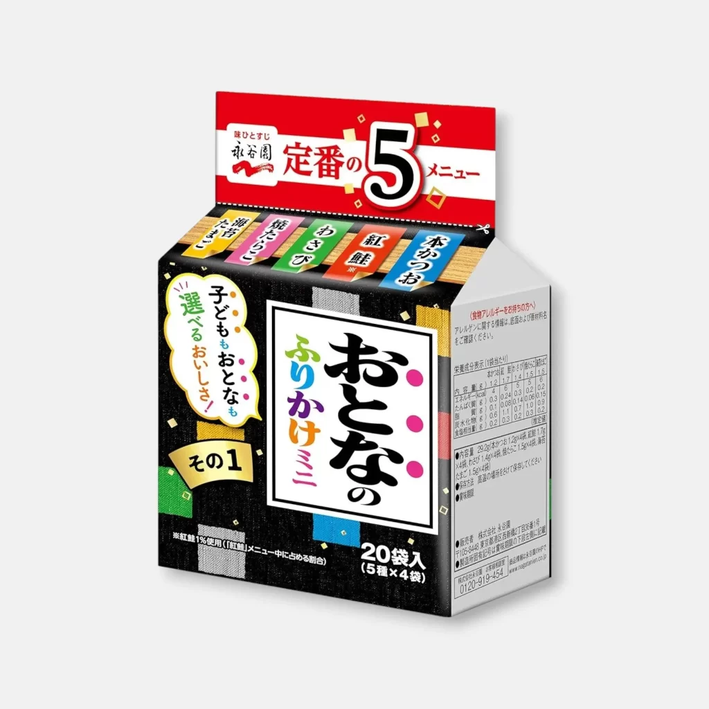
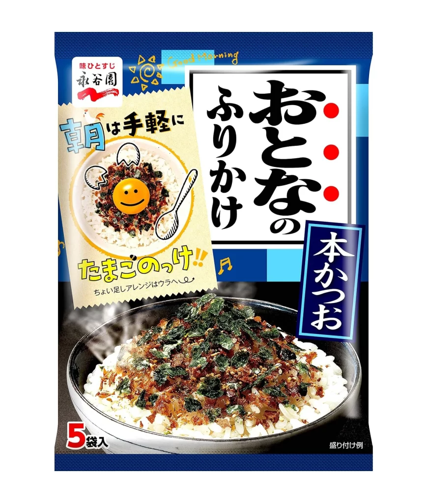
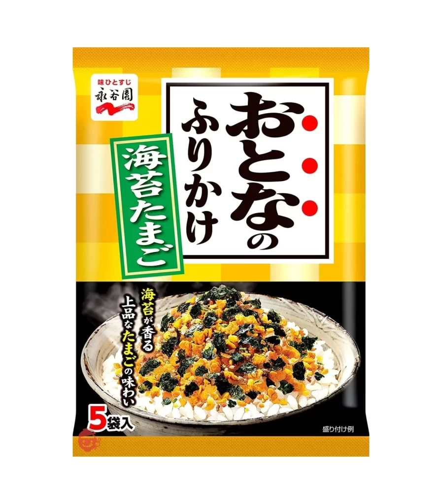
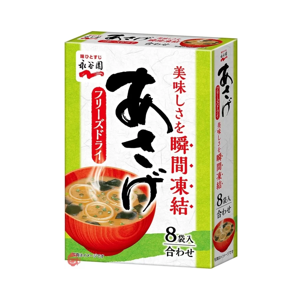
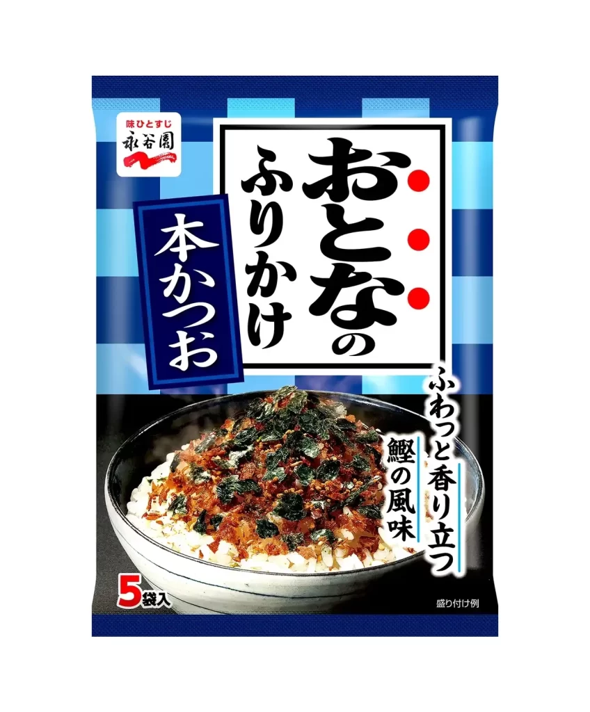
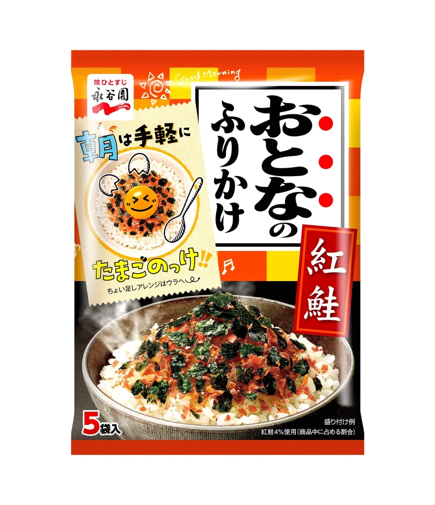
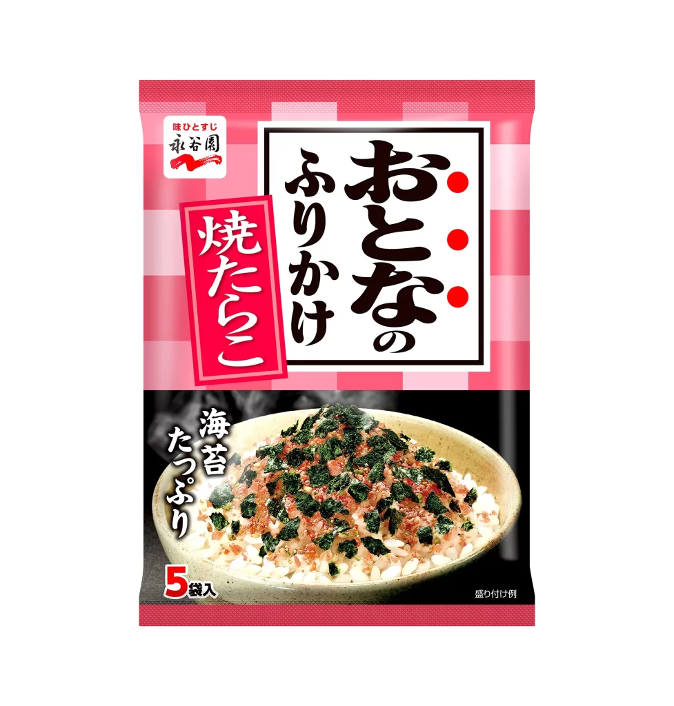
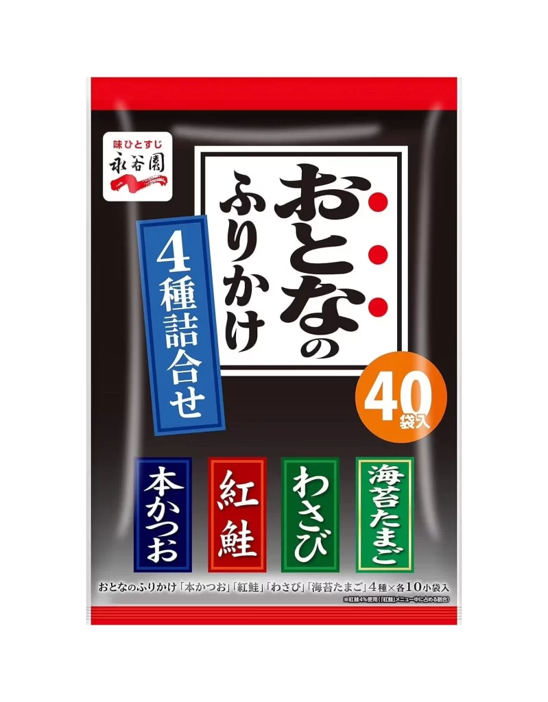
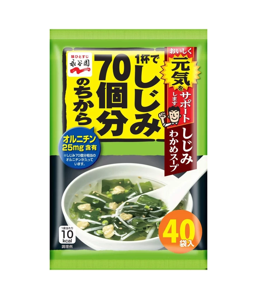
A vibrant green border frames the upper and lower edges of this rectangular package, creating a bold frame for the central content. Dominating the center is a large yellow rectangle containing thick, black Japanese characters that announce '70 portions per cup,' positioned directly above the brand name in a white box. Below this text block, a high-contrast photograph displays a white ceramic bowl filled with clear seaweed soup, complete with a white ladle resting inside, while a blue circular badge on the left highlights nutritional information about ornithine content.

Visual hierarchy is established through a strategic mix of saturated primary colors and varied typographic weights, drawing immediate attention to the quantity claim. The right side features a vertical red banner with a cartoon mascot pointing upward, adding a playful human element that contrasts with the utilitarian product photography. An orange circle in the bottom corner provides a final punch of color to indicate the forty-packet count, ensuring the value proposition is visible from any viewing angle.
Packaging designers studying Japanese consumer goods will find this layout useful for analyzing how to balance dense text requirements with appetizing food imagery. Illustrators looking to render contemporary snack packaging can reference the specific way flat color fields interact with photographic elements. Brand strategists might examine how the mascot character is integrated into the overall color scheme to reinforce brand recognition without overwhelming the product information.