Nagatanien Chicken Salt Chanko Ramen Cup Packaging
Topics
Details
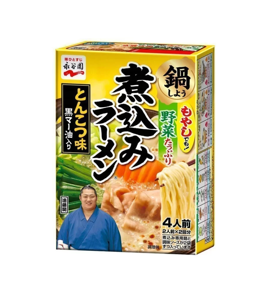
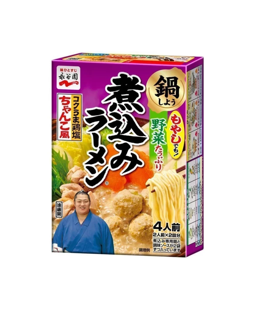
A vibrant magenta cardboard box dominates the frame, featuring the bold, black calligraphy of 'Nabe Ramen' slanted dynamically across its center. To the right, a circular gold emblem highlights the 'Nabe' (hot pot) concept, while vertical banners in red and green advertise the 'Chanko' flavor and vegetable inclusions. The lower portion displays a steaming bowl of ramen with thick noodles, meatballs, and sliced carrots, alongside a smiling man in a blue kimono positioned at the bottom left corner.
Visual hierarchy is established through the striking contrast between the saturated purple background and the traditional Japanese typography, which lends an authentic culinary authority to the product. The inclusion of a real person—likely a sumo wrestler given the chanko nabe association—adds a layer of cultural storytelling that distinguishes it from generic instant noodle packaging. Furthermore, the detailed food photography serves as a sensory promise, making the texture of the noodles and the richness of the broth immediately appetizing to the viewer.


Brand strategists analyzing the Japanese convenience market would find this layout useful for studying how traditional aesthetics are adapted for mass-market shelf appeal. Illustrators looking to practice rendering complex food scenes or fabric folds on clothing could utilize the specific lighting and textural details present here. Additionally, packaging engineers might examine the spatial arrangement of nutritional information and serving size indicators to understand effective information density on limited retail surfaces.