Title

Nagatanien Chazuke Tea Rice Snack Cup Packaging


Topics

NagatanienSnack

Details

Uploaded user: Leo

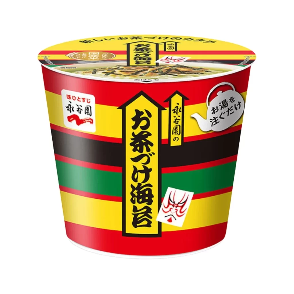
Vibrant horizontal bands of red, yellow, black, and green wrap around this cylindrical instant food container, creating a bold, almost circus-like aesthetic. A large yellow vertical banner dominates the center, featuring the bold black Japanese characters for 'Chazuke Kaiumi' (Tea Rice Sea Flavor), while the iconic red Nagatanien logo sits to the left. The lid displays a realistic photographic preview of the finished dish—rice topped with seaweed and seafood in a light broth—set against a clean white background that makes the product pop from a straight-on camera angle.

What sets this specific packaging apart is its striking use of high-contrast primary colors combined with traditional Japanese typographic elements and theatrical motifs. The inclusion of a small Kabuki-style mask sticker adds a cultural flair that distinguishes it from typical minimalist snack designs, while the teapot icon clearly communicates the preparation method. This particular version emphasizes the 'pour hot water' convenience factor through clever iconography that bridges modern instant food needs with heritage branding.

Product photographers might study the lighting setup used to eliminate glare on the glossy cup surface while maintaining color vibrancy. Brand strategists could analyze how the layered stripe pattern creates shelf presence without cluttering the essential nutritional information. Packaging engineers may reference the structural layout to understand how to balance bold graphic elements with mandatory regulatory text and instructional graphics on curved surfaces.