Nagatanien Crab Flavor Fried Rice Seasoning Packaging
Topics
Details
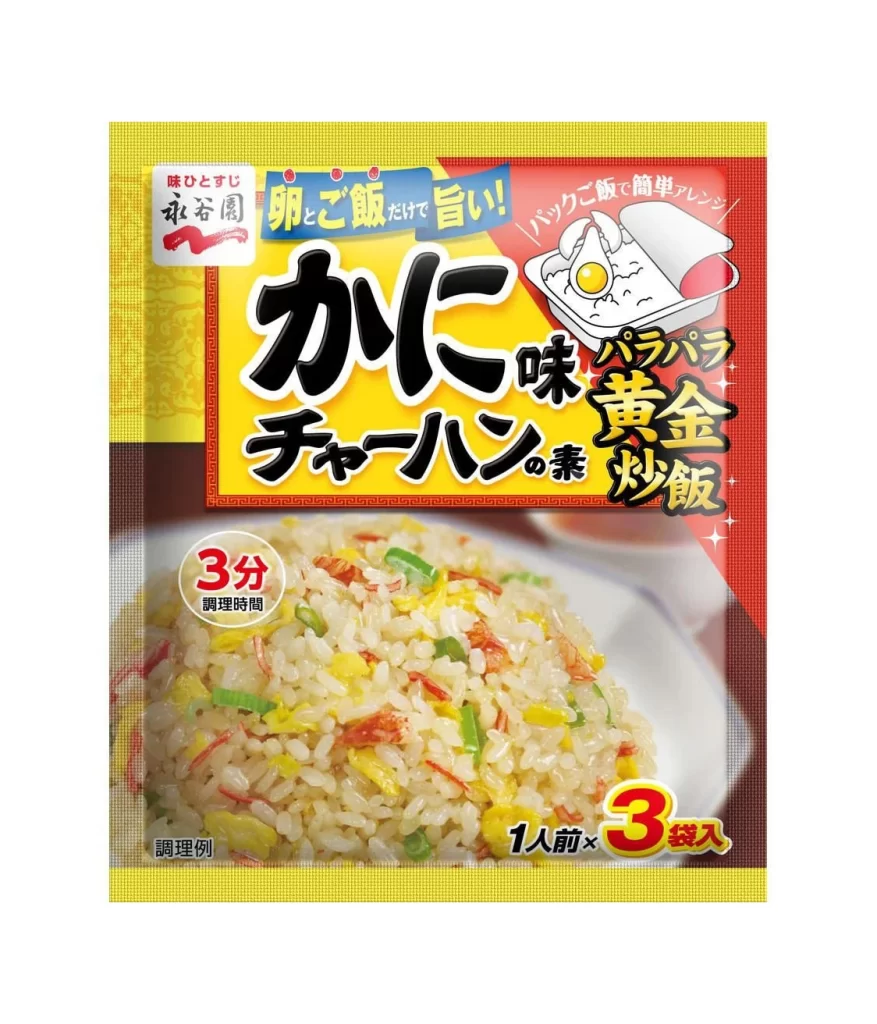
A vibrant yellow border frames the central composition, which is dominated by a bold red rectangular field containing large black Japanese characters for 'Crab Flavor.' To the right of the main title, a white illustration depicts a bento box with a fried egg, while the lower half features a photographic close-up of golden fried rice mixed with green peppers and red crab flakes. The packaging includes specific instructional text such as a red circle indicating a 3-minute cooking time and a yellow badge in the bottom right corner noting that the package contains three single-serving portions.

Visual hierarchy is established through aggressive color blocking, where the saturated primary colors compete for attention to signal appetite appeal and convenience. The juxtaposition of flat vector graphics against the high-resolution food photography creates a layered depth that guides the eye from the brand promise at the top to the actual product result at the bottom. Typography varies significantly in weight and style, utilizing thick brush-stroke fonts for the flavor profile alongside clean sans-serif text for technical details like serving size and preparation duration.
Food illustrators studying Japanese market trends would find this layout useful for understanding how to balance nutritional information with mouth-watering visuals within a confined space. Brand strategists could analyze the specific placement of the 'Golden Fried Rice' sub-branding to see how parent companies differentiate product lines using consistent iconography. Packaging engineers might reference the spatial distribution of elements to determine how to effectively communicate cooking instructions without obscuring the main appetizing image.