Daisho Snack Packaging
Topics
Details
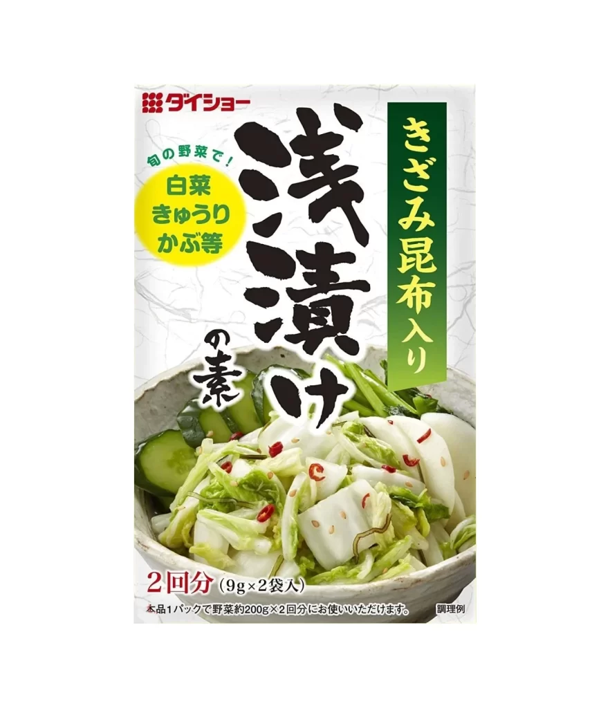
A rectangular Daisho package features bold, black calligraphic characters for 'Asazuke' (light pickles) sweeping diagonally across the center, with a smaller character for 'element' or 'base' nestled beneath. A vertical green banner on the right displays white text reading 'Kizami Konbu Iri' (with shredded kelp), while a yellow oval to the left lists compatible vegetables like cabbage, cucumber, and turnip in green script. The lower portion reveals a ceramic bowl filled with crisp sliced cucumbers and napa cabbage flecked with red chili peppers, all set against a subtly textured white background.
Visual interest arises from the deliberate contrast between traditional brushwork aesthetics and modern commercial graphic design elements. The large-scale kanji provides an artisanal, handcrafted feel that is immediately juxtaposed against the clean, geometric precision of the red corporate logo in the upper left corner and the utilitarian red sans-serif text detailing the quantity at the bottom. Furthermore, the photographic element of the finished dish—featuring crisp white cabbage slices, green cucumber rounds, and specks of red chili—adds a layer of tactile realism that breaks up the flat graphic fields.
Brand strategists analyzing Japanese market packaging would utilize this example to understand how to balance heritage cues with contemporary shelf appeal. Typography students could deconstruct the interplay between the fluid motion of the main headline and the rigid structure of the informational sidebars. Additionally, food photographers might reference the specific styling choices, such as the shallow depth of field on the ceramic bowl and the strategic placement of garnishes, to inform their own product visualization work.