Daisho Grilled Ago Dashi Soup Base Packaging
Topics
Details
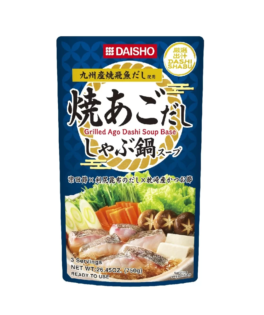
Deep navy blue dominates the vertical pouch, overlaid with a subtle geometric pattern of interlocking circles that creates a textured, traditional Japanese aesthetic. A bold red rectangle anchors the top center, housing the white 'DAISHO' brand name, while a golden circular seal to the right announces the product's suitability for dashi shabu. The central visual field features large, expressive black calligraphy for 'Grilled Ago Dashi Soup Base,' set against a stylized rope motif in gold and cream, with a photographic inset at the bottom displaying sliced fish, carrots, mushrooms, and tofu arranged for a hot pot meal.
Visual hierarchy is established through a sophisticated interplay of typographic weights, where the heavy brushstroke characters command immediate attention against the disciplined sans-serif English translation. The color palette strategically employs high-contrast red and gold accents against the dark background to evoke premium quality and culinary authenticity. Compositionally, the layout balances dense textual information with generous negative space, ensuring legibility while maintaining an elegant, uncluttered appearance typical of high-end Asian grocery packaging.
Brand strategists analyzing East Asian market positioning would examine this artifact to understand how traditional motifs are modernized for contemporary retail shelves. Packaging engineers could study the structural integration of photography with graphic elements to optimize consumer appeal in frozen food aisles. Cultural historians might reference this specific design language to track the evolution of dashi product branding from regional specialty to global commodity.