Daisho Yuzu Flavor Dressing Packaging
Topics
Details
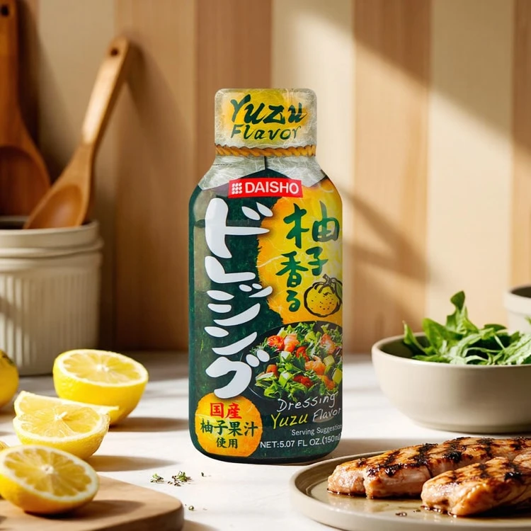
Centered within a sun-drenched kitchen setting, a dark green plastic bottle of Daisho Yuzu Flavor Dressing stands as the primary focal point. The packaging features bold white Japanese katakana characters for 'dressing' running vertically down the left side, contrasted against a vibrant yellow graphic panel on the right that displays the product name and an illustration of the citrus fruit. Natural light streams in from the right, casting soft shadows across a white countertop where sliced lemons rest on a wooden board to the left and a plate of grilled chicken sits to the right, while fresh greens fill a ceramic bowl in the background.
Visual interest is generated through the striking juxtaposition of the bottle's deep forest green hue against the acidic brightness of the lemon-yellow accents and the fresh produce surrounding it. The typography creates a dynamic vertical rhythm that guides the eye from the red Daisho logo at the top down through the flavor description, while the inclusion of a small salad image on the label provides immediate context for the liquid's intended use. This specific composition balances commercial clarity with lifestyle aesthetics, making the condiment appear both authentic and appetizing within a domestic culinary environment.
Food photographers and culinary stylists might study this arrangement to understand how to effectively position bottled goods alongside prepared ingredients to suggest recipe usage. Brand designers working on Asian-inspired food products could analyze the color palette and typographic hierarchy to inform their own label layouts for citrus-based condiments. Additionally, art directors planning e-commerce content for grocery items could utilize this setup as a template for showcasing dressings in a context that implies freshness and quality without requiring complex prop arrangements.