IPPUDO Plant-Based Paitan Style Soup Base Packaging
Topics
Details
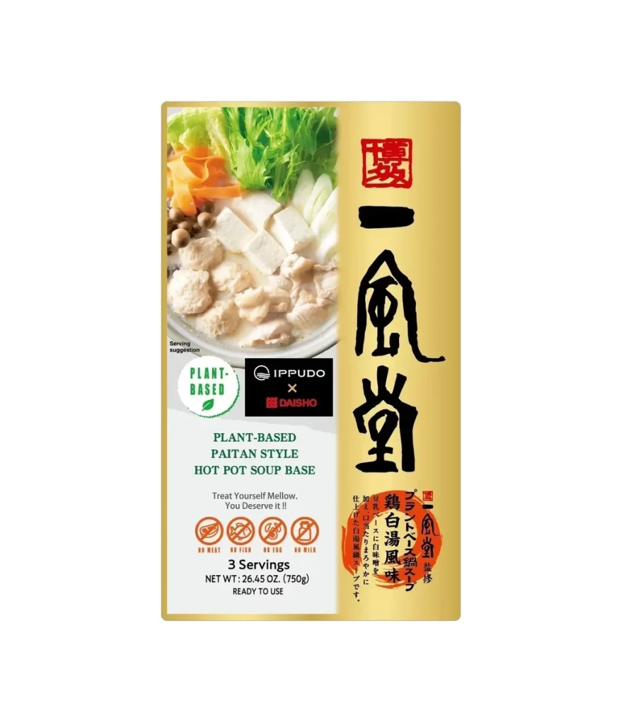
A warm, metallic gold background dominates the right side of this rectangular package, featuring bold black calligraphy and a red seal at the top. To the left, a photographic panel displays fresh ingredients like leafy greens, sliced carrots, tofu cubes, and what appears to be plant-based protein in a creamy broth. The lower section combines white and dark green text blocks with circular icons indicating dietary restrictions, all set against a clean studio backdrop with even, shadowless lighting.
Visual contrast drives the aesthetic appeal here, balancing traditional Japanese typography against modern, clean sans-serif English labeling. The collaboration branding between IPPUDO and DAISHO sits centrally in a stark black box, creating a focal point that bridges the cultural design elements. Notably, the 'PLANT-BASED' badge uses a soft green leaf motif that harmonizes with the food photography while clearly signaling the product's unique market position.
Packaging designers studying cross-cultural food branding would find this layout particularly useful for understanding how to integrate multiple languages without visual clutter. Brand strategists could analyze the color psychology of gold paired with dietary icons to appeal to health-conscious luxury consumers. Anyone developing premium convenience food packaging might reference the way photography and typography share space to convey both authenticity and modernity.