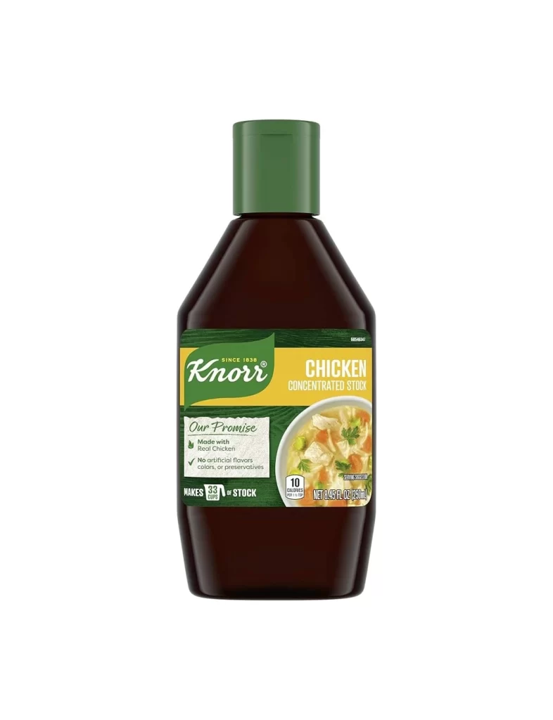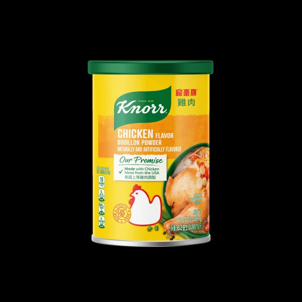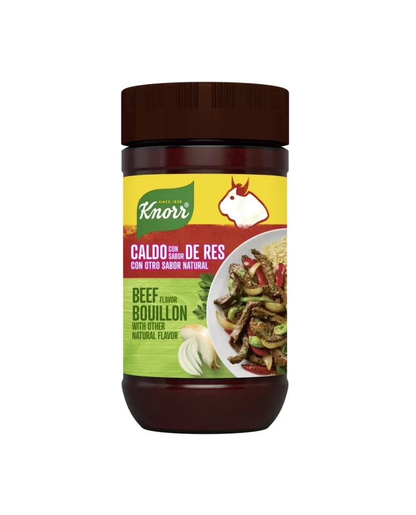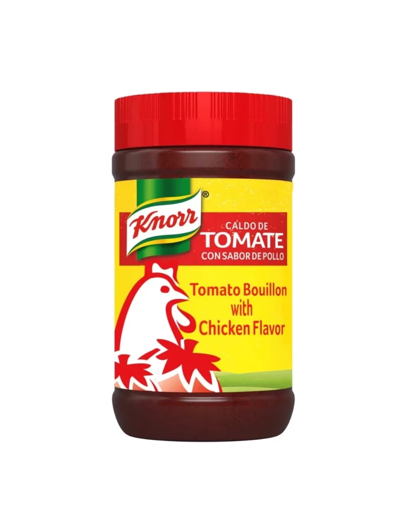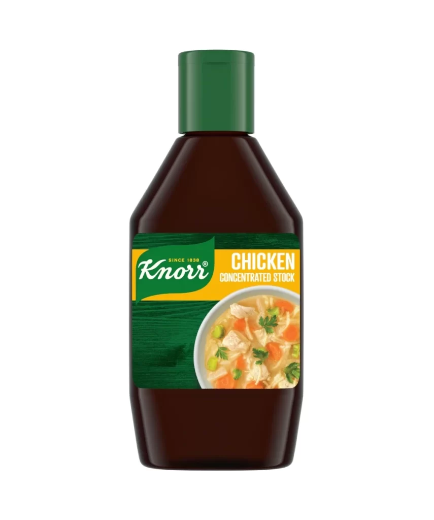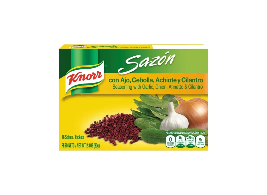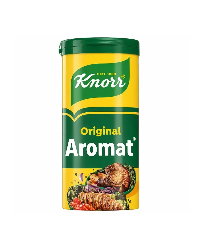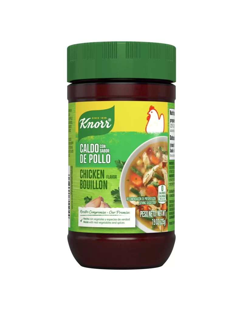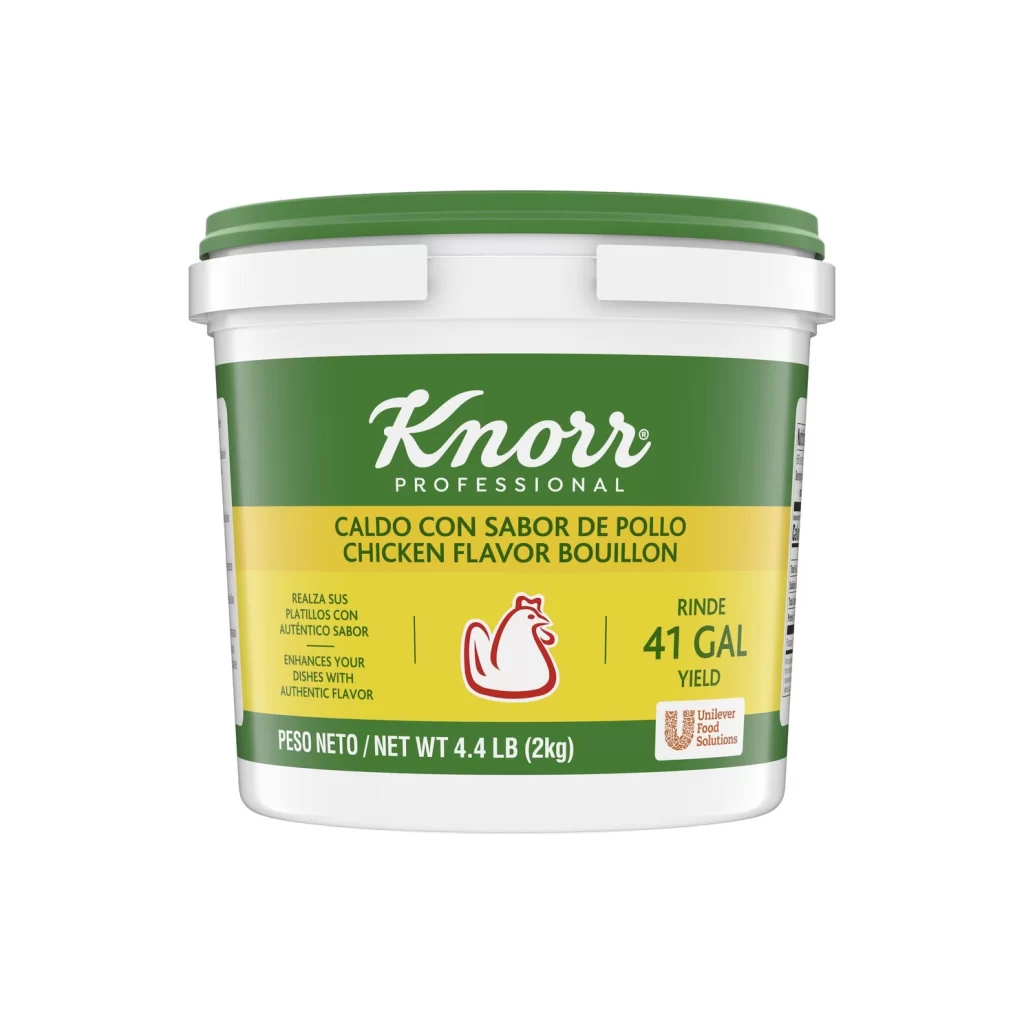
Knorr Professional Chicken Flavor Bouillon Jar Packaging
Topics
Details
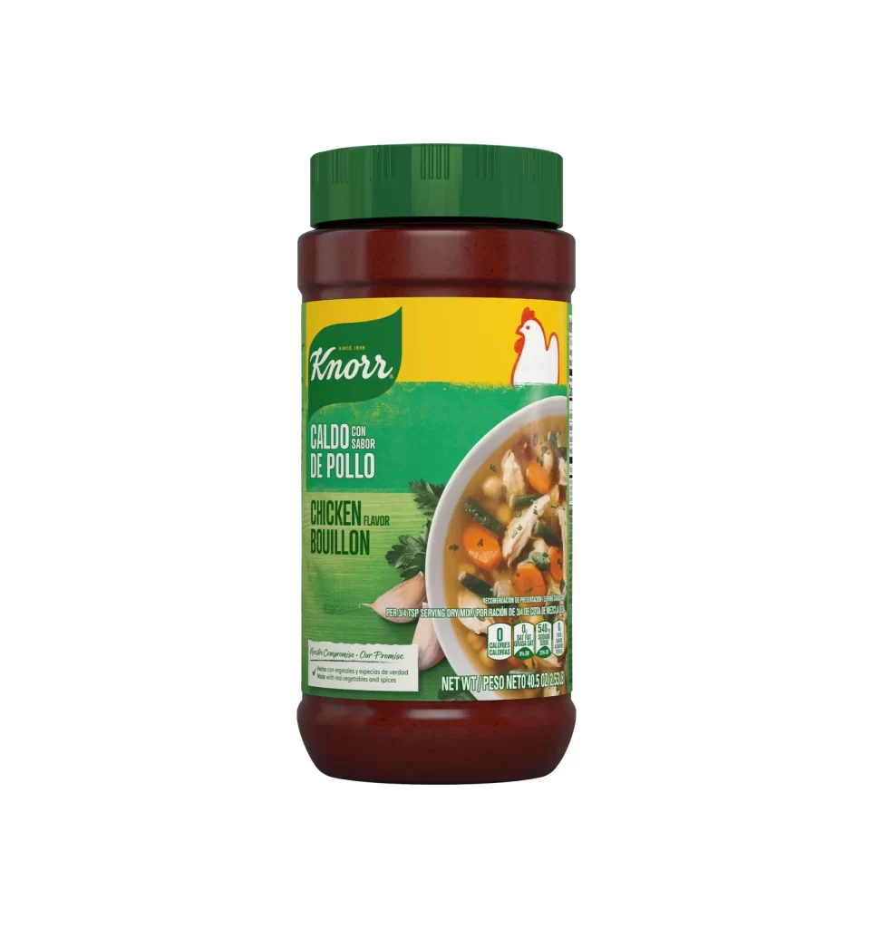
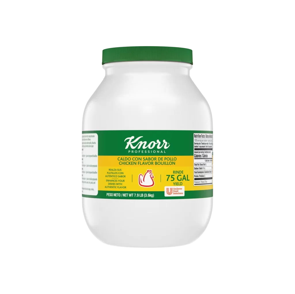
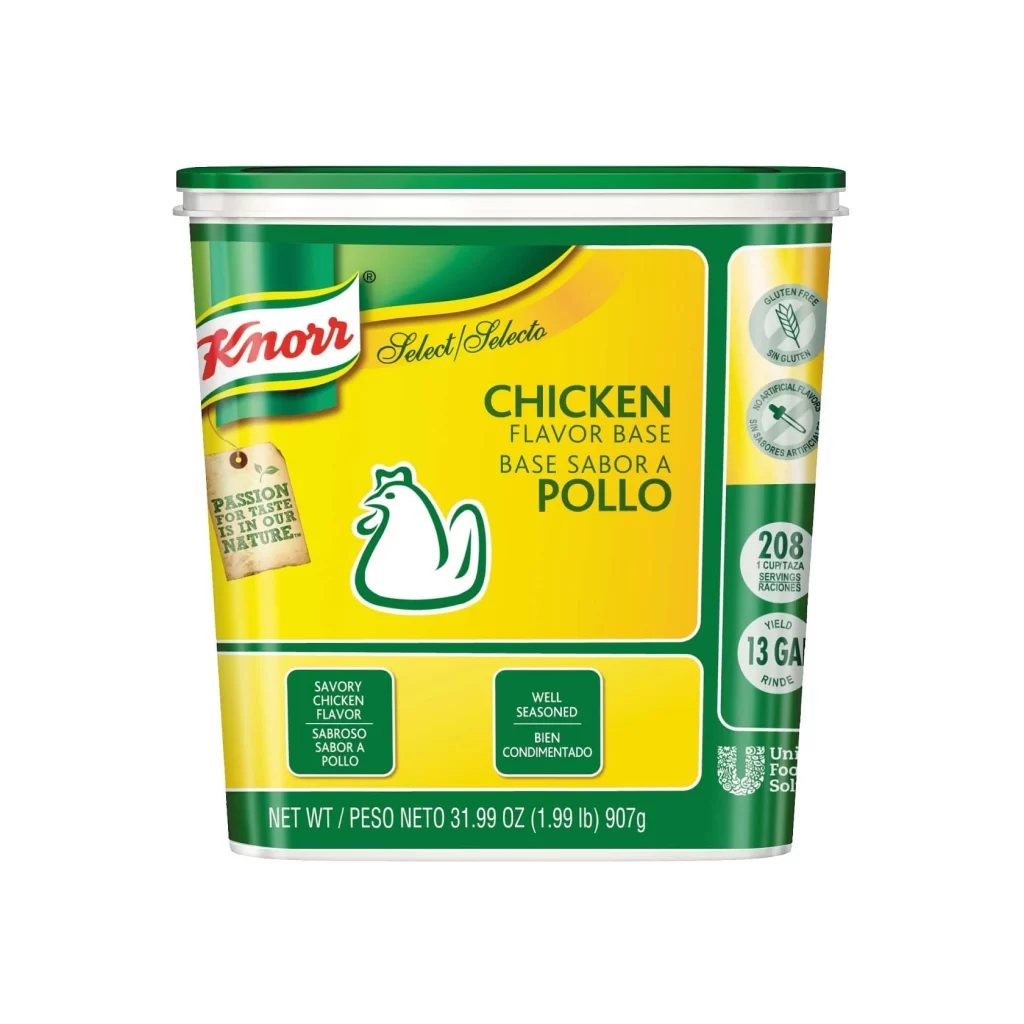
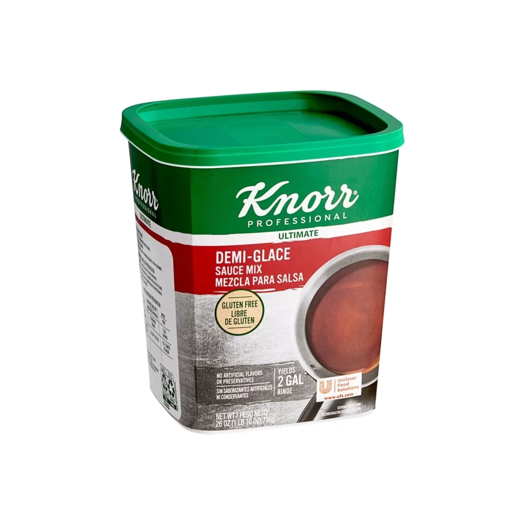
A white plastic bucket with a forest green lid displays the Knorr Professional brand identity across its cylindrical surface. The label features a dark green upper band with white script lettering, a bright yellow middle section containing bilingual product text and a red chicken icon, and a lower green band indicating the 4.4-pound net weight. The container is photographed straight-on under even studio lighting, revealing nutritional information printed vertically along the right edge.
Visual hierarchy plays a crucial role here, with the high-contrast yellow band drawing immediate attention to the product's core identity and purpose. The bilingual labeling creates an interesting typographic challenge, balancing Spanish and English text while maintaining readability through careful font sizing and weight distribution. That minimalist chicken icon acts as a clever visual shorthand, instantly communicating the flavor profile without cluttering the composition with complex imagery.
Packaging designers studying commercial food branding would find this layout particularly useful for understanding how professional kitchen products differ from retail versions in their information density. Industrial design students could analyze the structural elements of the tub itself, from the lid's grip features to the label's wrap-around proportions. Marketing teams developing multi-regional product lines might reference this example when crafting labels that must serve diverse linguistic markets simultaneously.