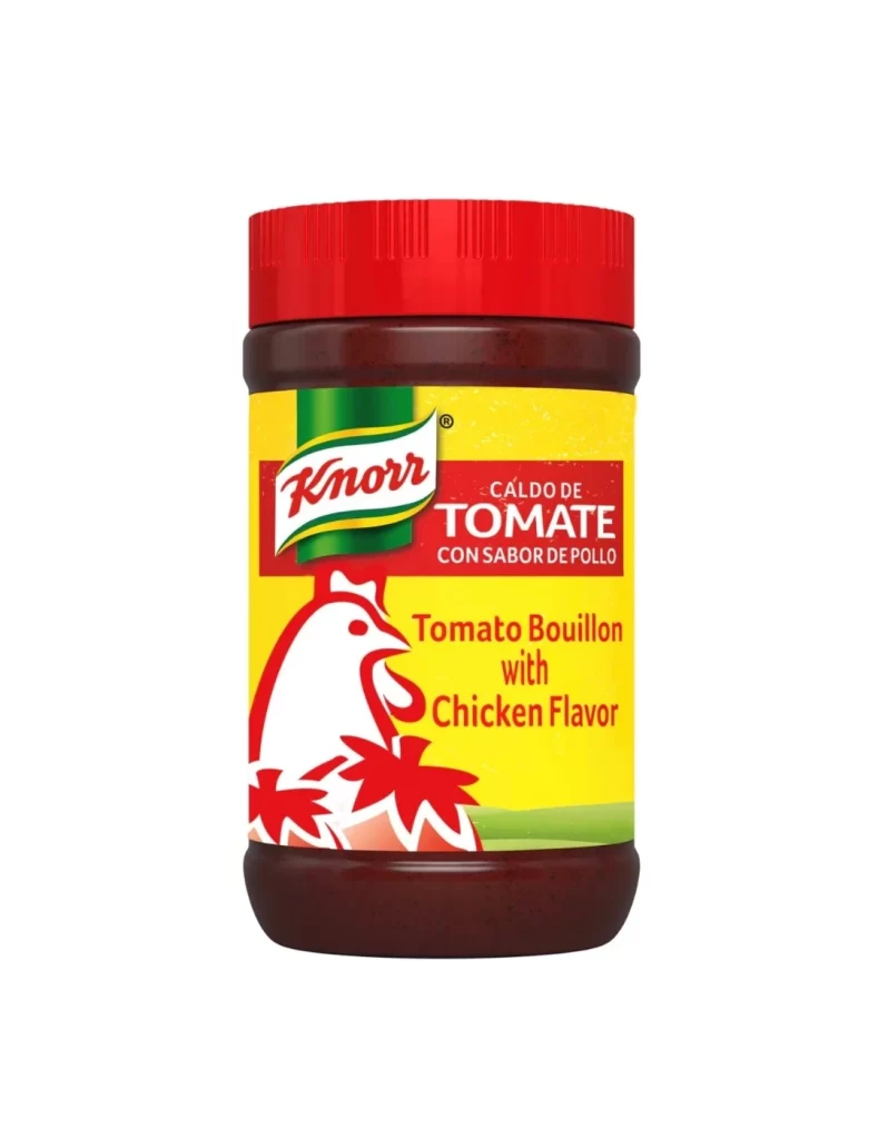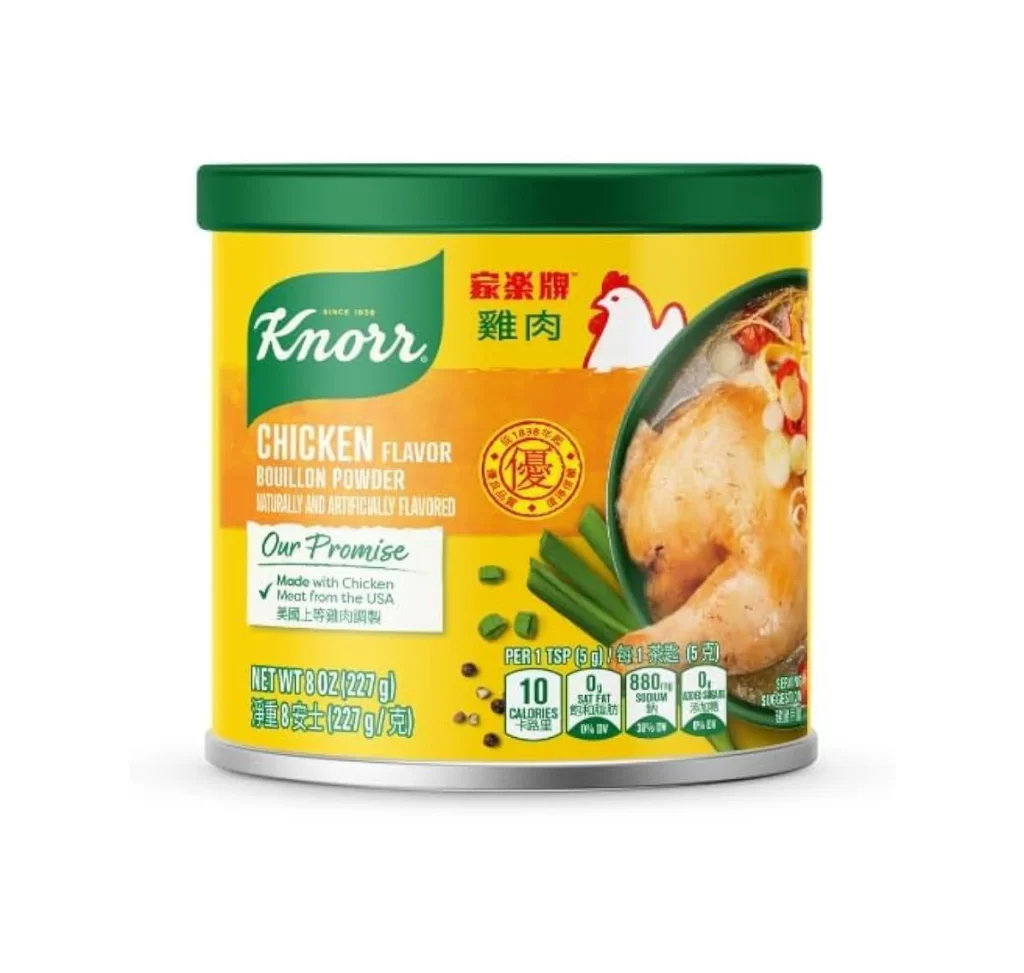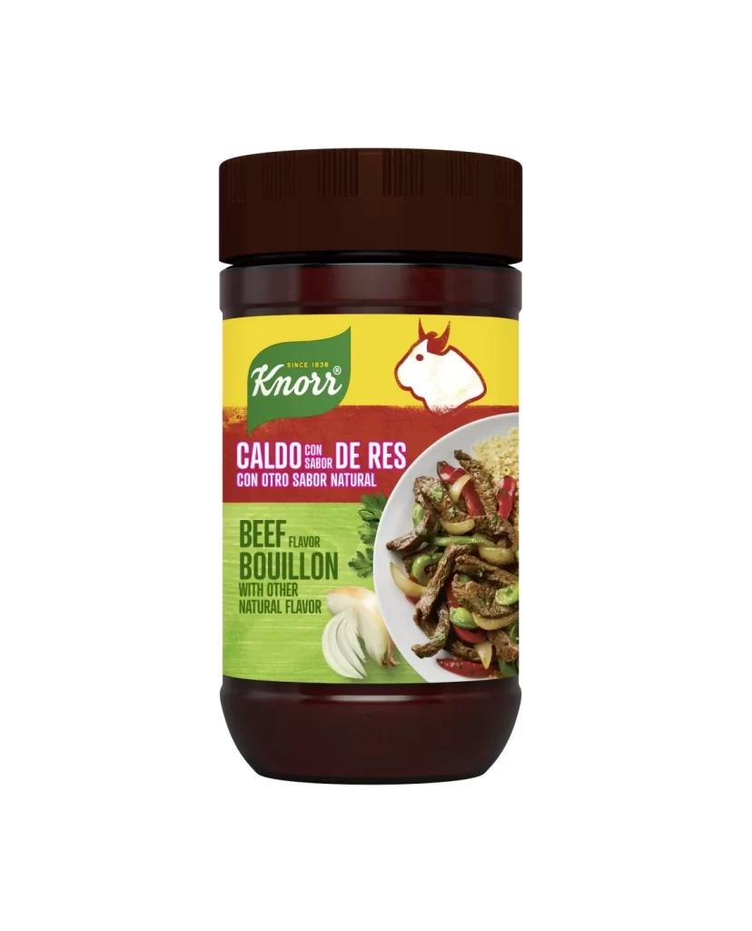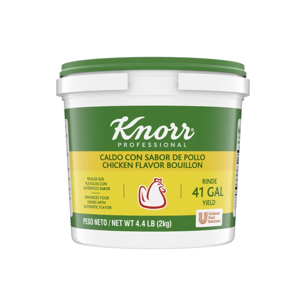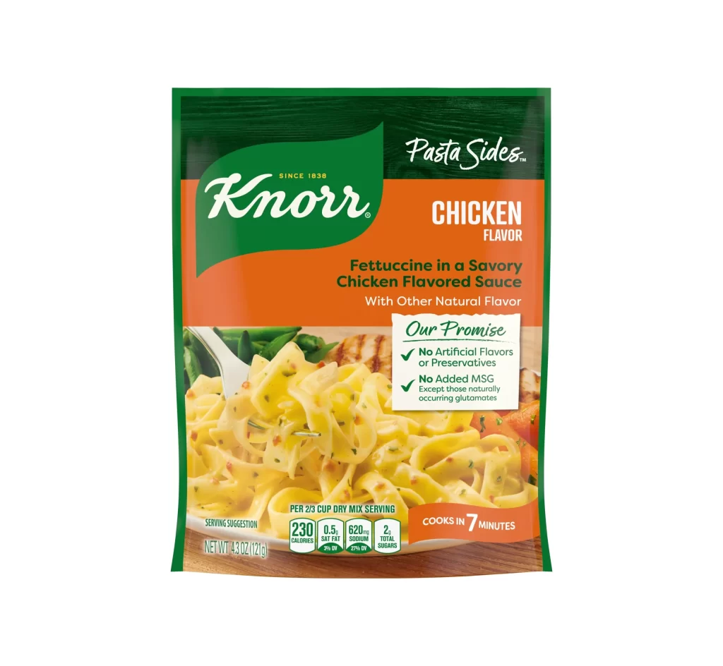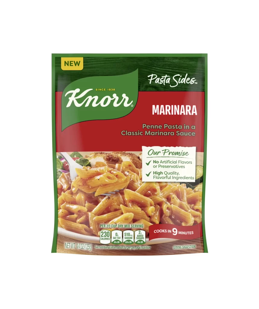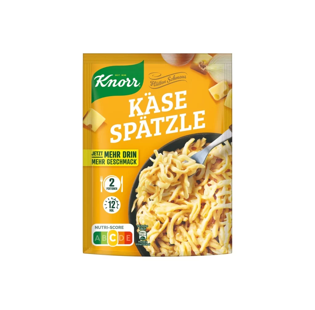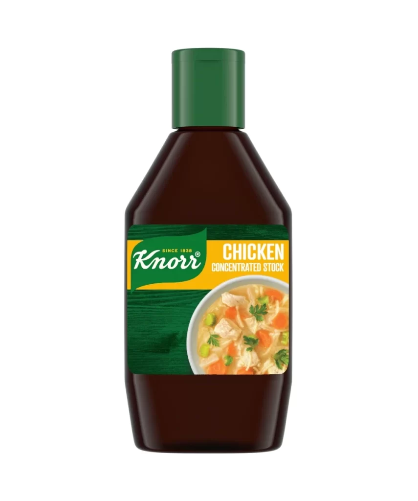
Knorr Chicken Concentrated Stock Bottle Packaging
Topics
Details
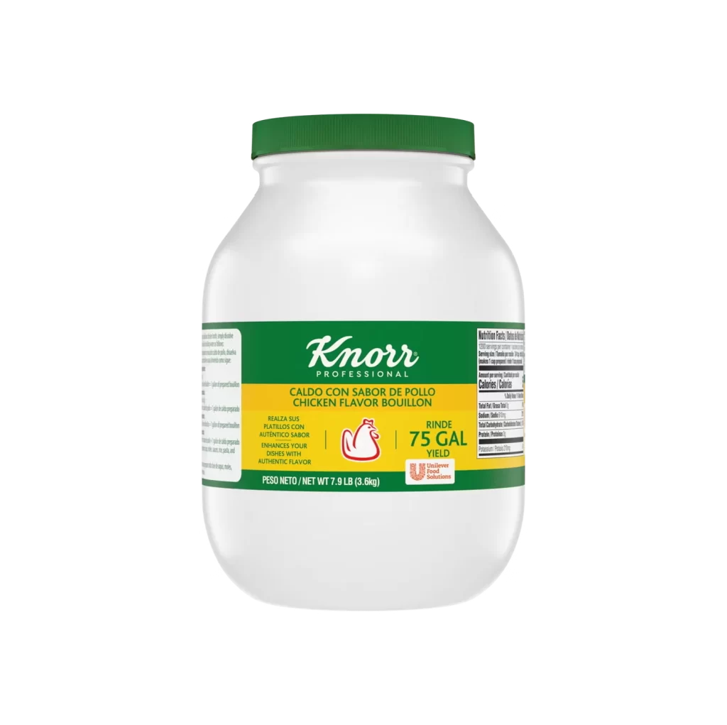
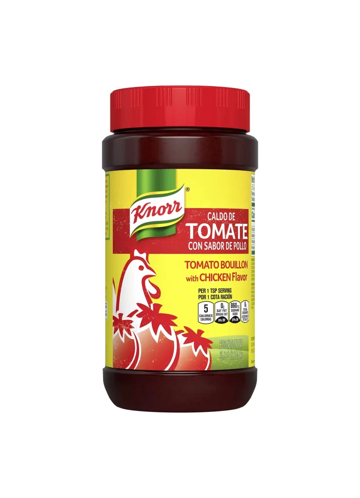
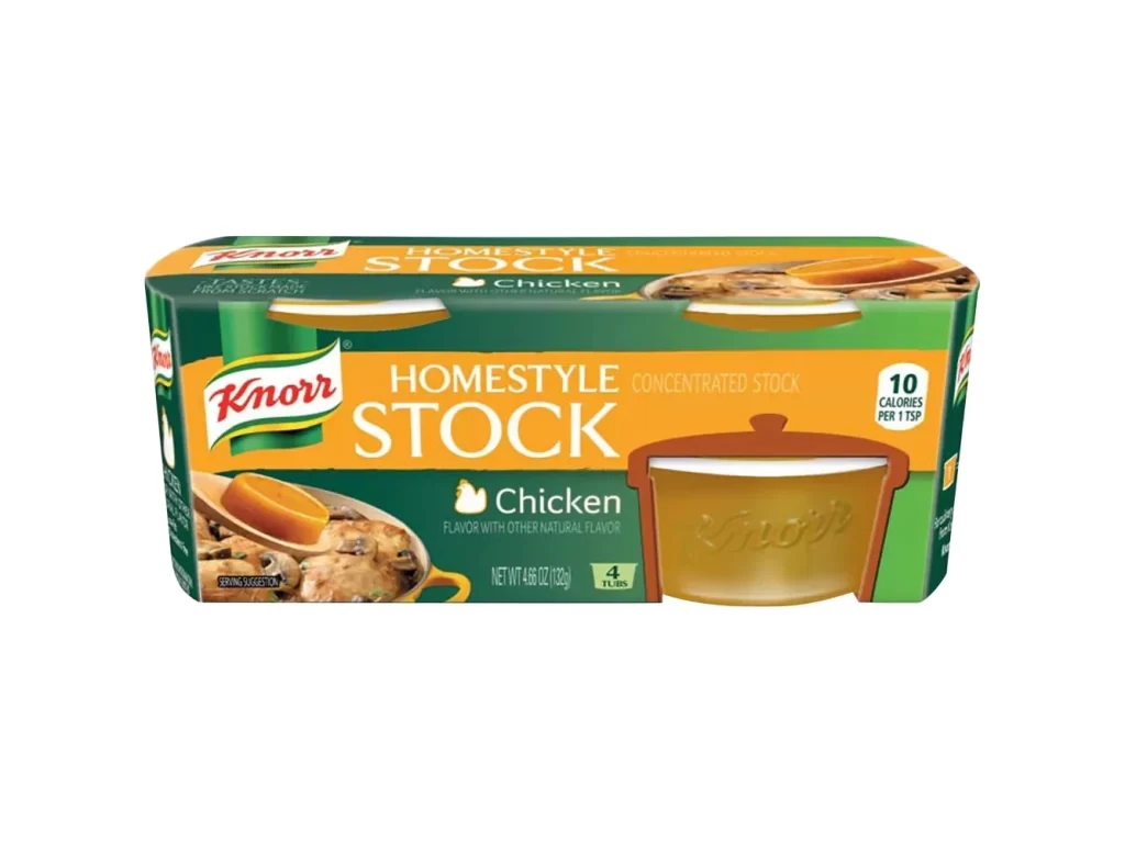
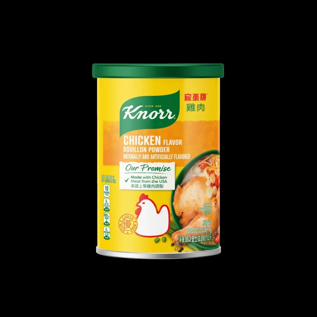
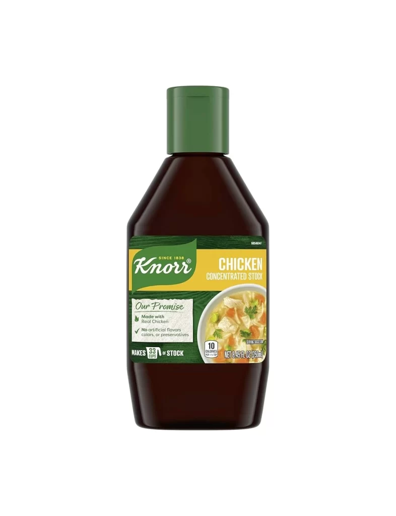
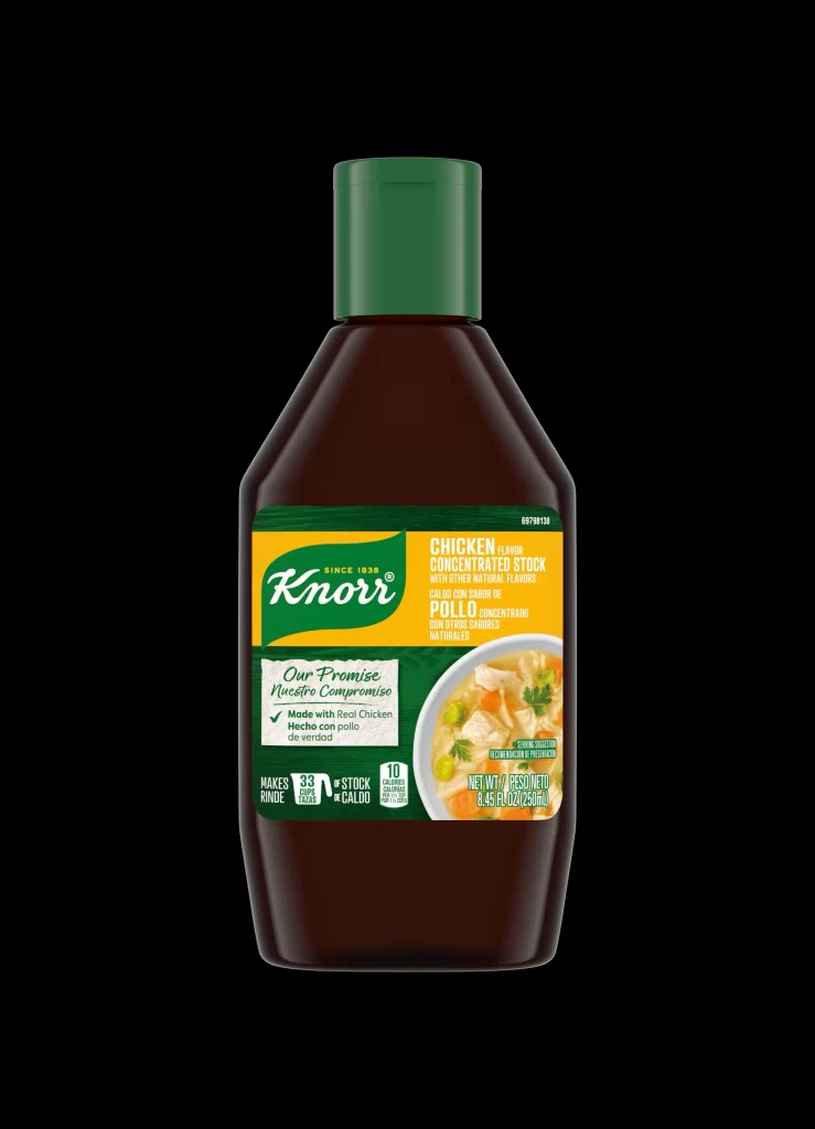
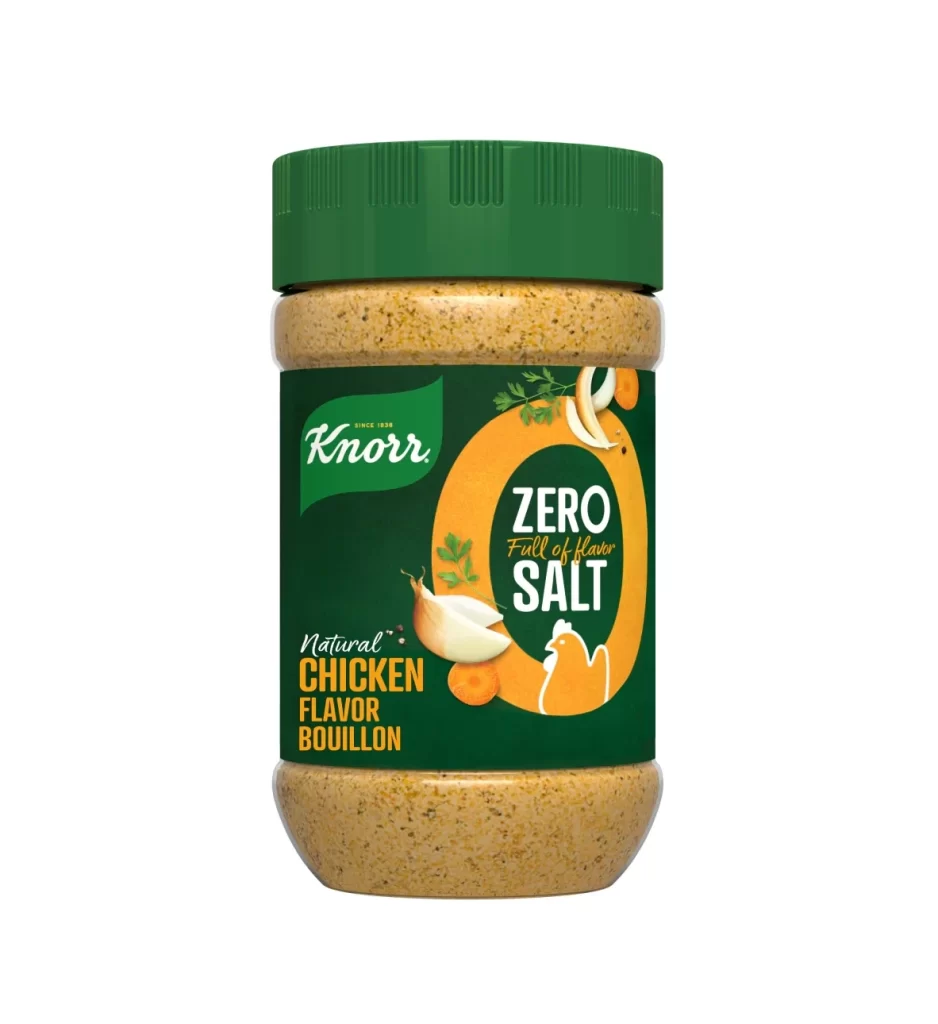
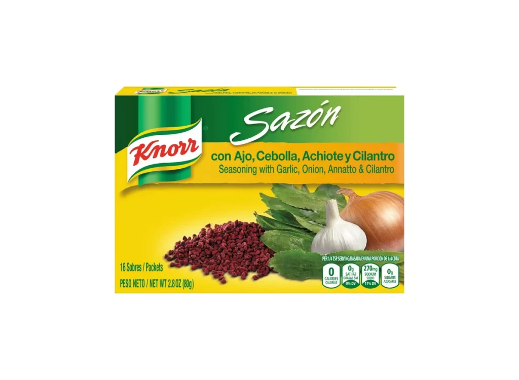
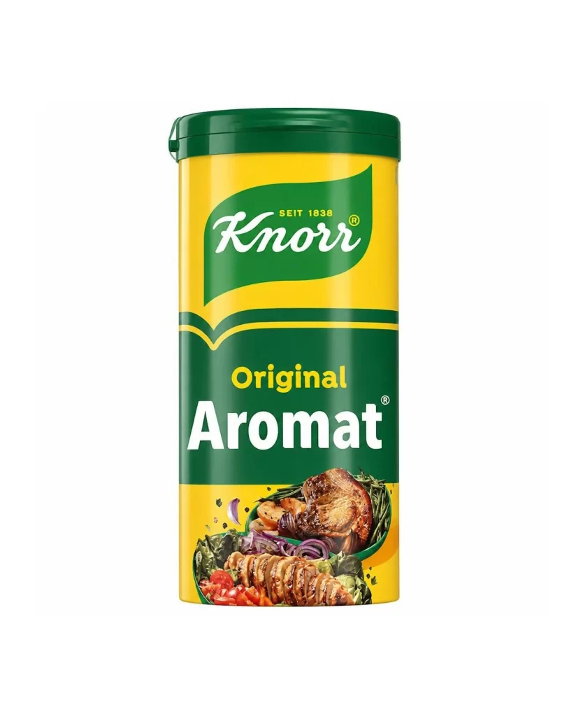
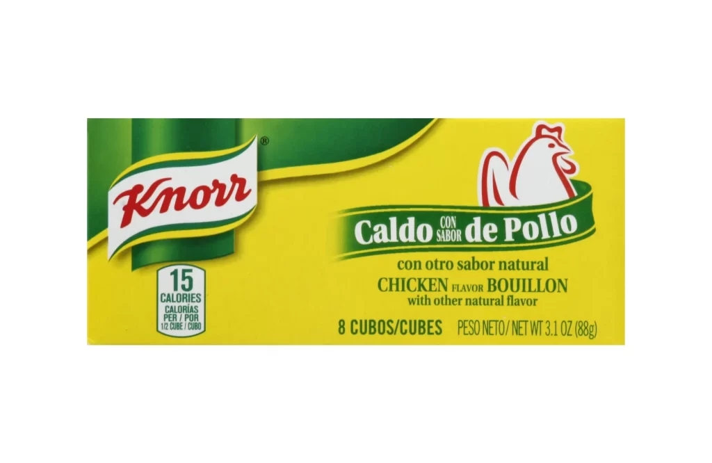
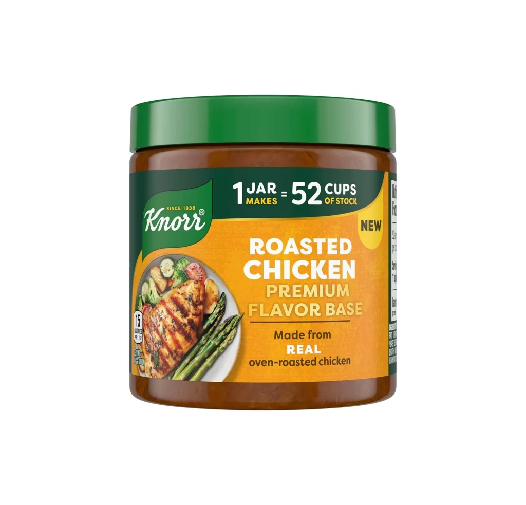
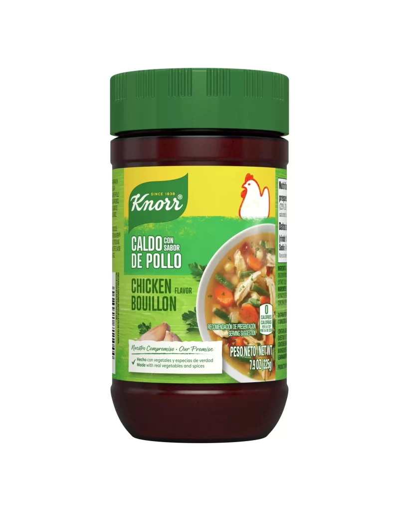
A dark brown plastic bottle with a green screw cap stands upright, featuring a label that combines forest green and golden yellow sections. The Knorr logo appears in white script on the green background, while bold white text reads CHICKEN CONCENTRATED STOCK against the yellow stripe. A circular food photograph showing chicken soup with vegetables occupies the lower right portion of the label, all presented under even studio lighting with a straight-on camera angle.
Visual hierarchy operates through disciplined color blocking, where the saturated yellow band functions as an optical anchor between the darker green zones. The typographic contrast between the organic script logo and utilitarian product descriptor establishes brand personality while ensuring legibility at retail distances. Photographic realism in the food inset provides tactile appetite appeal that balances the abstract geometric purity of the packaging architecture, creating a tension between industrial design and culinary warmth.
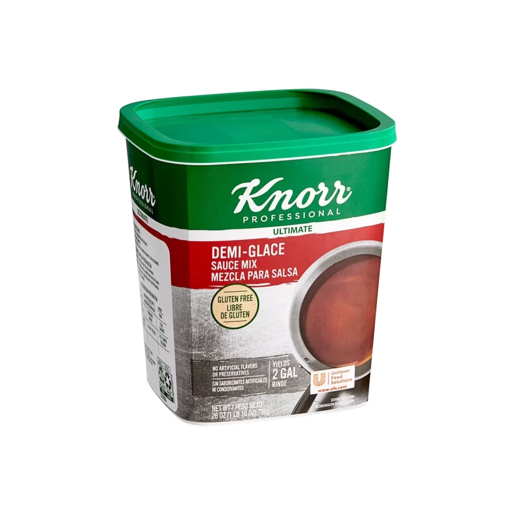
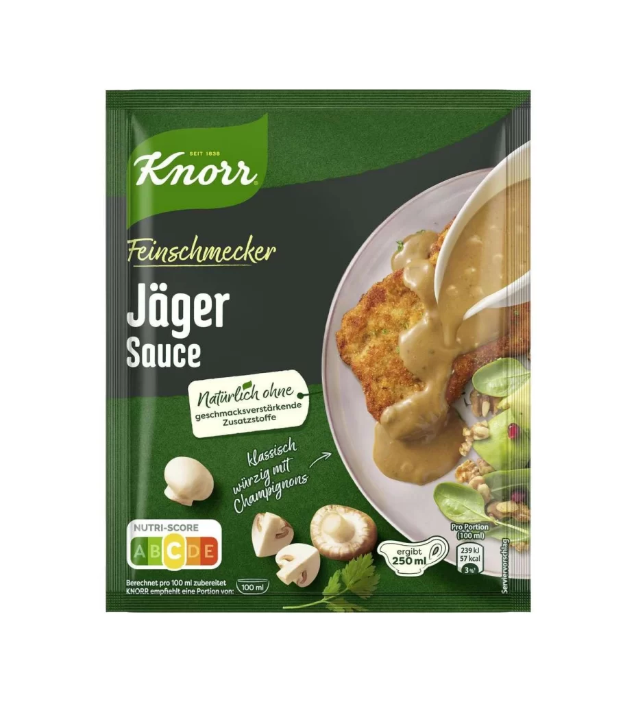
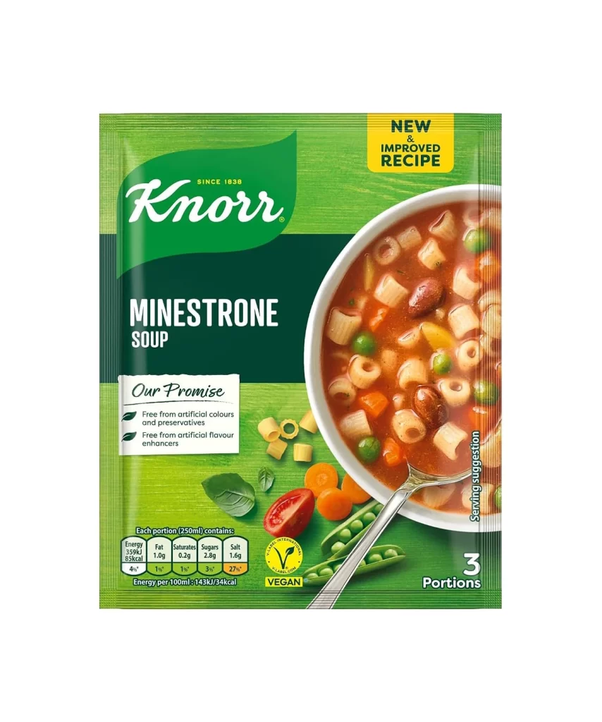
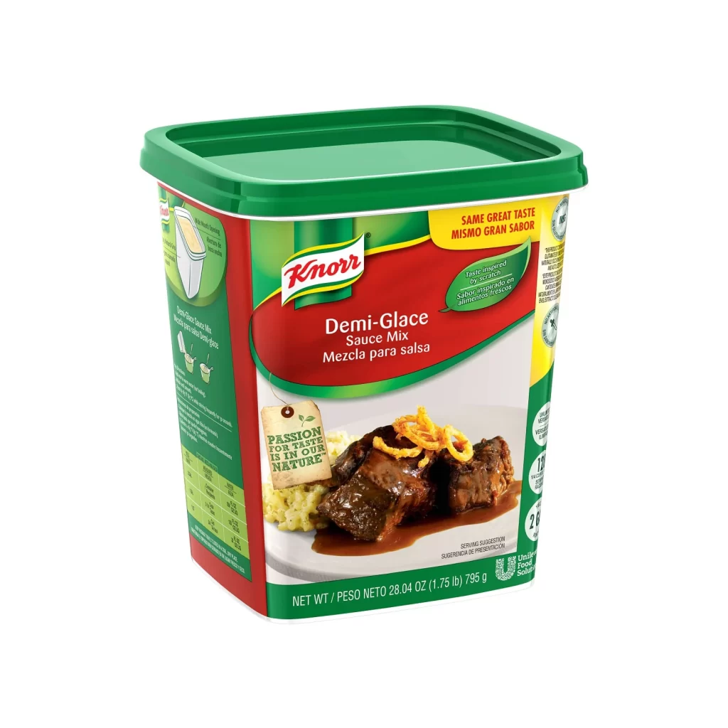
Packaging designers analyzing condiment category conventions would examine this specimen for color-coding strategies across stock varieties. Brand identity specialists might reference the logo integration techniques when developing premium food product systems. Culinary photographers could study the lighting ratios on the soup inset to understand how liquid translucency is rendered against opaque container materials.