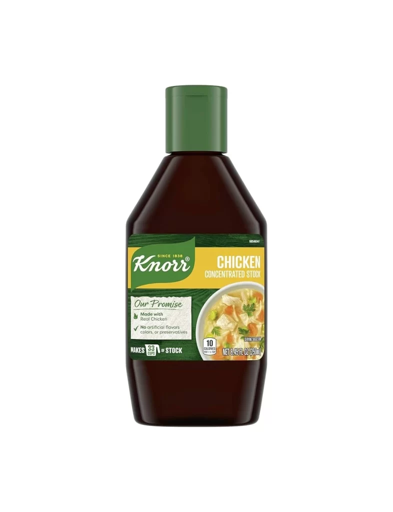
Knorr Homestyle Chicken Stock Box Packaging
Topics
Details
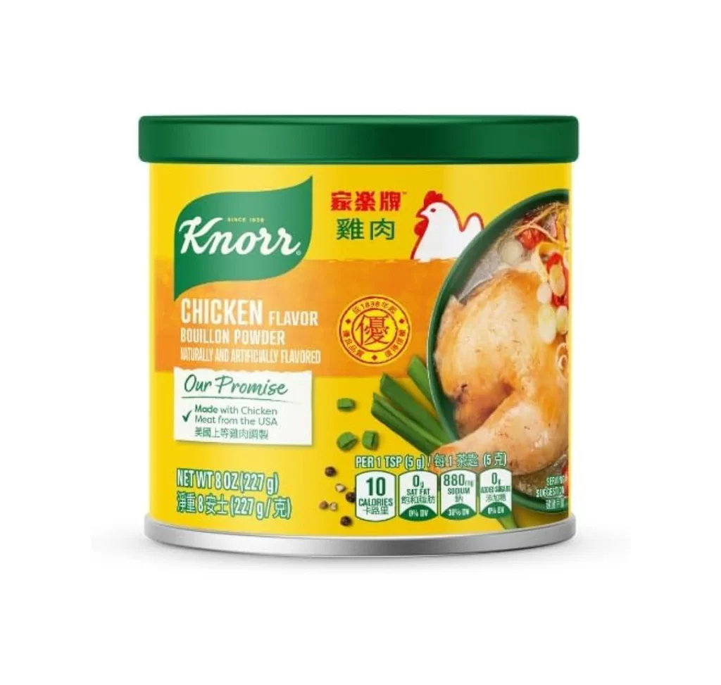
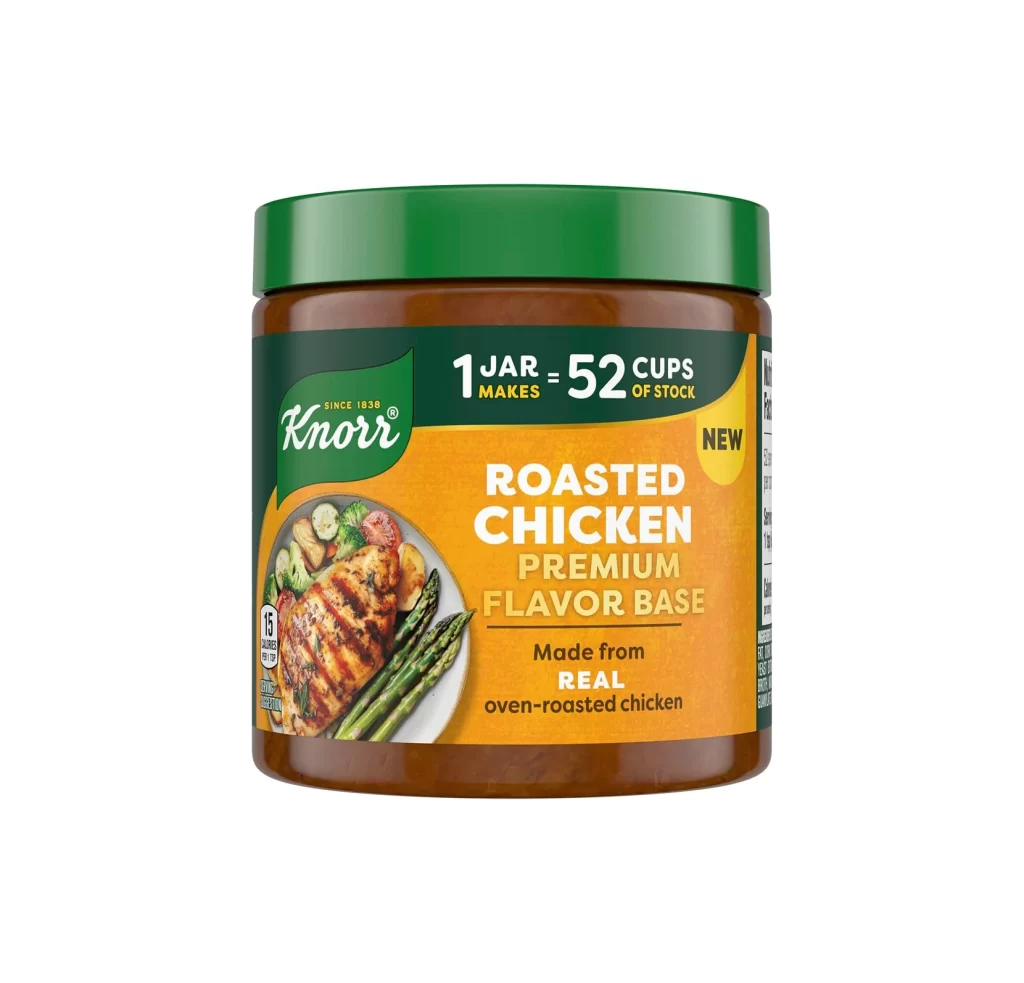
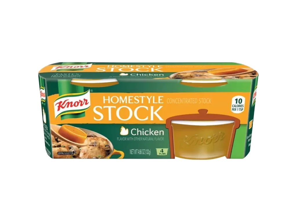
A rectangular cardboard carton displays Knorr Homestyle Chicken Stock packaging with a dominant green and orange color scheme. The front features the red and white Knorr logo in the upper left, bold white 'HOMESTYLE STOCK' text across an orange band, and a photographic image of chicken pieces with a wooden spoon on the left side. A yellow-tinted pot graphic appears on the right, while nutritional information indicating 10 calories per tablespoon sits in the upper right corner of the package.
Visual hierarchy plays a crucial role here, as the contrasting warm orange stripe against the cool green background creates immediate shelf presence and brand recognition. The inclusion of both realistic food photography and stylized packaging illustration offers dual visual cues-appealing to appetite while simultaneously communicating the concentrated format of the product. Nutritional information, specifically the '10 CALORIES PER 1 TSP' badge, integrates seamlessly into the color-blocked layout without disrupting the overall aesthetic flow or legibility of the primary branding elements.
Packaging designers studying consumer goods branding will find this composition particularly useful for analyzing how established food brands balance appetite appeal with functional information density. Marketing teams developing similar stock or broth products could reference this layout when determining optimal placement for flavor indicators versus nutritional claims on limited surface areas. Additionally, 3D artists creating grocery store environments might utilize this specific color palette and typographic arrangement to ensure their rendered products maintain authentic supermarket aesthetics.