Title

Huel Complete Gum Snack Packaging


Topics

HuelSnack

Details

Uploaded user: Leo

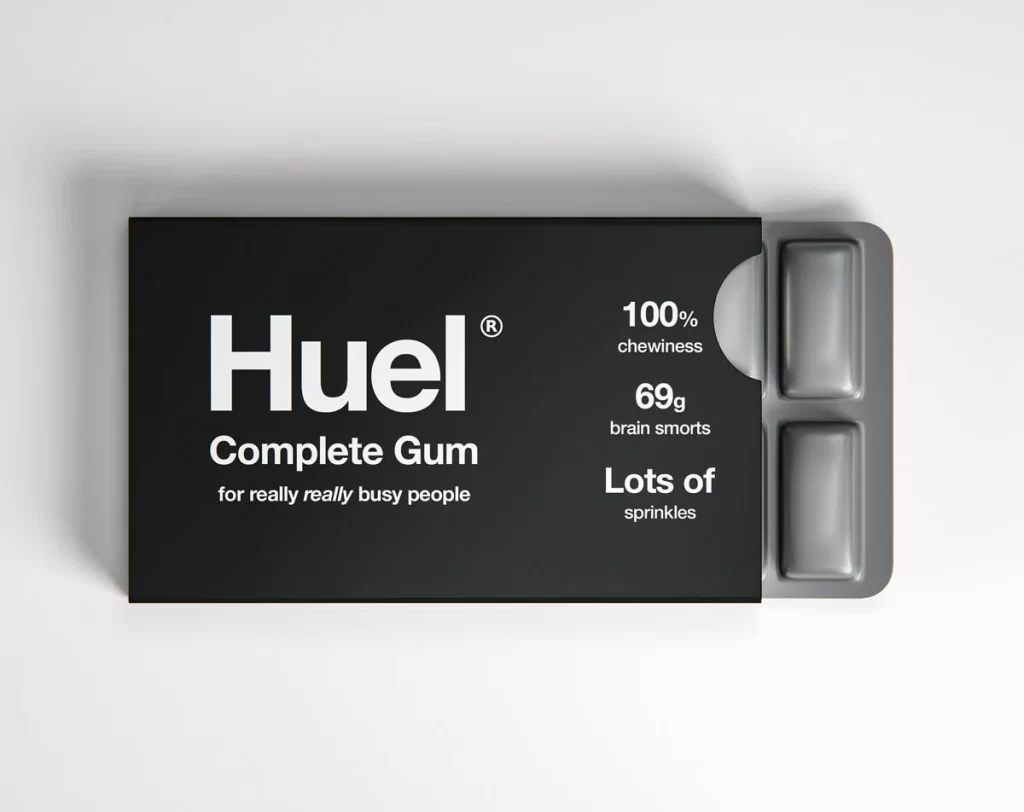
A matte black rectangular box displays bold white typography, with the brand name 'Huel' dominating the left half in a heavy sans-serif font above 'Complete Gum' and the smaller tagline 'for really really busy people'. A curved cutout on the right side reveals two gray gum pieces nestled in a blister pack, while the right panel lists '100% chewiness', '69g brain smorts', and 'Lots of sprinkles'. The packaging sits on a white surface at a slight angle that exposes the product within.

What makes this mockup particularly engaging is its satirical take on functional food marketing, blending pharmaceutical aesthetics with absurd nutritional claims. The stark contrast between the serious, minimalist black-and-white color scheme and the playful, nonsensical copy creates an immediate visual tension that draws the eye. By mimicking the layout of supplement boxes or medication while selling something as mundane as chewing gum, the design cleverly subverts expectations and demonstrates how typographic hierarchy can sell even the most ridiculous concepts with apparent authority.

Packaging designers studying minimalism would find this a perfect case study for balancing whitespace with impactful text placement, while copywriters could analyze how tone shifts between technical specs and casual humor. Students learning about brand voice might use this to explore how visual seriousness can amplify comedic messaging, and product photographers could reference the soft shadow work and surface reflections for their own studio setups. Anyone developing conceptual packaging for a portfolio piece would benefit from deconstructing how this image uses familiar forms to create something entirely new and memorable.