Title

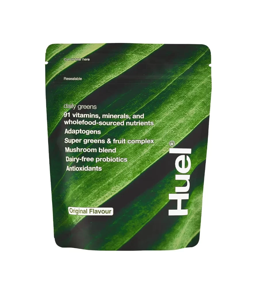
Huel daily greens Original Flavour Beverage Packaging


Topics

BeverageHuel

Details

Uploaded user: Leo

A resealable pouch of Huel daily greens Original Flavour showcases a deep green leaf texture across its surface, with the brand name 'Huel' rendered in bold, vertical white typography along the right edge. The packaging displays key product claims including '91 vitamins, minerals, and wholefood-sourced nutrients,' 'Adaptogens,' and 'Dairy-free probiotics' in white text against the organic background. Functional markings such as 'cut or tear here' and 'Resealable' appear at the top of the pouch, which sits on a white surface.

Visual hierarchy is established masterfully here by contrasting the dark botanical imagery with crisp white lettering, ensuring legibility while maintaining an earthy aesthetic. The diagonal flow of the leaf veins guides the eye naturally from the product claims down to the flavor designation, creating dynamic movement within a static rectangular format. Such a layout effectively balances informational density with breathable negative space, making it a compelling study in modern health-product branding.
Brand strategists developing supplement lines could analyze this composition to understand how photography integrates with typographic elements without cluttering the message. Packaging engineers might examine the placement of functional instructions versus marketing copy to optimize user experience on similar flexible containers. Additionally, color theorists studying the psychology of wellness marketing would find this specific shade of forest green particularly instructive for conveying freshness and vitality.