Huel Nutrition Shake Mix Pouch View
Topics
Details
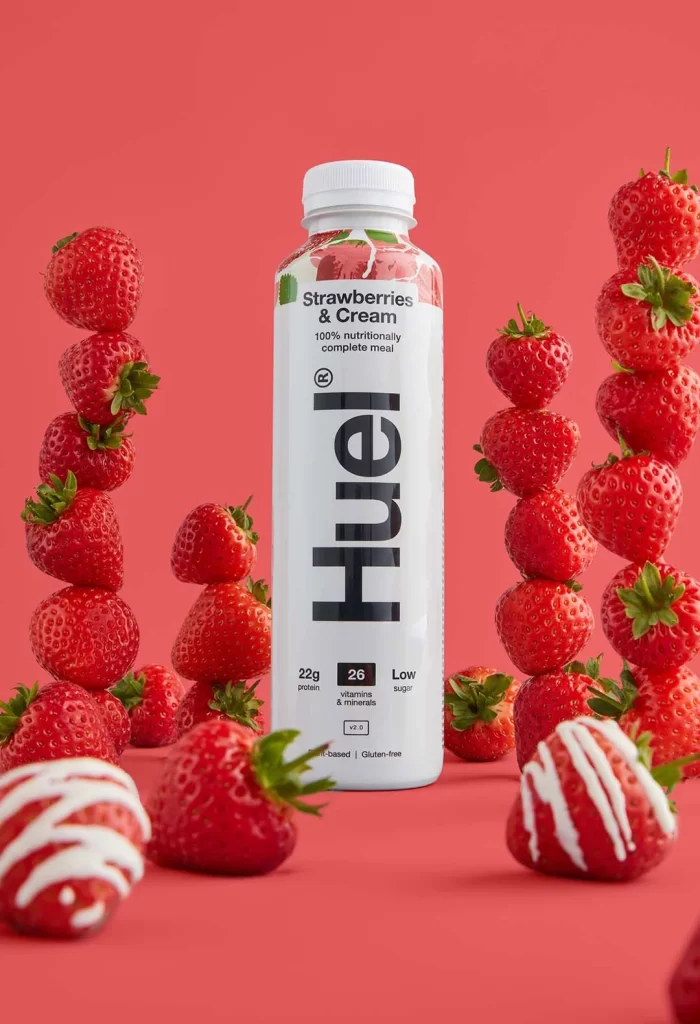
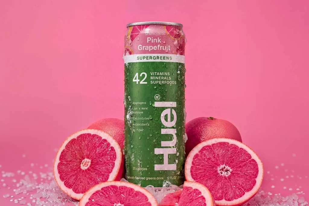
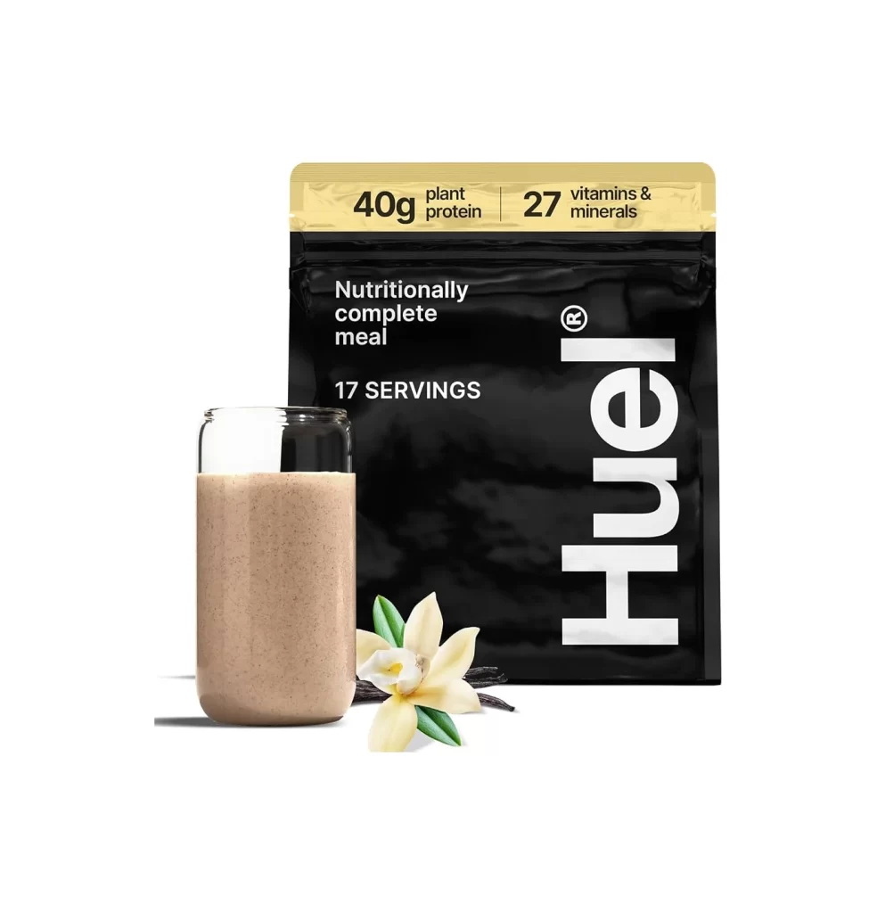
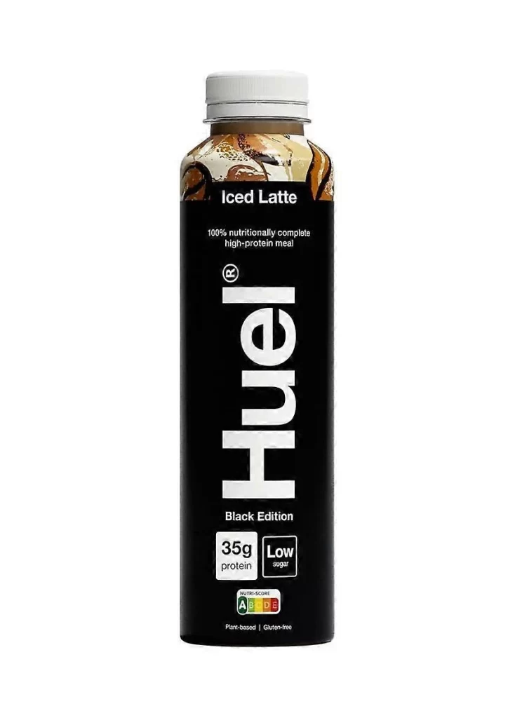
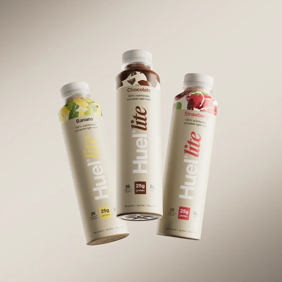
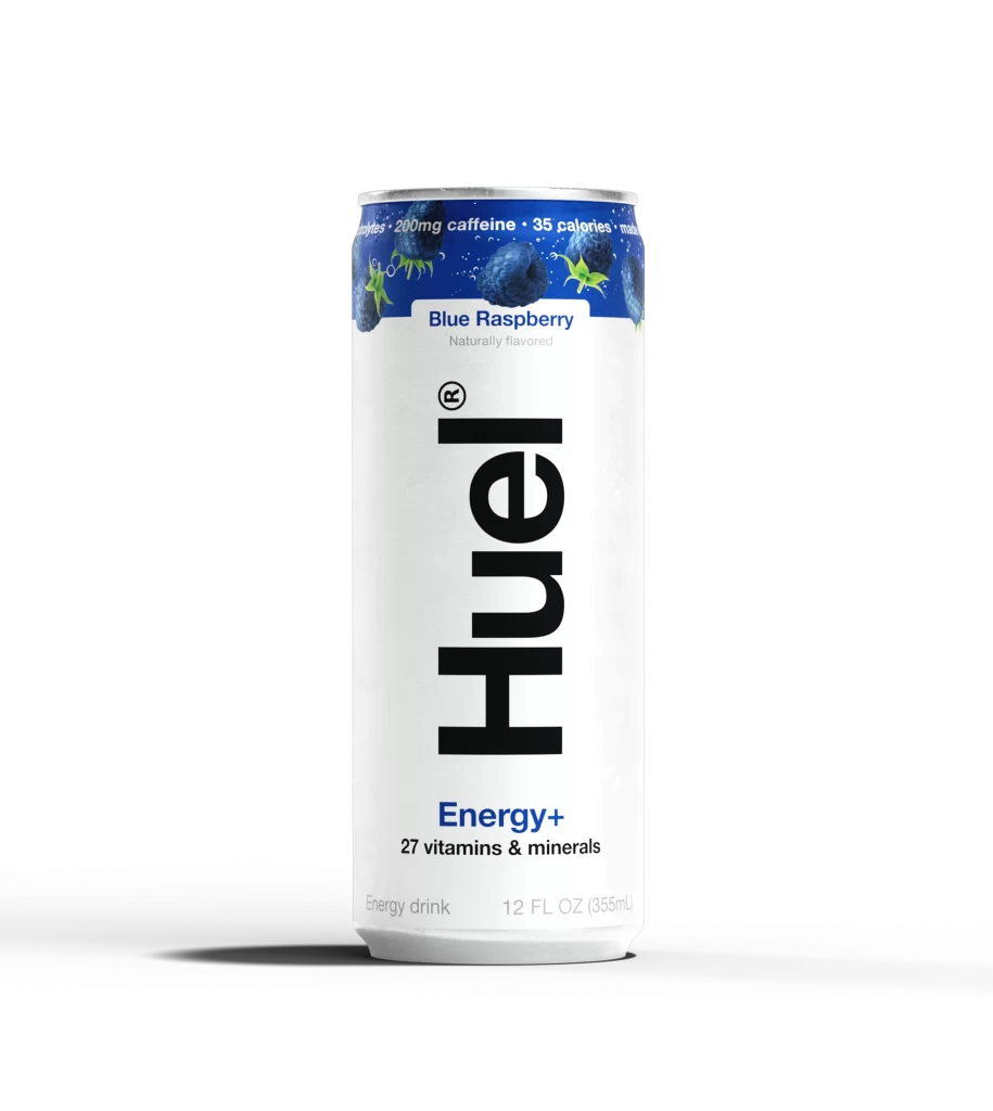
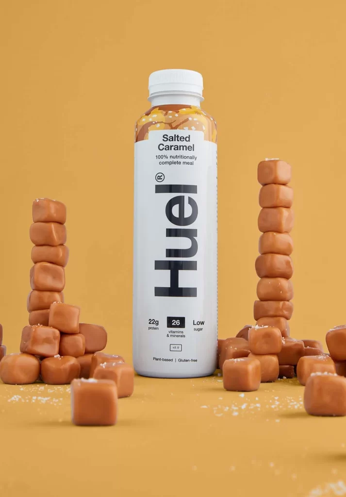
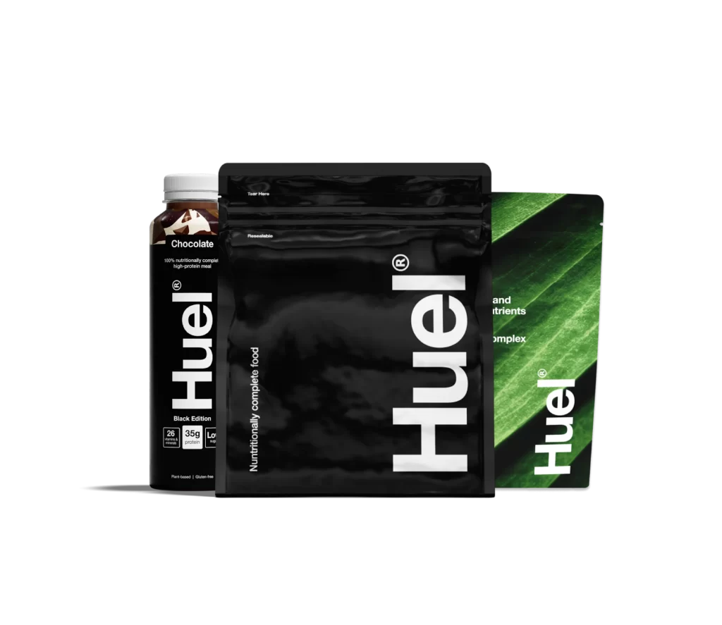
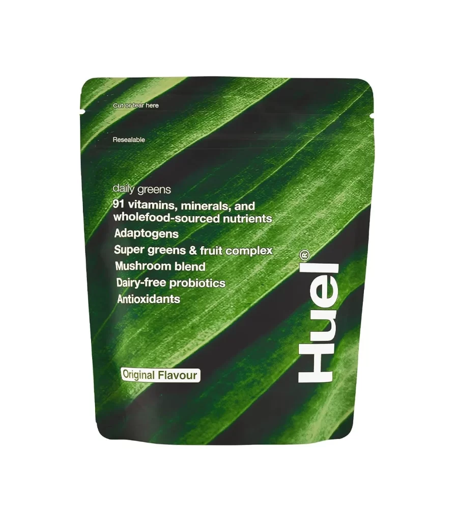
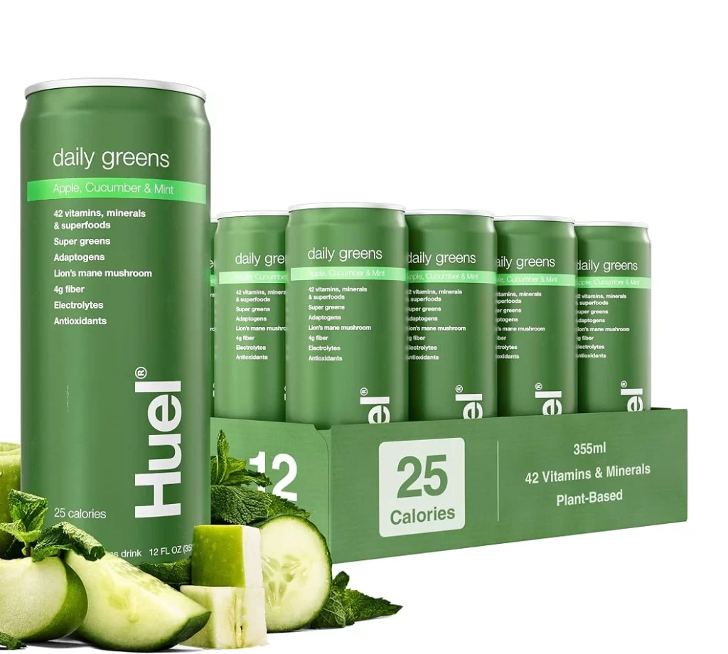
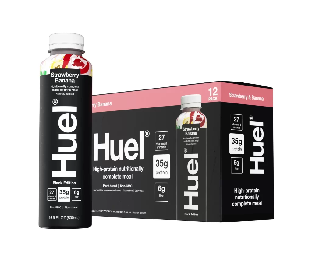
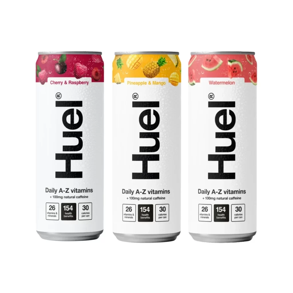
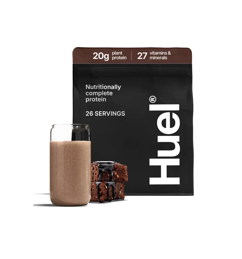
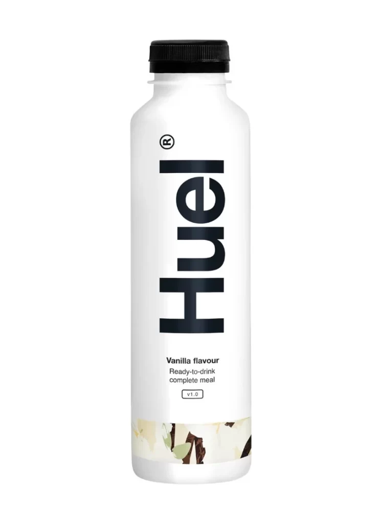
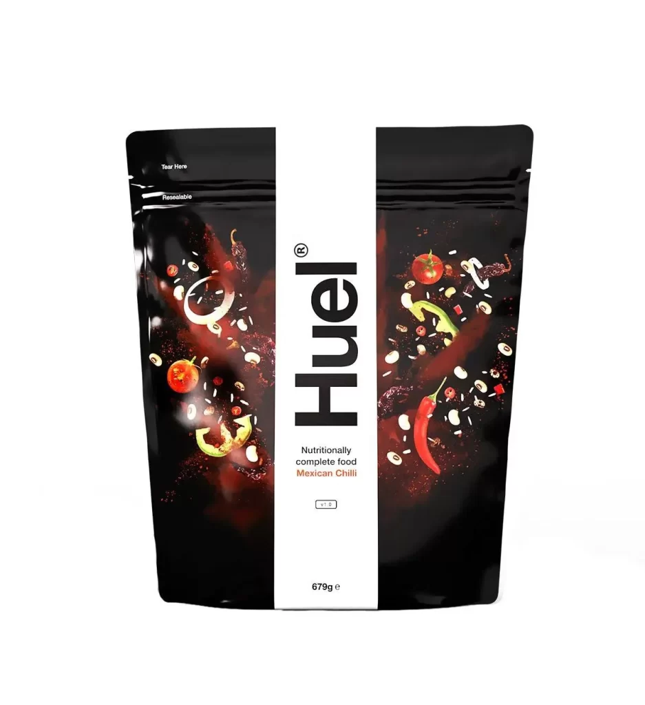
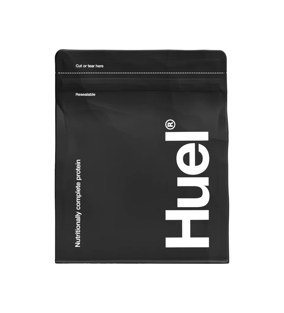
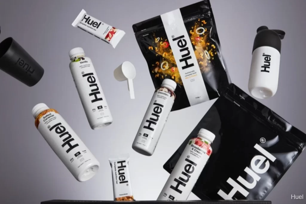
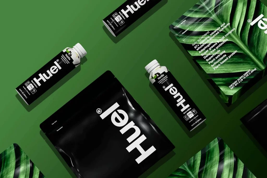
Deep forest green fills the frame, providing a lush backdrop for an array of Huel nutrition products scattered across the surface. Matte black pouches and glossy bottles dominate the composition, featuring the brand's name in bold, white, sans-serif lettering that reads 'Huel' or its mirrored reflection. One package in the upper right breaks the monochrome pattern with a vibrant photographic print of tropical leaves, displaying nutritional details like '87+ vitamins and minerals' and 'plant-based protein' in clean white typography.
Visual interest stems from the striking contrast between the minimalist black packaging and the organic, vivid greenery of the leaf-printed variant. The arrangement plays with orientation, as some items display inverted text, suggesting a deliberate stylistic choice to emphasize form over immediate readability. Soft, even lighting highlights the different material textures, from the crinkled finish of the foil pouches to the smooth, reflective surfaces of the plastic bottles.
Product photographers might study this layout to understand how to artfully disperse multiple SKUs within a single frame while maintaining brand cohesion. Packaging designers could analyze the typographic hierarchy and color palette to see how health-food brands balance clinical information with approachable aesthetics. Art directors planning lifestyle shoots for wellness brands would find this a useful example of integrating natural elements with modern product design.