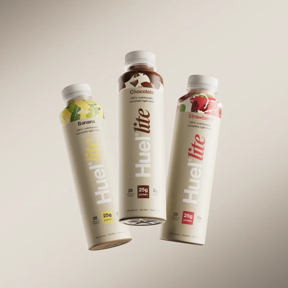
Huel Nutrition Mix Bottle
Topics
Details
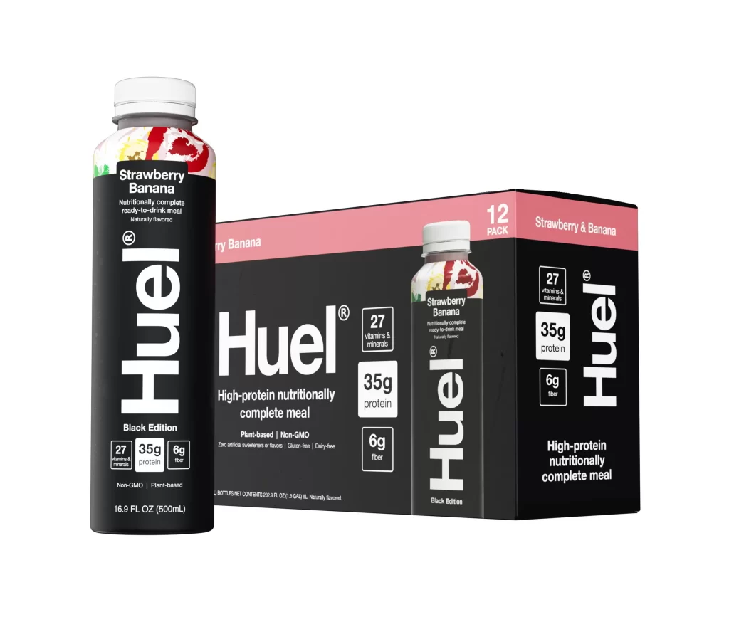
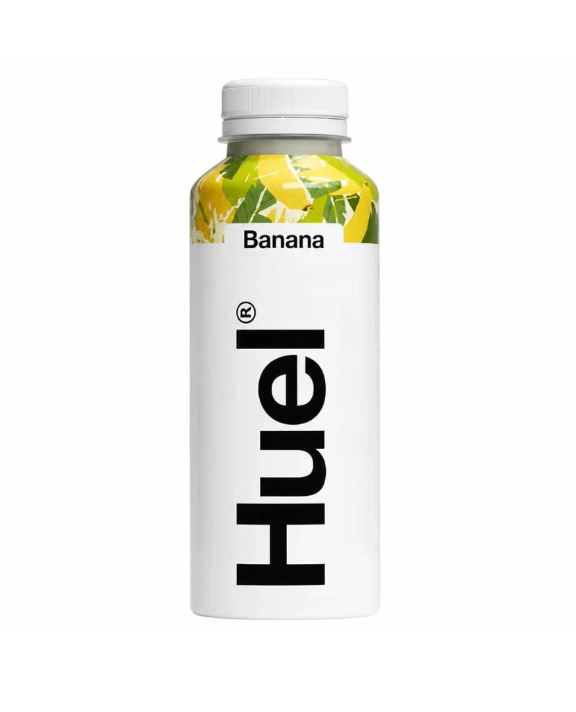
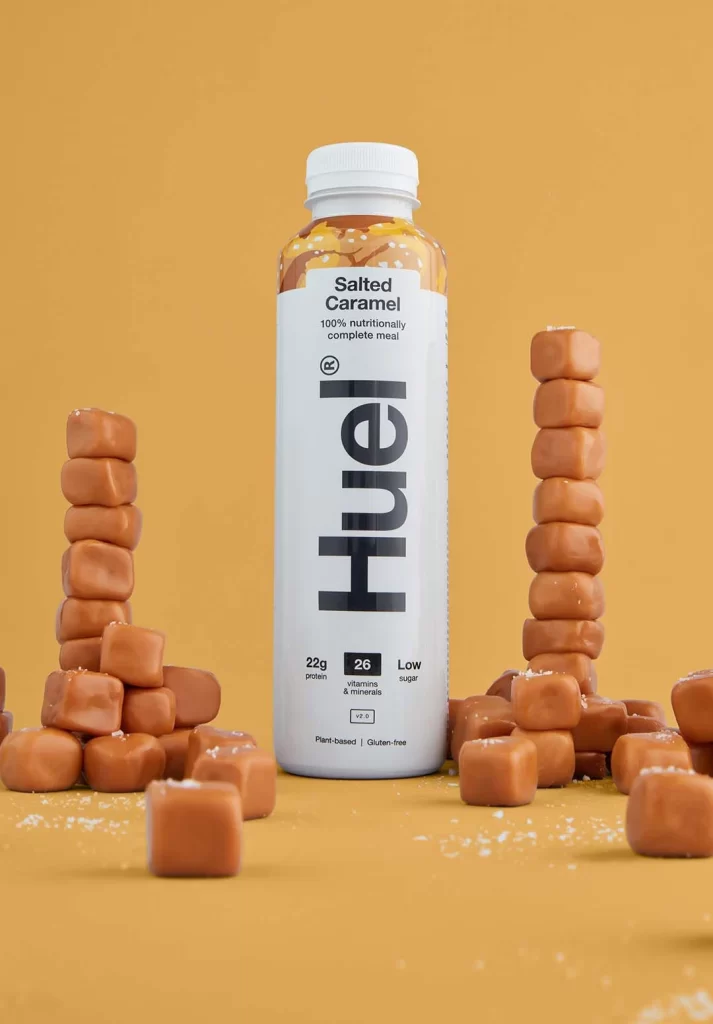
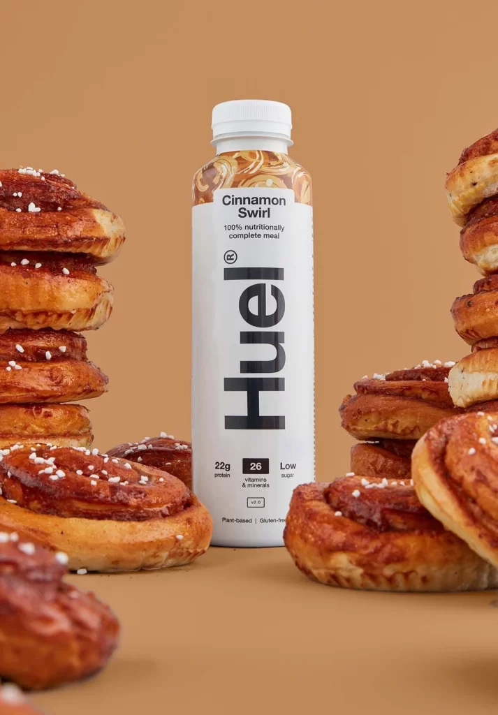
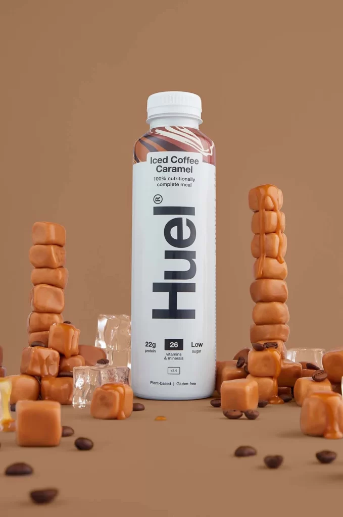
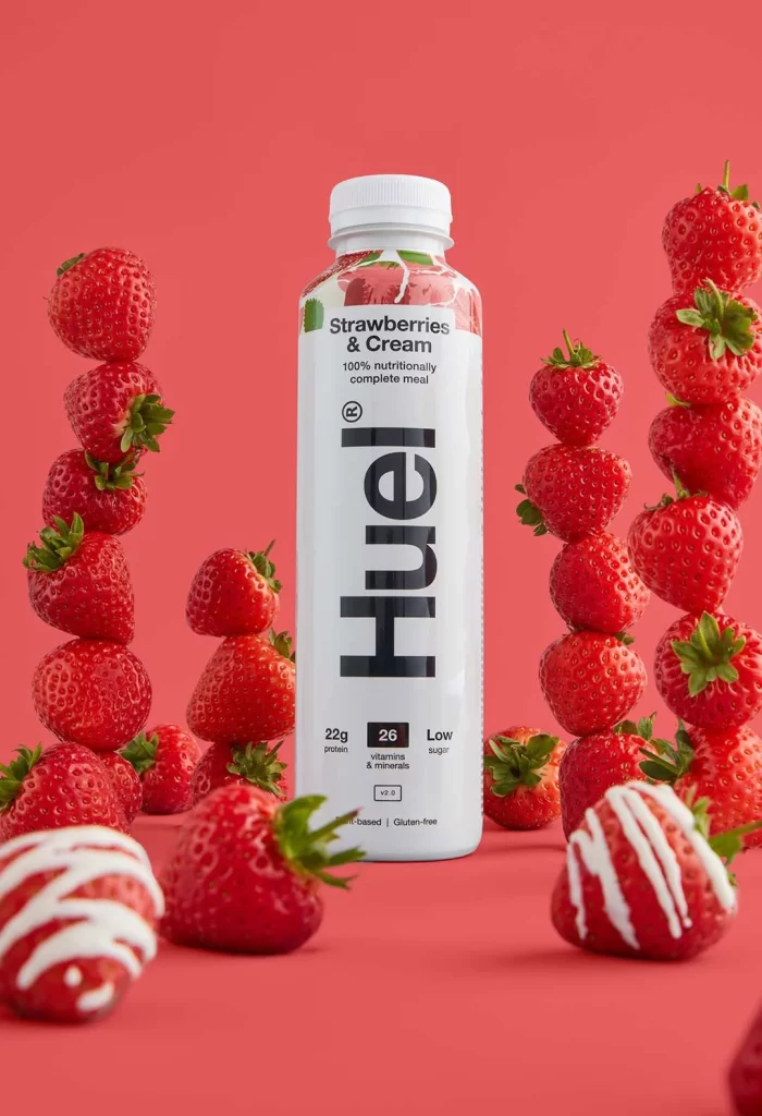
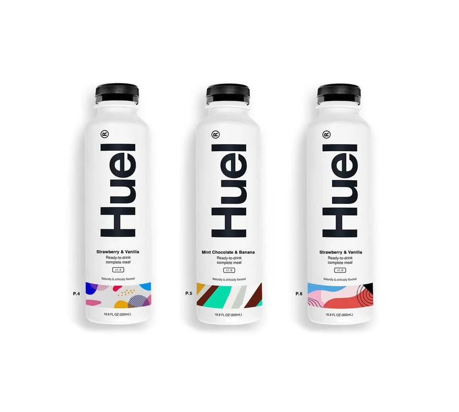
Against a seamless, warm beige gradient that fades from light to shadow, three cylindrical Huel Lite bottles float in a loose triangular formation. The leftmost container features a vibrant yellow and green banana motif at its shoulder, while the center bottle displays a rich brown chocolate swirl pattern, and the rightmost one is crowned with a deep red strawberry illustration. Each matte white bottle bears the brand name 'Huel lite' in a bold, vertically oriented sans-serif typeface, with flavor designations and nutritional claims like '25g protein' clearly printed above the base.
Visual hierarchy plays a crucial role in this product presentation, utilizing color-coded accents to differentiate flavors while maintaining a unified brand identity through consistent typography and layout. The soft, diffused lighting creates gentle highlights along the curved surfaces, emphasizing the smooth texture of the packaging and the clean lines of the white screw caps. Such a minimalist aesthetic relies on the interplay between the neutral bottle color and the vivid, fruit-specific graphics to create immediate visual recognition for consumers.
Marketing teams analyzing competitive packaging strategies would find this composition useful for studying how color psychology influences flavor perception in the health-food sector. 3D artists tasked with creating realistic product renders can examine the subtle reflections and material properties to understand how to simulate plastic and paper labels effectively. Furthermore, brand managers looking to refresh their own visual identity might study the balance between informational text and decorative elements to optimize shelf appeal.