Title

Huel v2.0 Salted Caramel Beverage Packaging


Topics

BeverageHuel

Details

Uploaded user: Leo

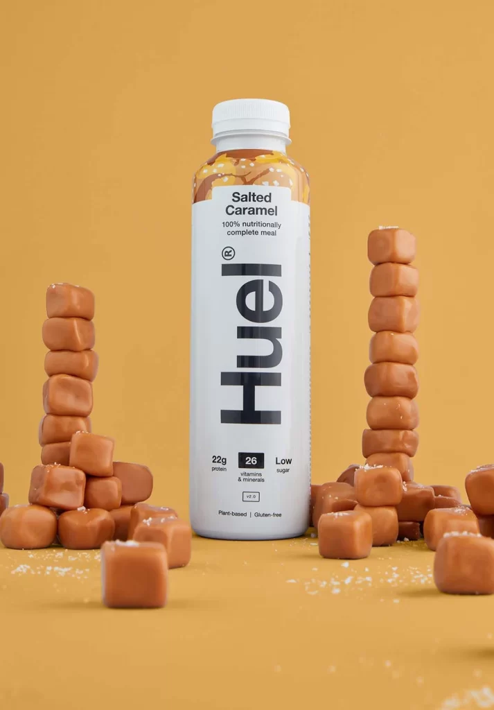
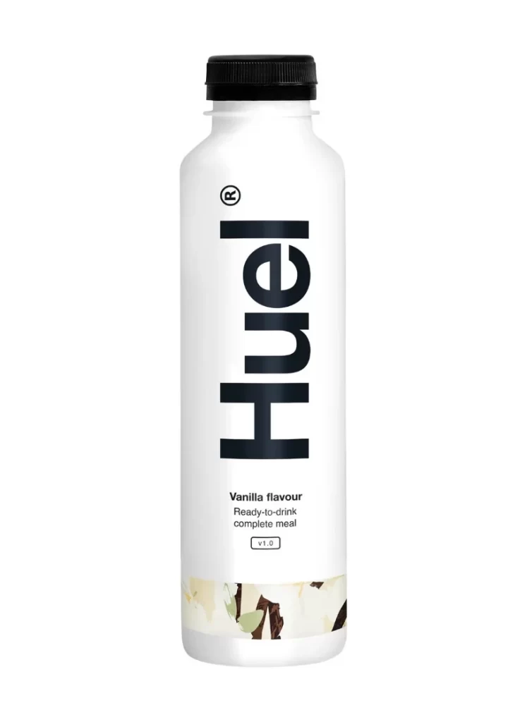
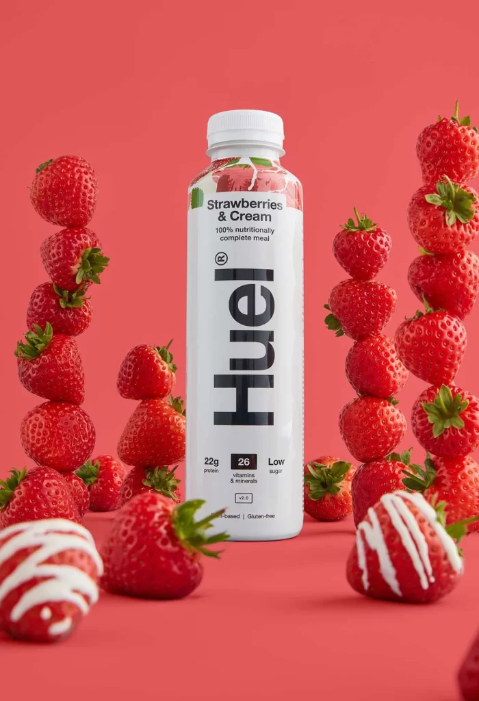
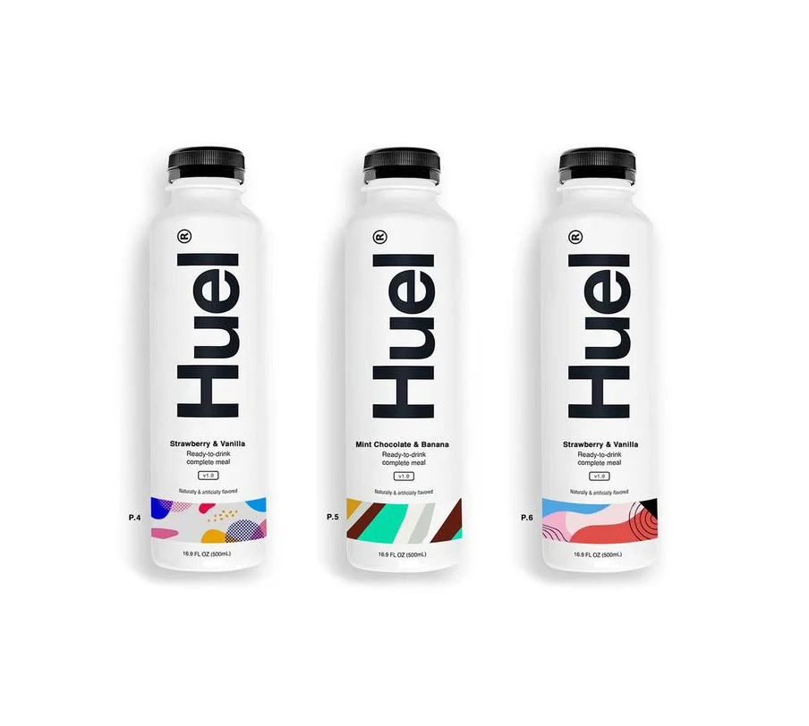
A cylindrical white bottle commands the center of the composition, its label dominated by the brand name 'Huel' rendered in bold, vertically oriented black typography. The packaging identifies the flavor as Salted Caramel and displays key nutritional metrics—22g of protein and 26 vitamins and minerals—alongside plant-based and gluten-free claims, while caramel-colored cubes flank the container on an ochre surface.
Visual interest derives from the deliberate juxtaposition of industrial packaging minimalism against the organic, tactile quality of the stacked confectionery. The color palette creates a cohesive narrative where the warm background echoes the amber hue of the caramel visible through the bottle’s shoulder, reinforcing the flavor profile without relying on complex imagery. This specific iteration balances clinical nutritional data presentation with an appetizing, almost sculptural arrangement that elevates the product from mere sustenance to a lifestyle object.

Art directors analyzing food photography trends would examine this composition to understand how prop styling can enhance product desirability through textural contrast. Packaging designers might study the typographic hierarchy to see how vertical branding integrates with horizontal nutritional information within a constrained label space. Marketing teams could reference the color psychology at play here when developing campaigns for health-conscious consumers who still prioritize sensory satisfaction.