Huel Protein Shake Bottle
Topics
Details
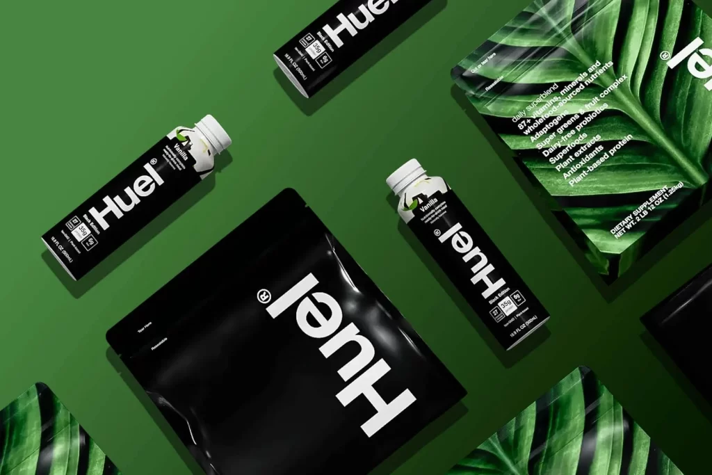
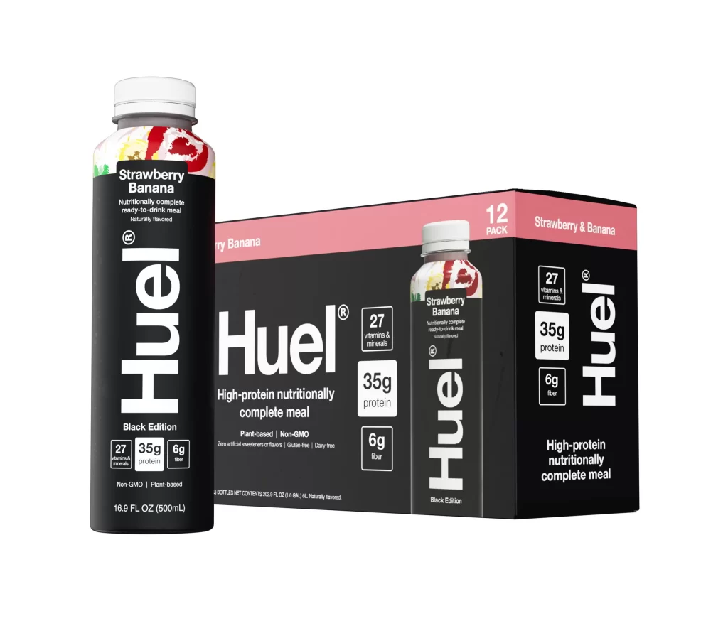
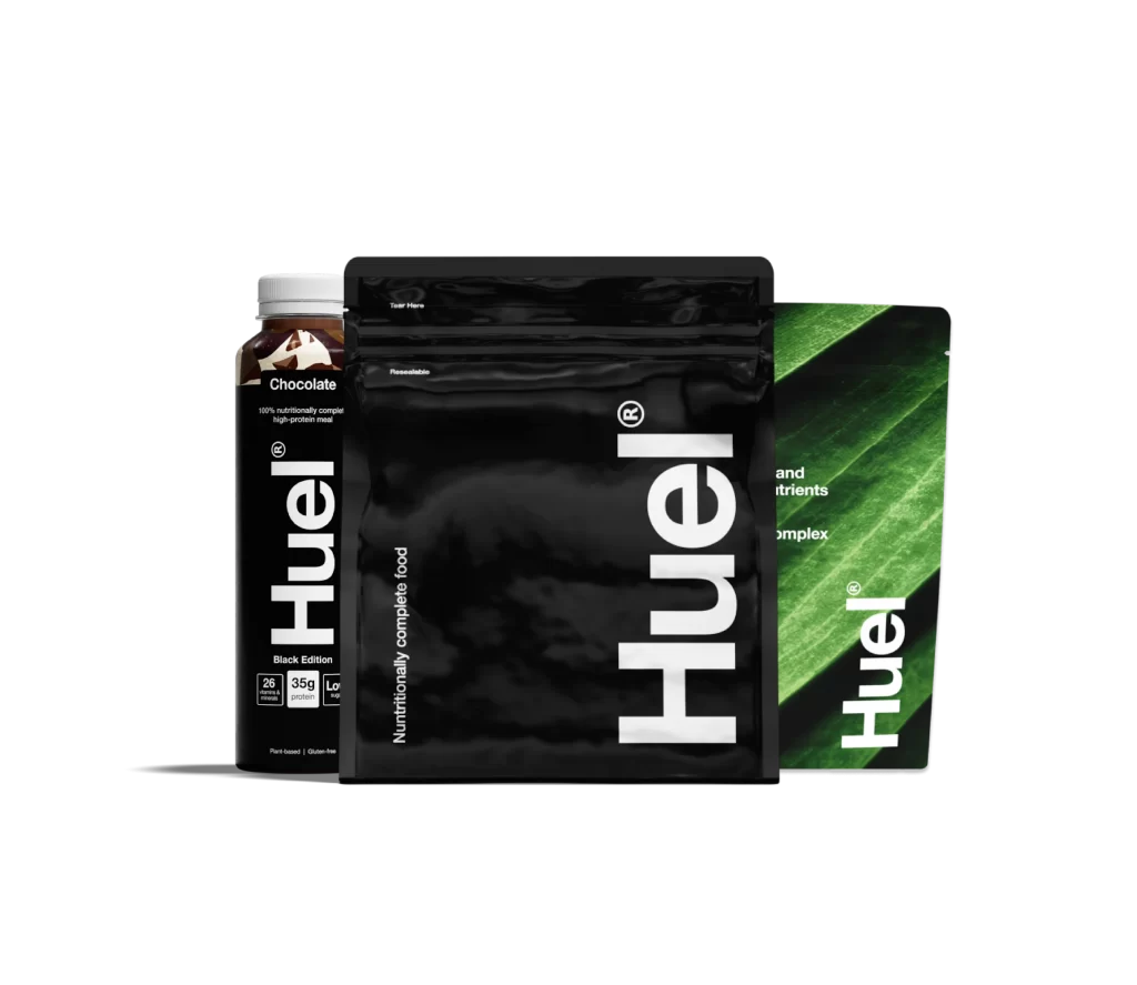
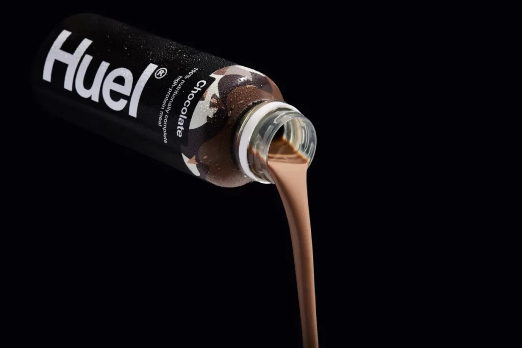
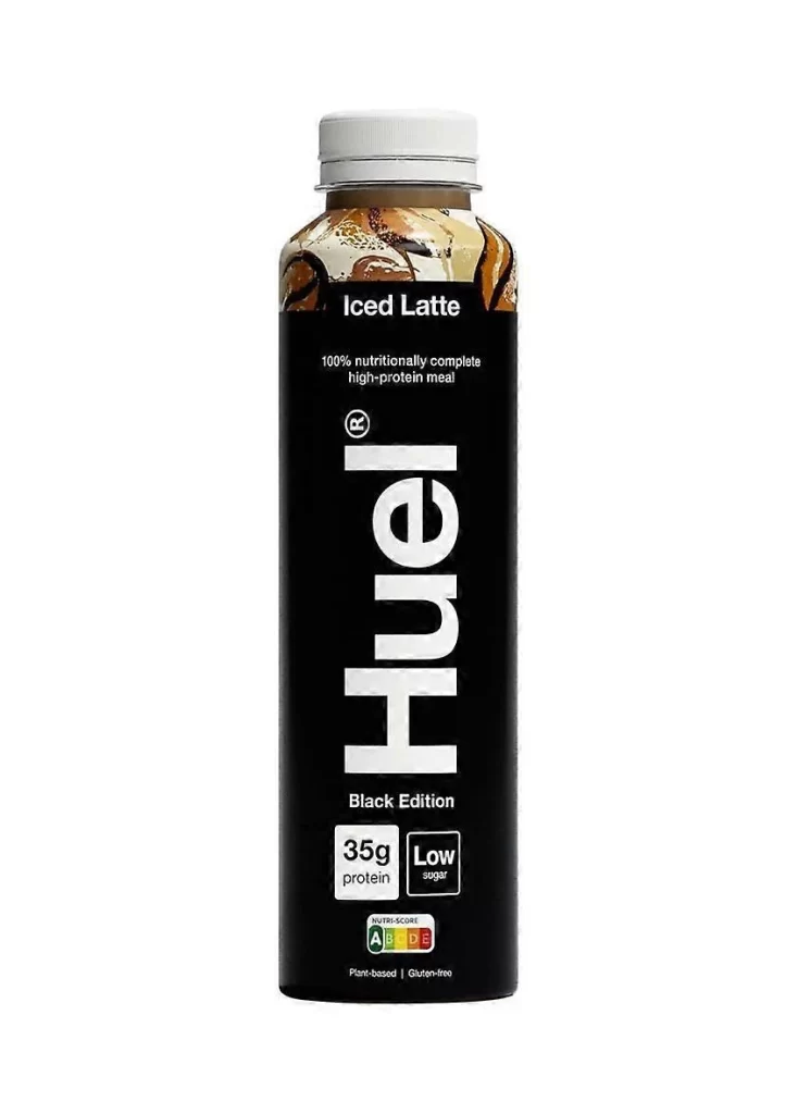
A tall, cylindrical black bottle stands vertically with a white screw cap sealing the top. The label features bold white 'Huel' lettering running vertically down the center, with 'Iced Latte' printed above and 'Black Edition' below in smaller text. Near the bottom, two rectangular boxes display '35g protein' and 'Low sugar', while a colorful Nutri-Score badge sits just beneath them.
Visual hierarchy is masterfully executed through scale and weight, drawing the eye immediately to the brand name before guiding it through the product specifications. The inclusion of the Nutri-Score ‘A’ rating and dietary badges for plant-based and gluten-free attributes adds layers of information without cluttering the composition. Such a layout demonstrates how negative space can be utilized to emphasize key selling points while maintaining a premium, modern aesthetic.
Brand strategists might analyze this packaging to understand how color psychology and typographic choices communicate health-conscious values to a specific demographic. Packaging designers could deconstruct the balance between the photographic element at the top and the graphic elements below to inform their own beverage labeling projects. Marketing teams reviewing this reference would likely focus on how the ‘Black Edition’ sub-branding creates a distinct product line identity within a larger portfolio.