Huel Nutrition Shake Mix Pouch
Topics
Details
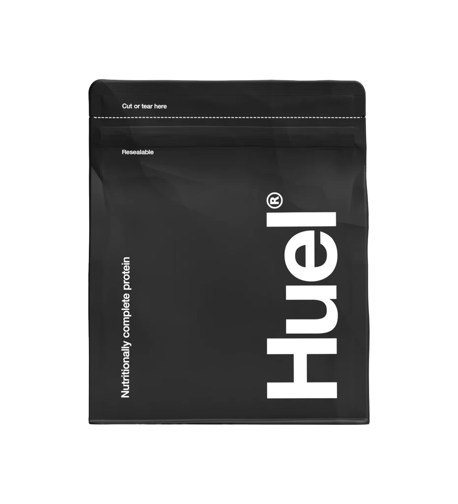
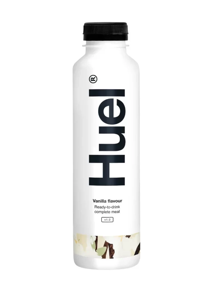
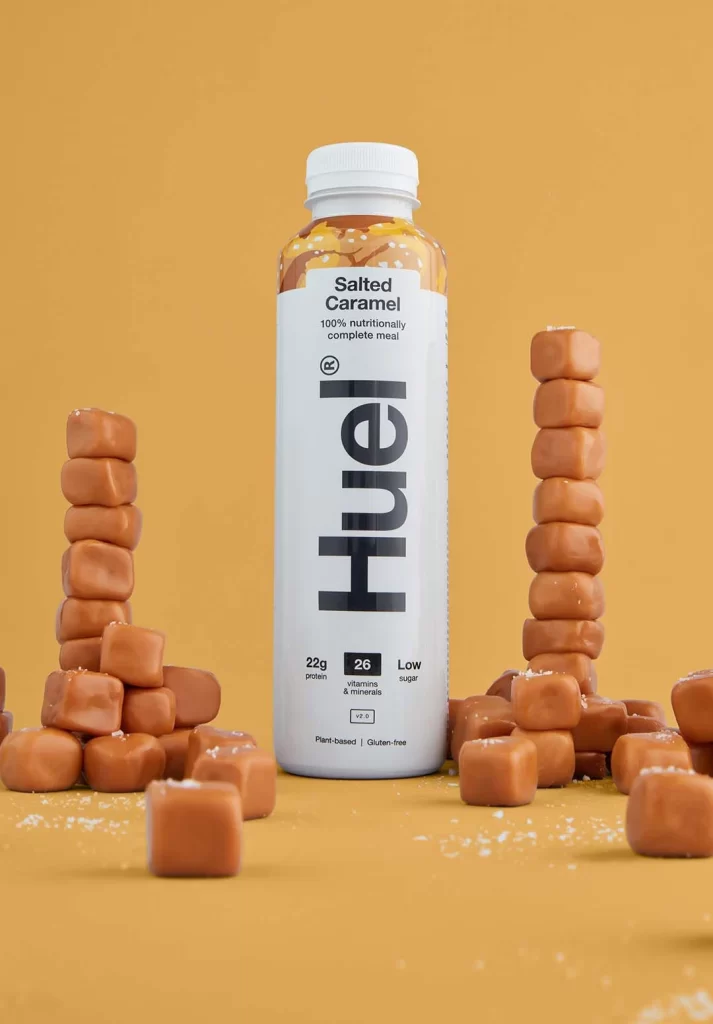
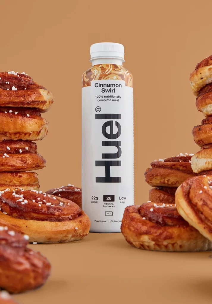
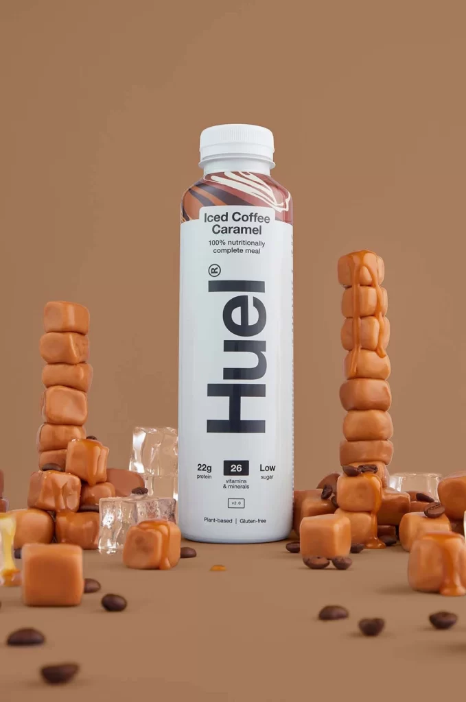
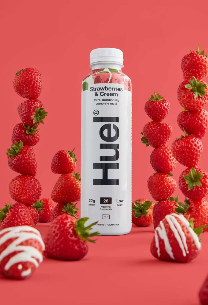
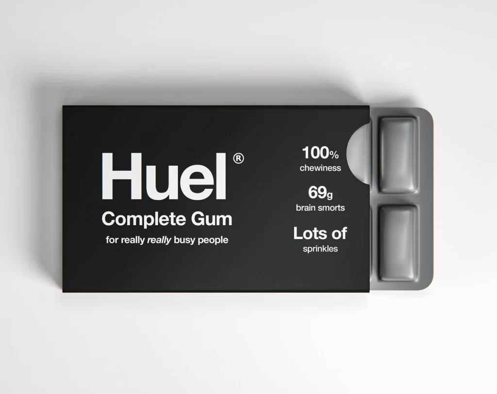
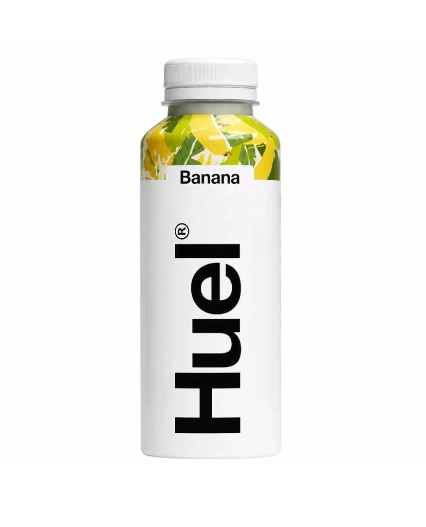
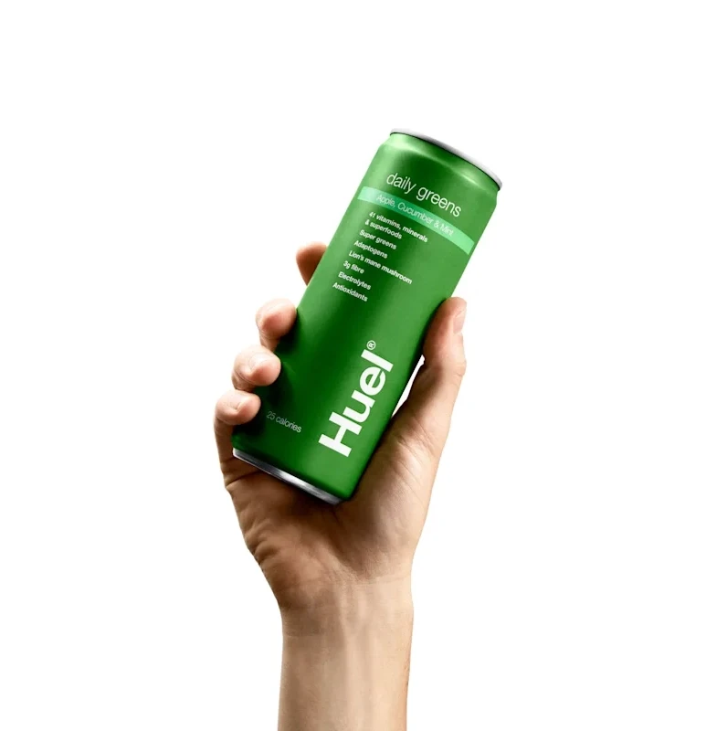
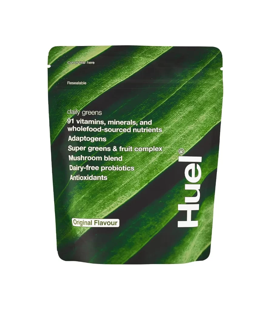
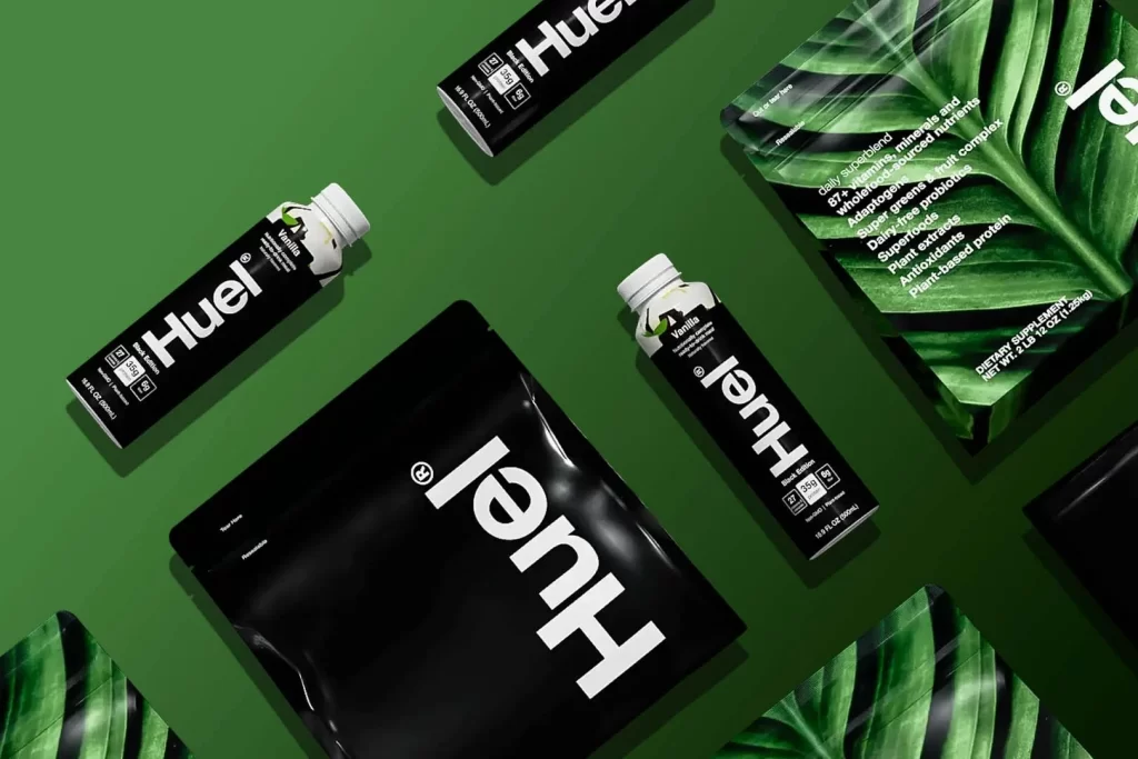
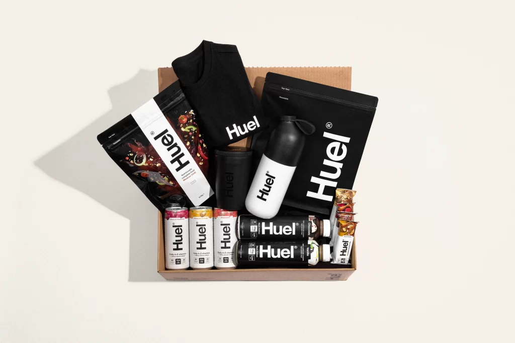
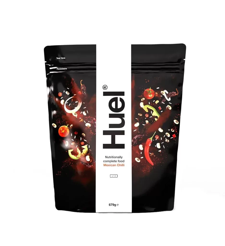
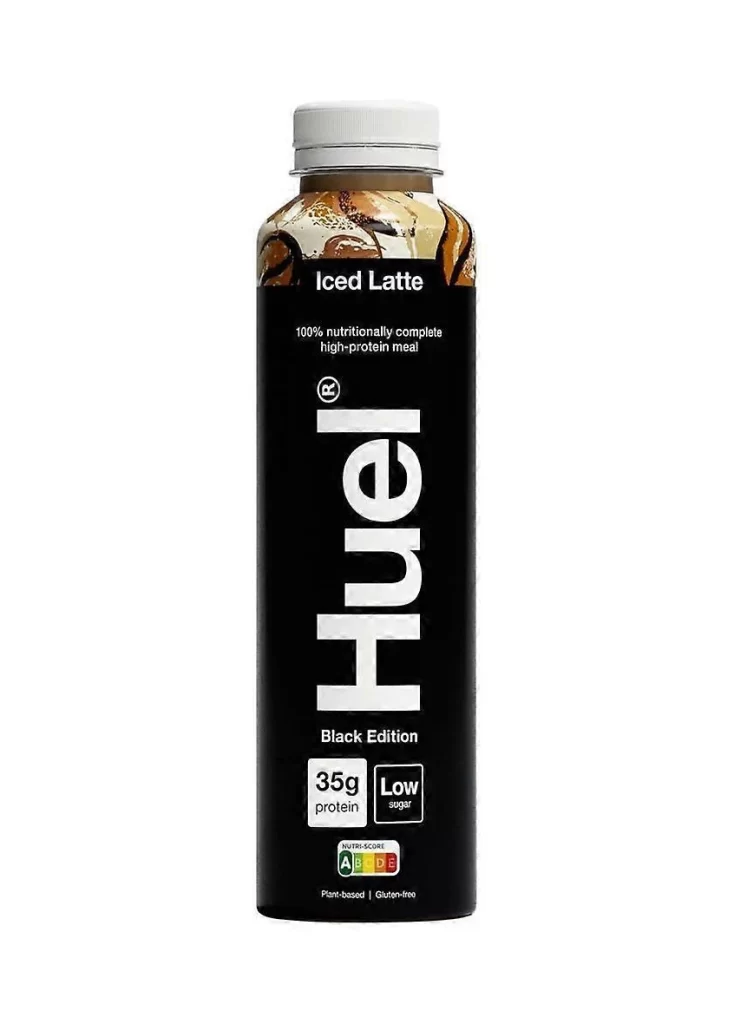
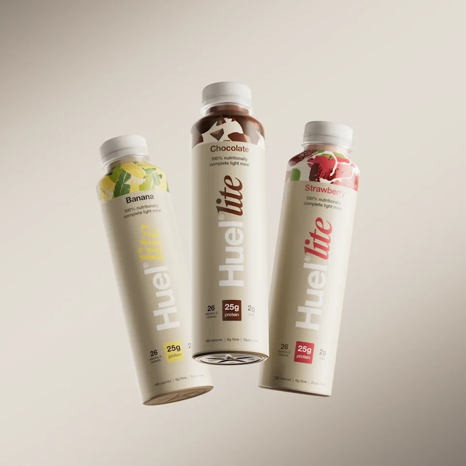
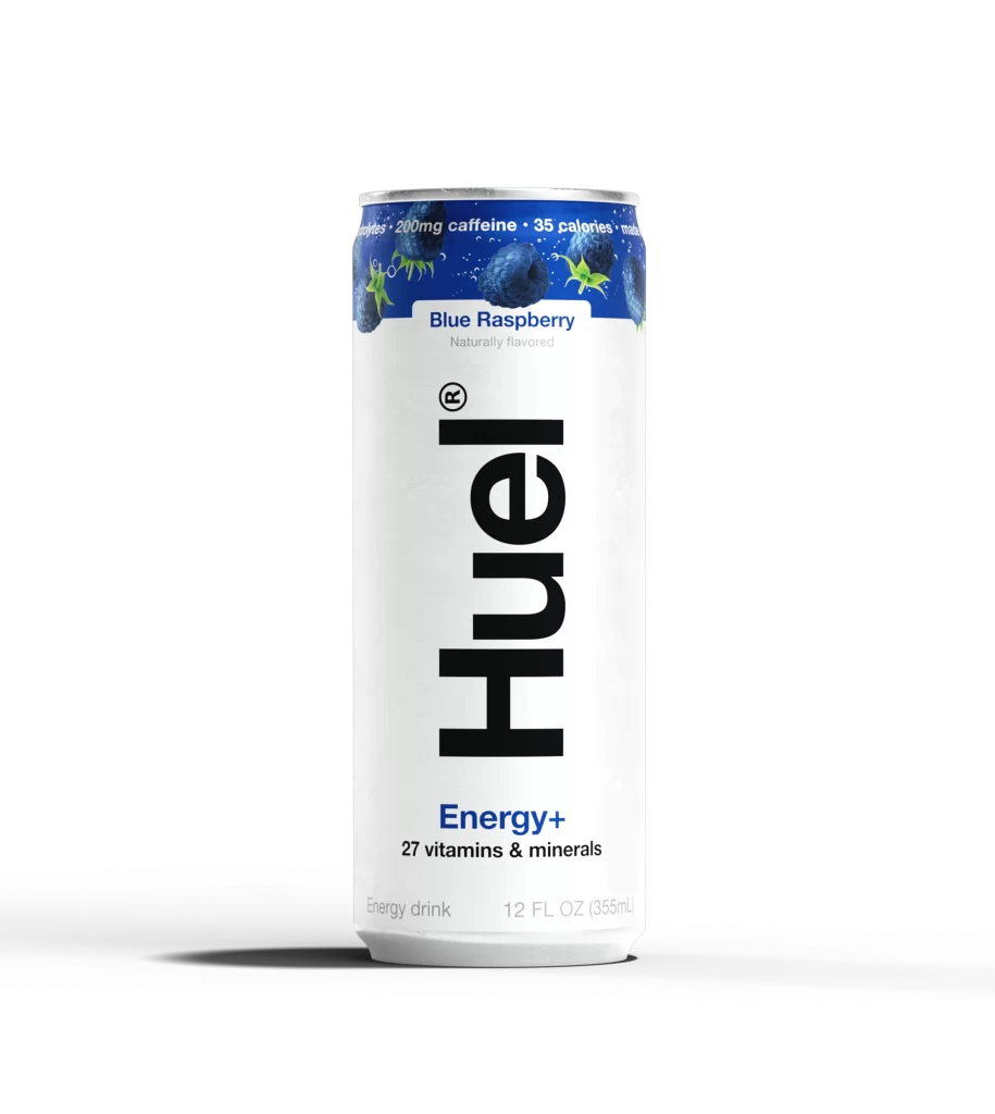
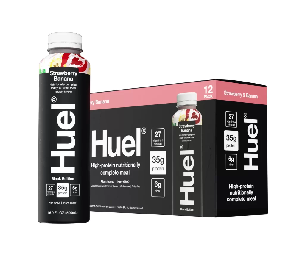
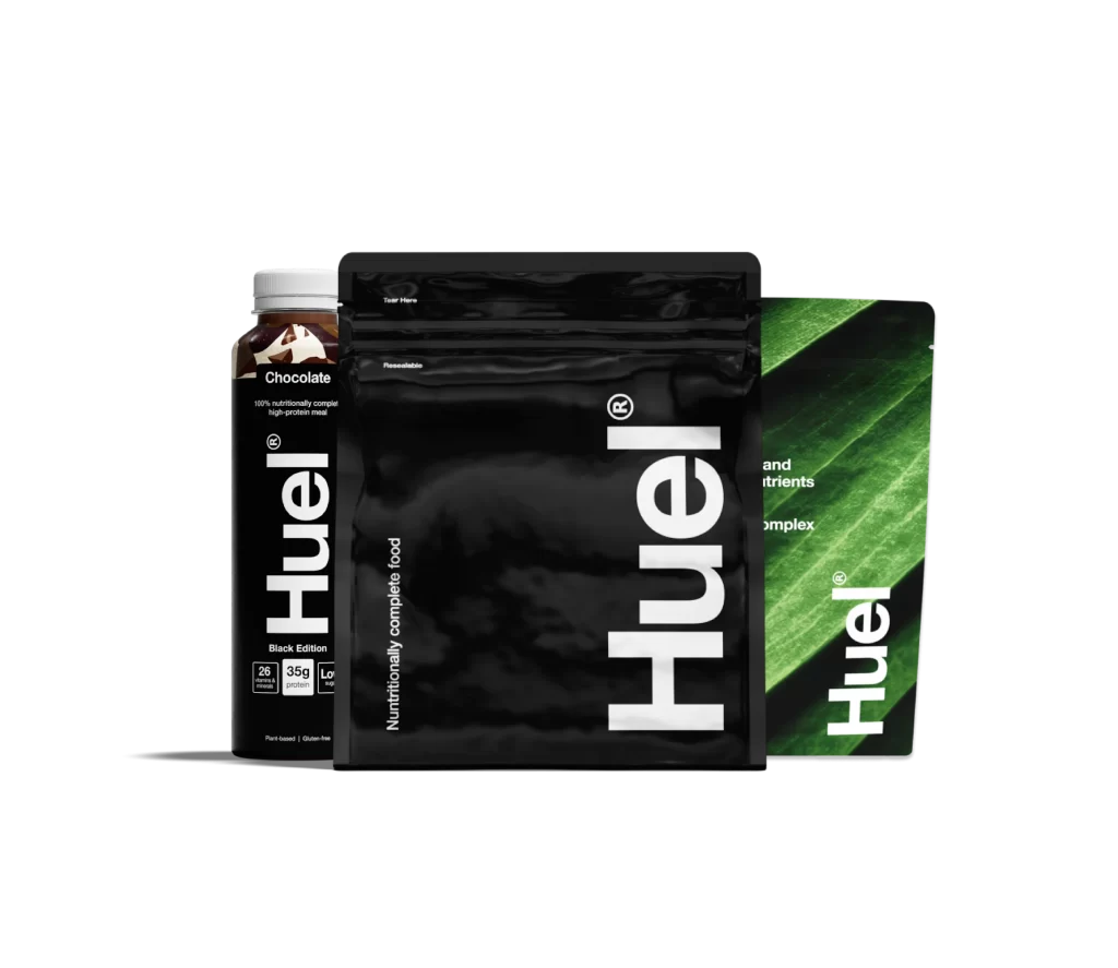
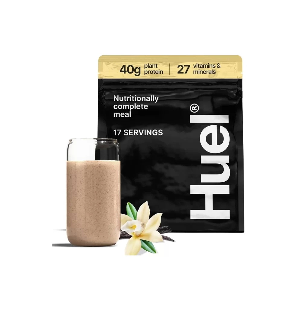
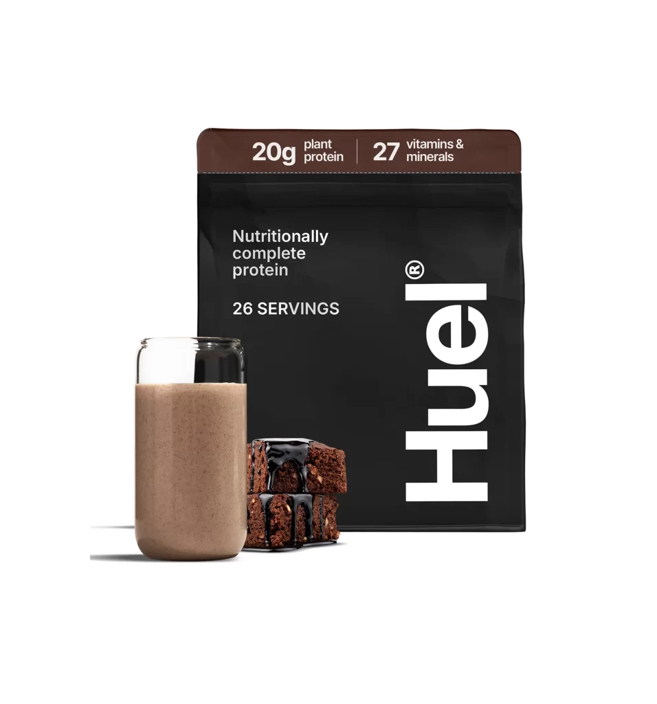
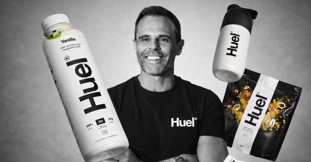
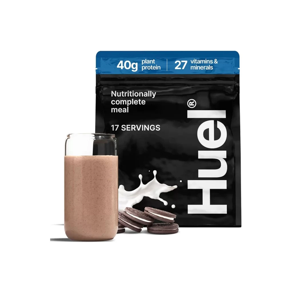
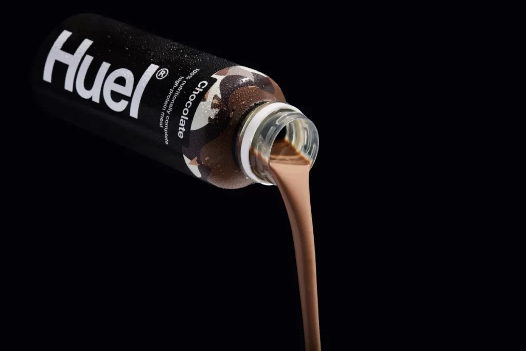
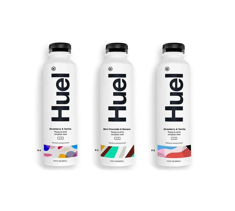
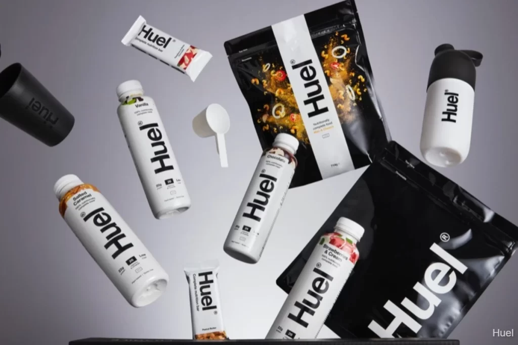
White cylindrical bottles and rectangular black pouches bearing the bold 'Huel' logotype float in a suspended arrangement across a light gray backdrop. The composition features matte black shaker cups, a white scoop, and sealed bars scattered among the nutrition products, all illuminated by soft, even studio lighting that highlights the contrast between the glossy bottle surfaces and the textured powder packaging. Each item displays minimalist typography with flavor variants like Vanilla, Chocolate, and Salted Caramel visible beneath the prominent brand name.
Visual hierarchy emerges through the strategic use of monochrome packaging punctuated by minimal color accents—amber tones on the salted caramel bottle, deep browns for chocolate variants, and red-pink hues indicating strawberry cream. The typographic system relies on heavy black lettering against stark white fields, creating immediate brand recognition across diverse product formats from the scoop nestled among items to the resealable pouch structures. This systematic approach to packaging design demonstrates how consistent branding elements can unify disparate product shapes while maintaining clear flavor differentiation through secondary visual cues.
Product photographers studying controlled levitation compositions will find valuable lessons in the spatial distribution and shadow placement throughout this arrangement. Brand identity designers examining cohesive packaging systems across multiple SKUs can analyze how logo scaling adapts to different surface geometries without losing legibility. Marketing teams developing lifestyle imagery for health-food brands might reference the balance between clinical precision and approachable warmth achieved through careful prop selection and color temperature choices.