Title

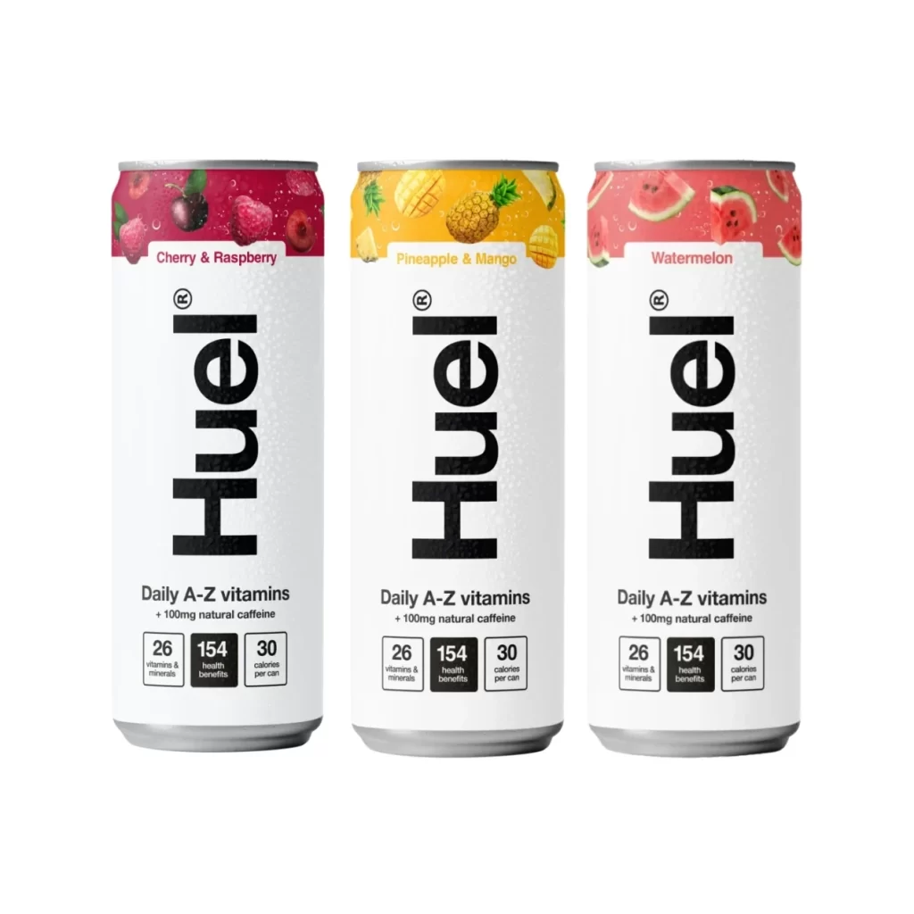
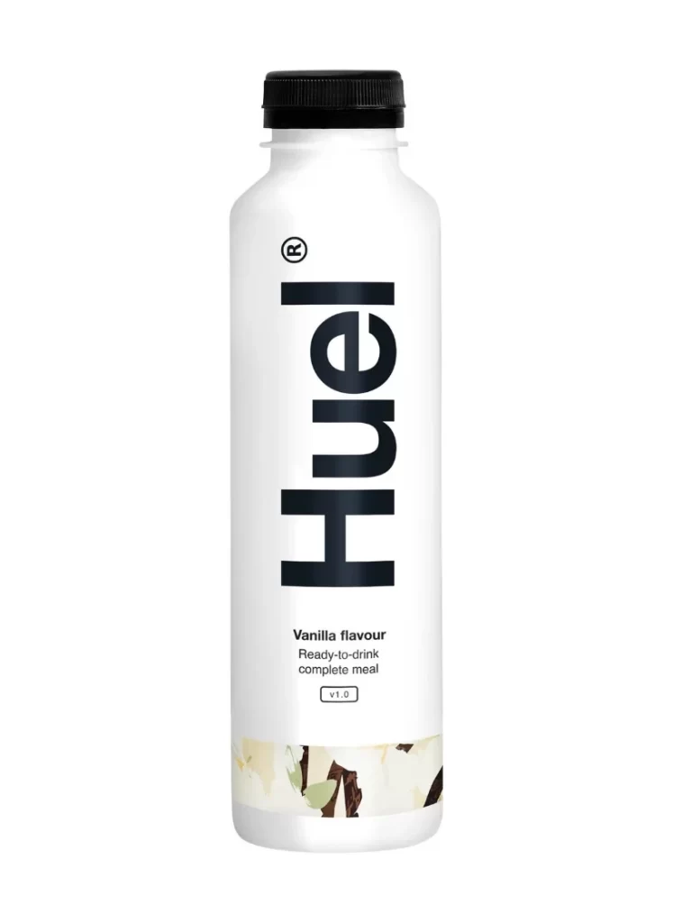
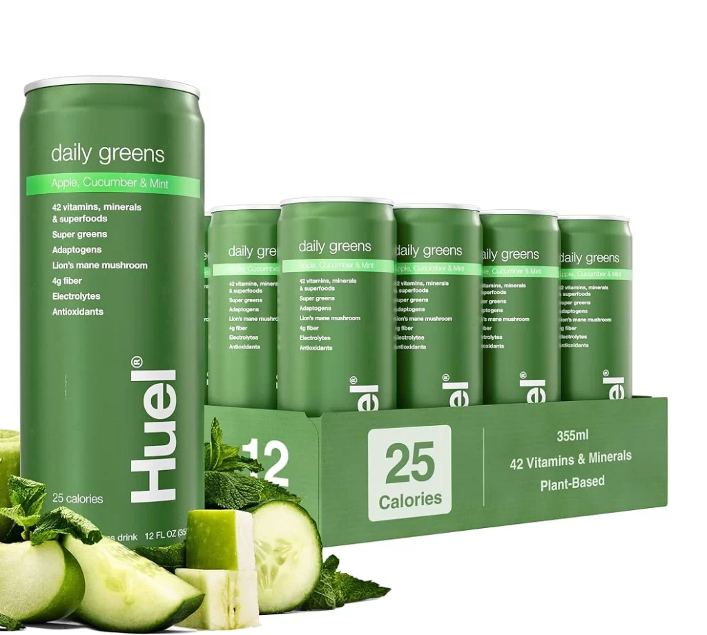
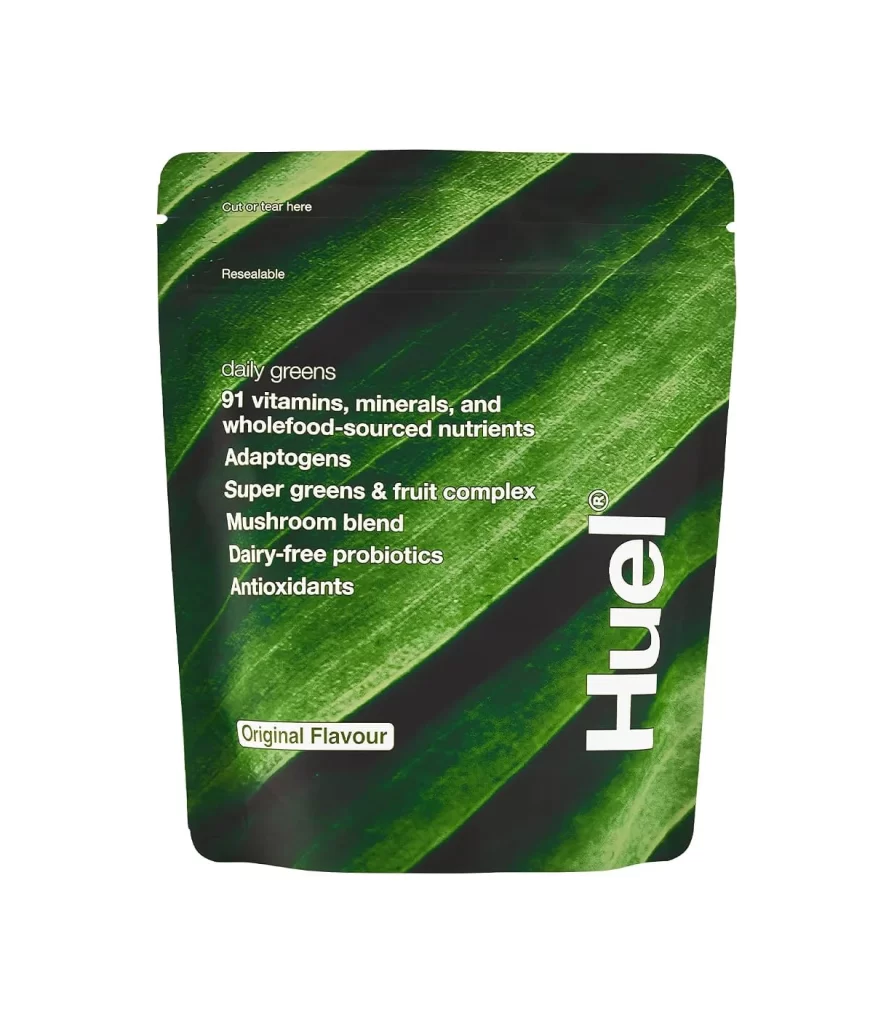
Huel Meal Replacement Product Display Packaging


Topics

HuelMeal Replacement

Details

Uploaded user: Leo

The word 'Huel' dominates the frame in a bold, geometric sans-serif typeface rendered in untextured white. A small registered trademark symbol sits neatly to the upper right of the final 'l', completing the composition in a centered, head-on view against a deep black background.
Visual impact here comes from the absolute simplicity of the color palette and the confident weight of the typography. There are no gradients, shadows, or decorative elements to distract the eye, which forces focus entirely on the brand’s identity. This minimalist approach suggests modernity and clarity, making the logo feel both authoritative and accessible at a glance.

Brand strategists might study this layout to understand how negative space can elevate a logotype’s presence. Packaging designers could use this as a baseline for testing how their own product labels perform under high-contrast conditions. Even students learning about corporate identity systems would find value in analyzing how such a clean execution communicates professionalism without unnecessary ornamentation.