Huel Protein Powder Pouch
Topics
Details
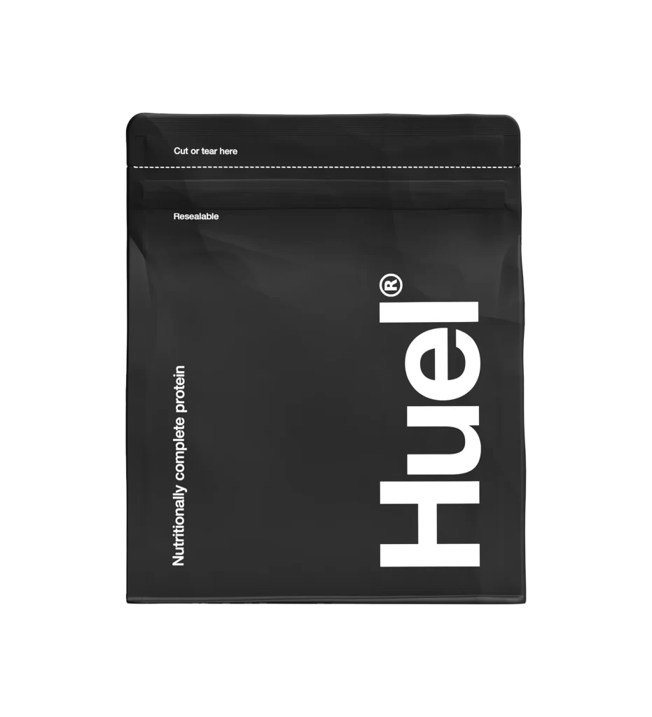
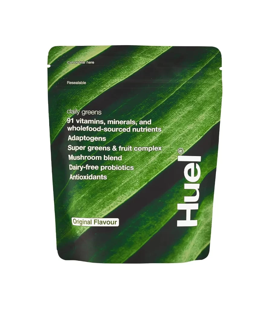
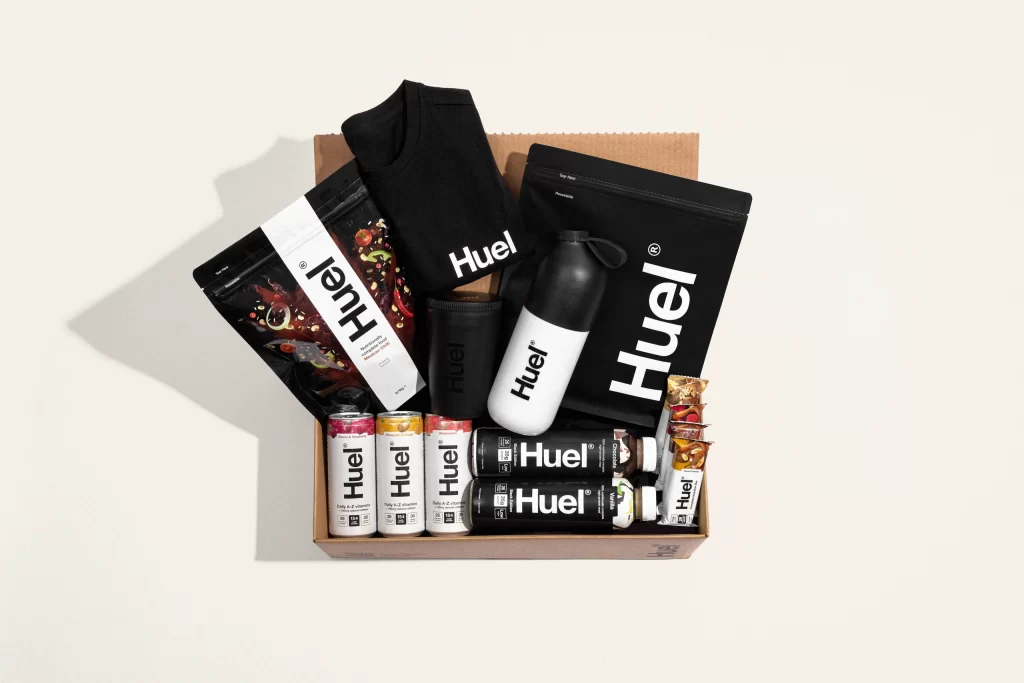
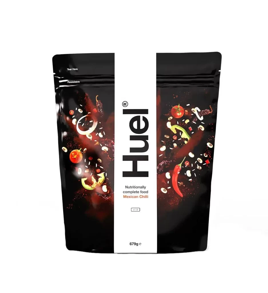
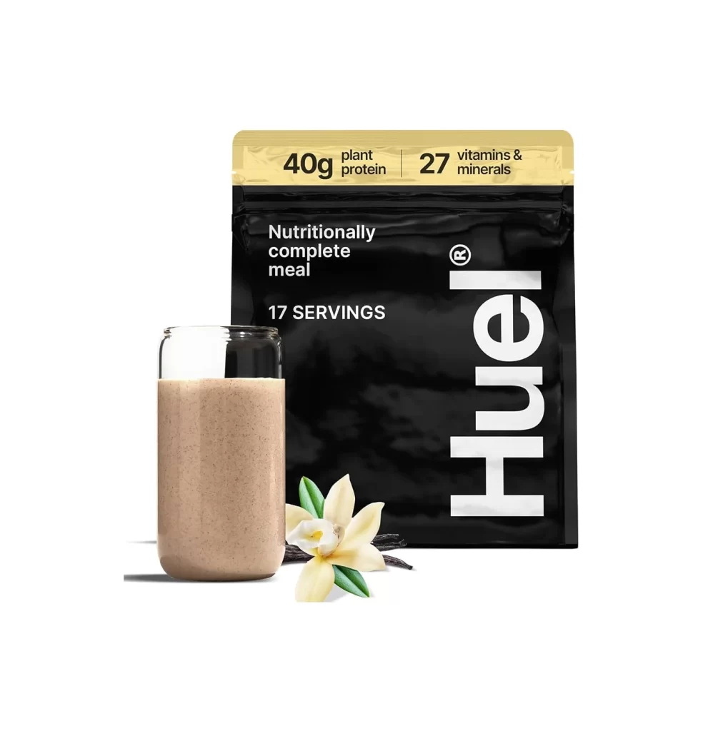
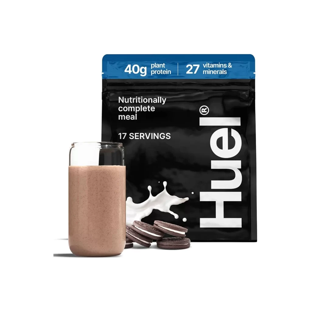
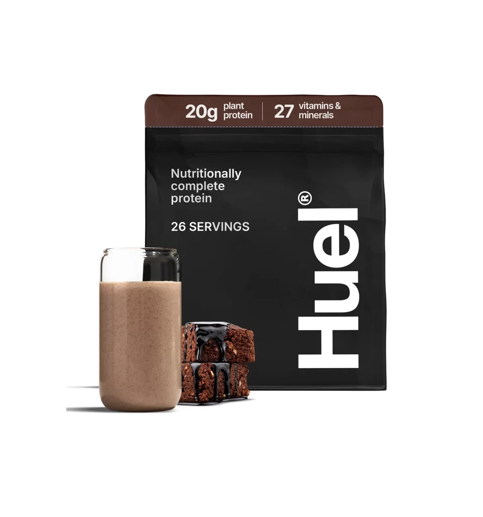
A matte black Huel protein powder pouch dominates the frame, featuring bold white typography that reads 'Huel' vertically along the right side and 'Nutritionally complete protein' in smaller text to the left. The brown header strip displays nutritional claims—20g plant protein and 27 vitamins & minerals—in crisp white lettering, while the text '26 SERVINGS' appears below. To the left of the packaging, a clear glass filled with a light brown protein shake stands beside two stacked chocolate brownies drizzled with dark icing, all illuminated by soft, even lighting that casts subtle shadows on the clean white surface.
Visual hierarchy operates through deliberate scale manipulation, where the oversized vertical logotype dominates the composition while secondary information recedes into smaller, precisely aligned text blocks. The material contrast between the pouch’s flat, light-absorbing black finish and the reflective glass surface creates tactile differentiation, while the brown accent strip at the top establishes color continuity with the food items. Minimalist composition strategies are evident in the generous negative space surrounding the product trio, allowing each element to maintain distinct visual weight without clutter.
Commercial photographers studying beverage and supplement packaging arrangements would examine this setup for its balanced product-to-prop ratios and lighting techniques that emphasize texture without harsh reflections. Brand identity developers could analyze the typographic weight distribution and color palette integration between packaging graphics and physical product representation. E-commerce visual merchandisers might reference the spatial relationships between primary packaging, prepared serving suggestion, and flavor-indicating accessories to optimize their own product display compositions.