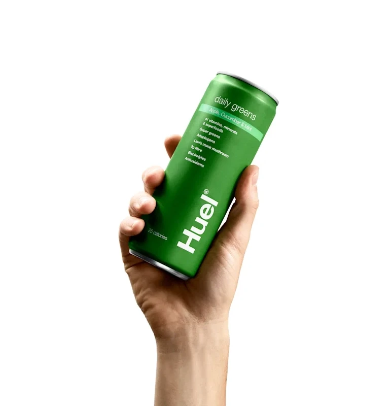
Huel Daily Greens Apple Cucumber Mint Can Packaging
Topics
Details
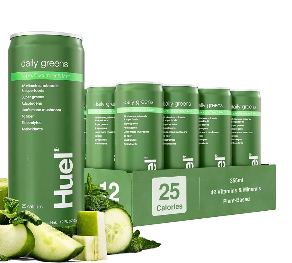
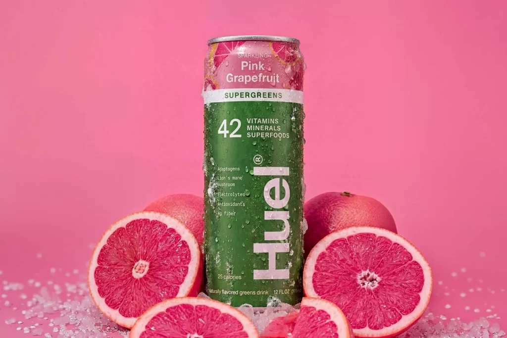
A deep forest green aluminum can with a matte finish sits at a slight diagonal angle within a human hand's grip, its surface bearing crisp white typography. The brand name 'Huel' appears in bold vertical lettering along the lower curve, while smaller text above lists 'daily greens,' 'apple Cucumber Mint' flavor, and additional product attributes including 41 vitamins and minerals. The hand holds the container against a white background.
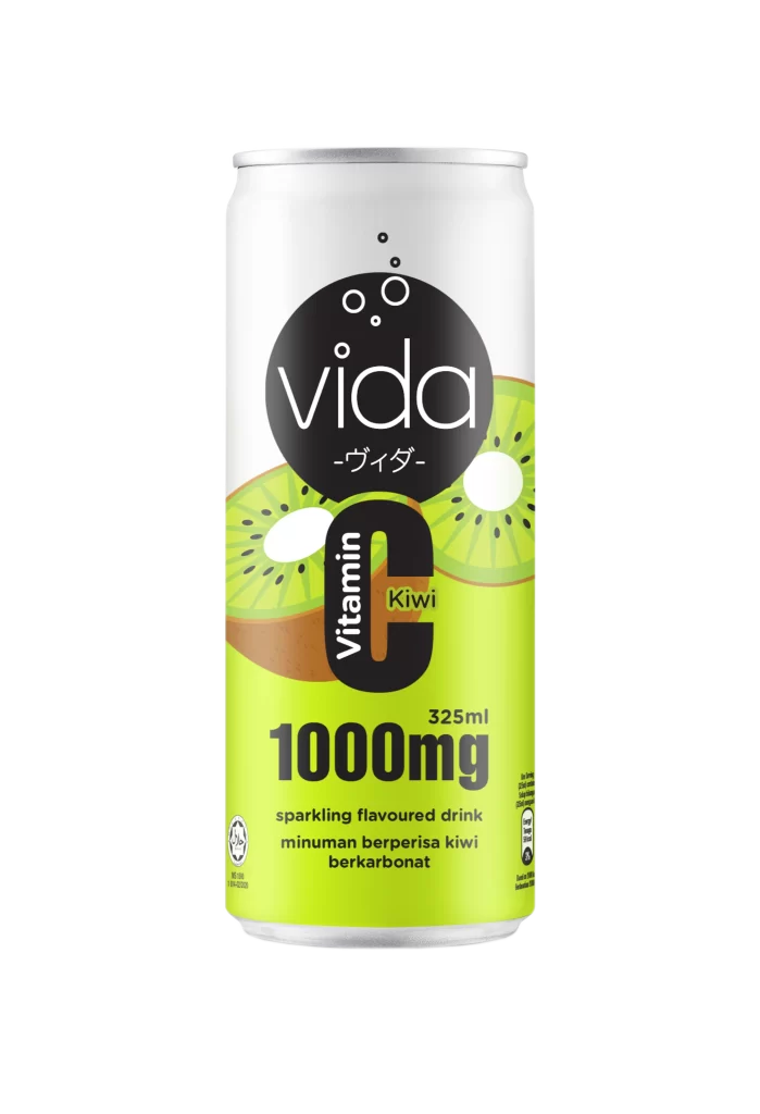
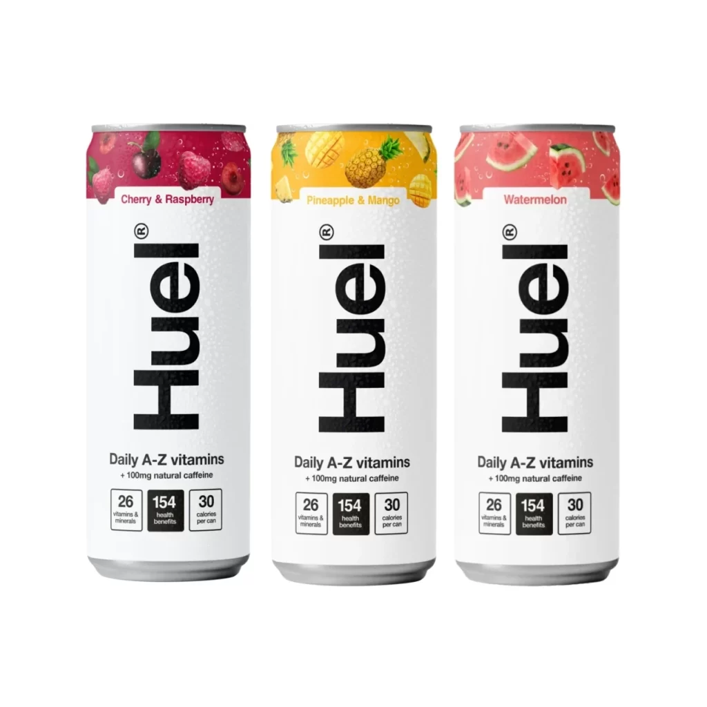
Minimalist aesthetics define this packaging approach, relying on high-contrast white ink against the saturated green substrate rather than complex illustrations or photographic elements. The typographic hierarchy creates clear visual scanning paths from the large brand mark upward through flavor and ingredient details, demonstrating effective information architecture for beverage containers. Such restrained color palettes and clean sans-serif choices communicate health-focused branding through simplicity rather than ornamentation.
Product photographers might study the hand positioning and finger placement to replicate natural grip poses for similar consumer goods mockups. Packaging designers could analyze the spatial distribution of text elements to understand how to balance mandatory regulatory information with marketing copy on curved surfaces. Brand strategists evaluating wellness market positioning would find value in examining how monochromatic schemes convey organic or nutritional product categories without explicit imagery.