Wrigley’s Doublemint Chewing Gum Packaging
Topics
Details
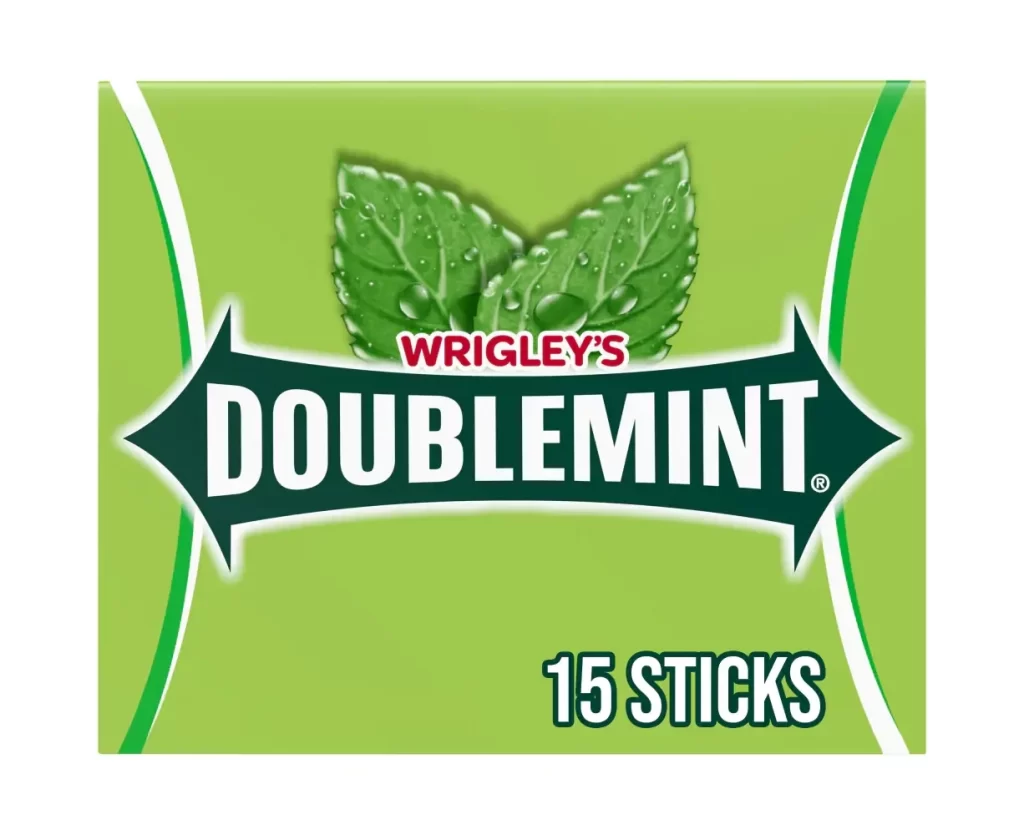
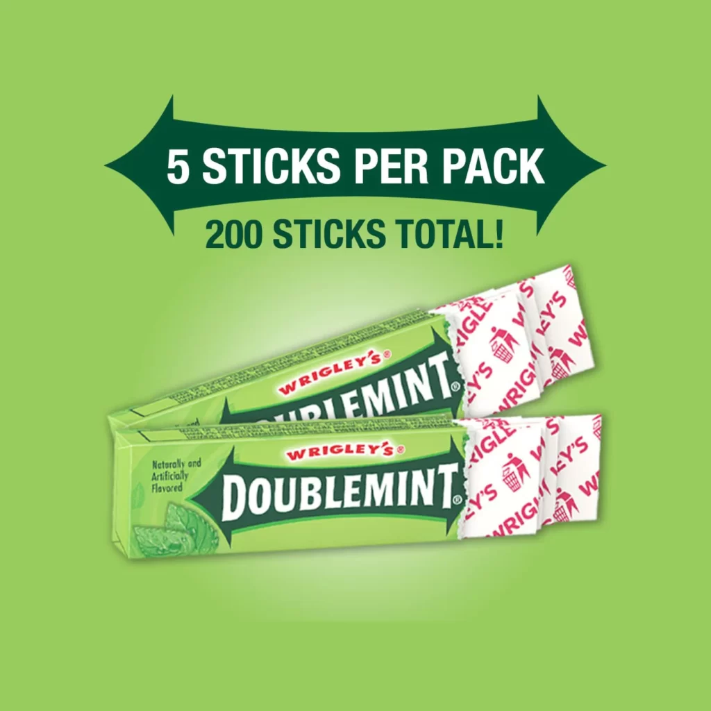
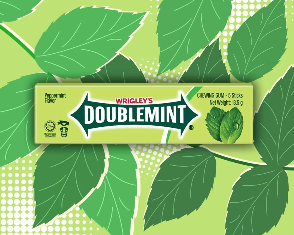
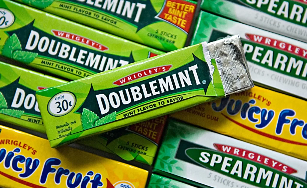
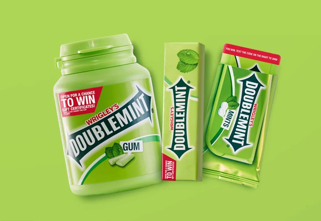
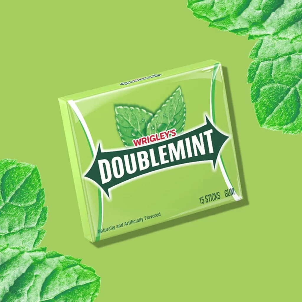
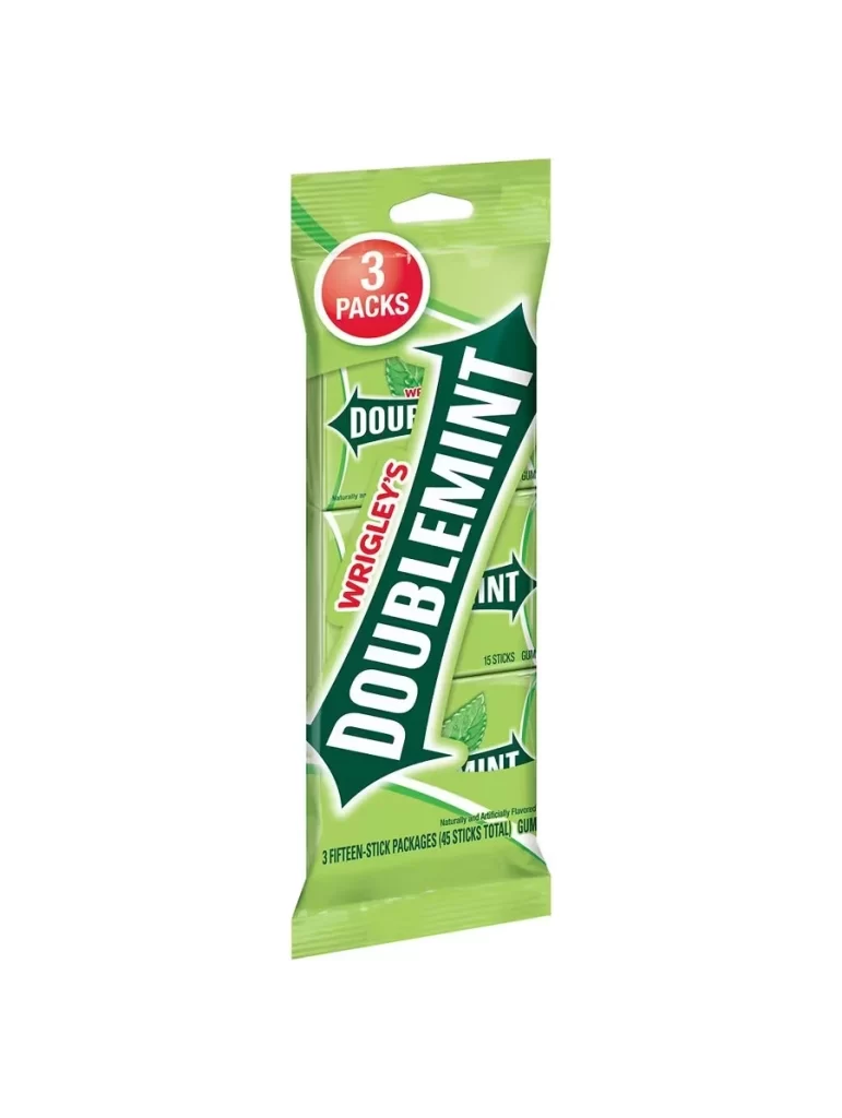
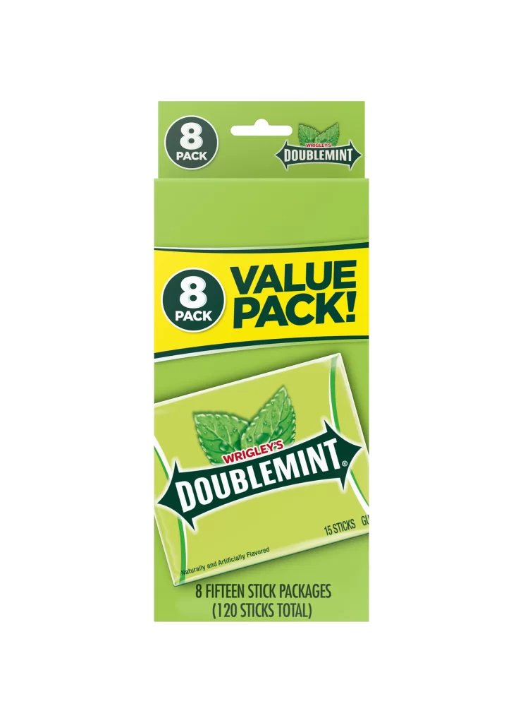
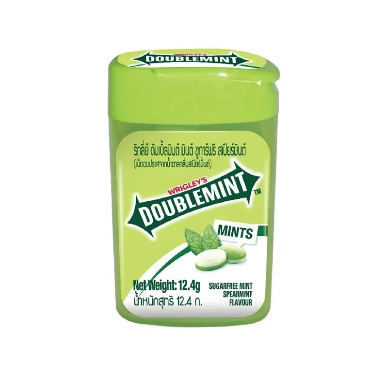
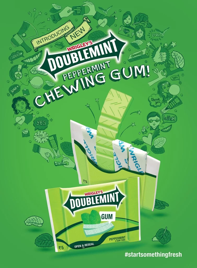
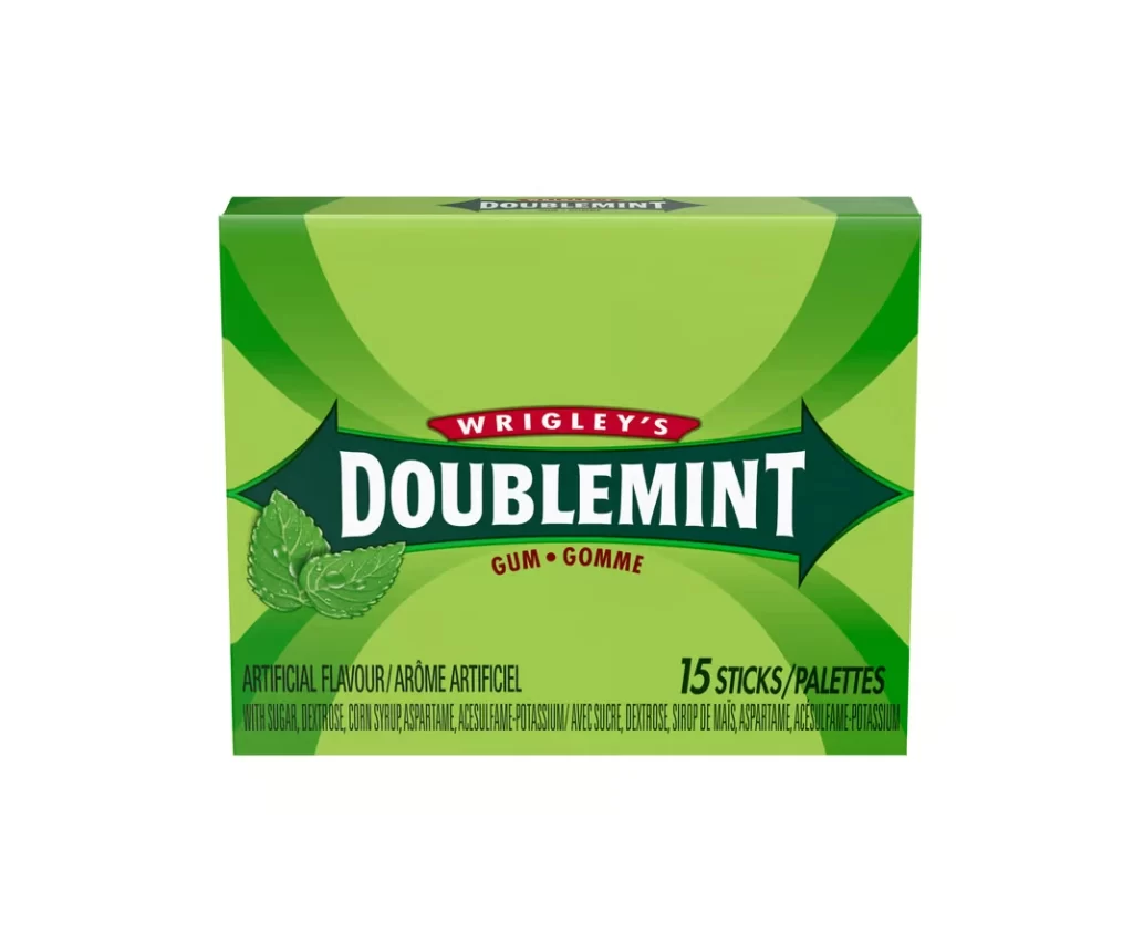
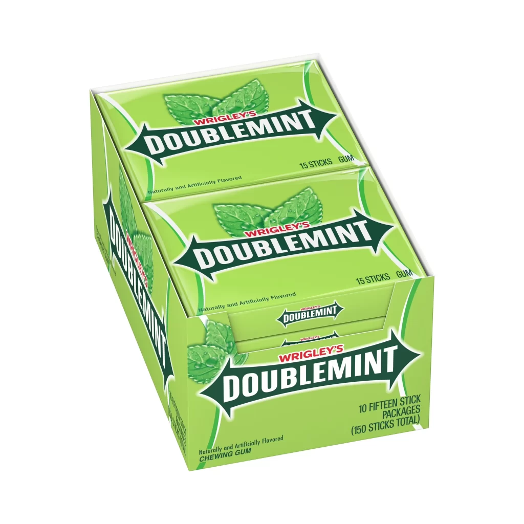
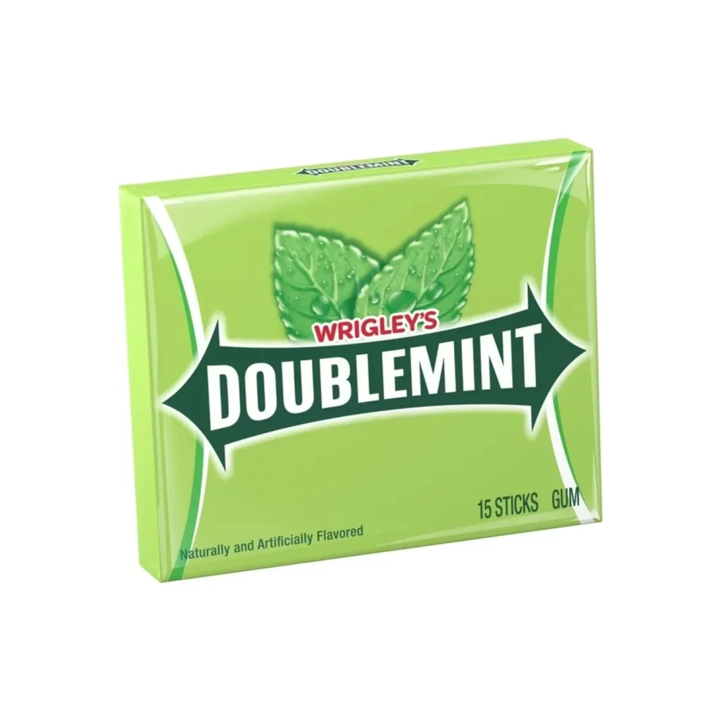
A vibrant lime-green field dominates the rectangular composition, framed by curved white and dark green lines that create a sense of dynamic containment. Centered within this background, two fresh mint leaves with visible water droplets sit above a dark green, arrow-shaped banner containing the brand name. The text 'WRIGLEY'S' appears in red sans-serif capitals above the larger white 'DOUBLEMINT' lettering, while '15 STICKS' anchors the lower right corner in dark green outlined type.
Visual emphasis derives from the high-contrast interplay between the saturated green backdrop and the stark white typography of the primary logo. The organic texture of the dewy leaves provides a naturalistic counterpoint to the geometric sharpness of the banner's pointed extremities. Such deliberate color coding immediately signals flavor identity while maintaining legibility across varying retail display conditions.
Brand historians might consult this artifact when documenting mid-century confectionery marketing strategies or analyzing typographic evolution in mass-market packaging. Packaging engineers could examine the spatial allocation of information elements to optimize shelf presence. Students of commercial design will find value in studying how botanical imagery reinforces product claims without textual explanation.