Wrigley’s Doublemint Gum Retina Box Packaging
Topics
Details
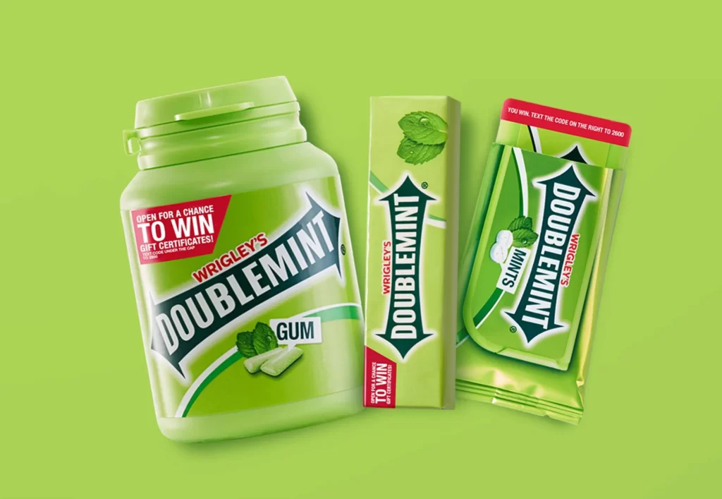
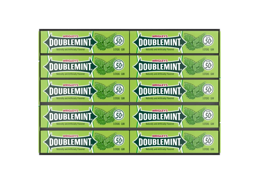
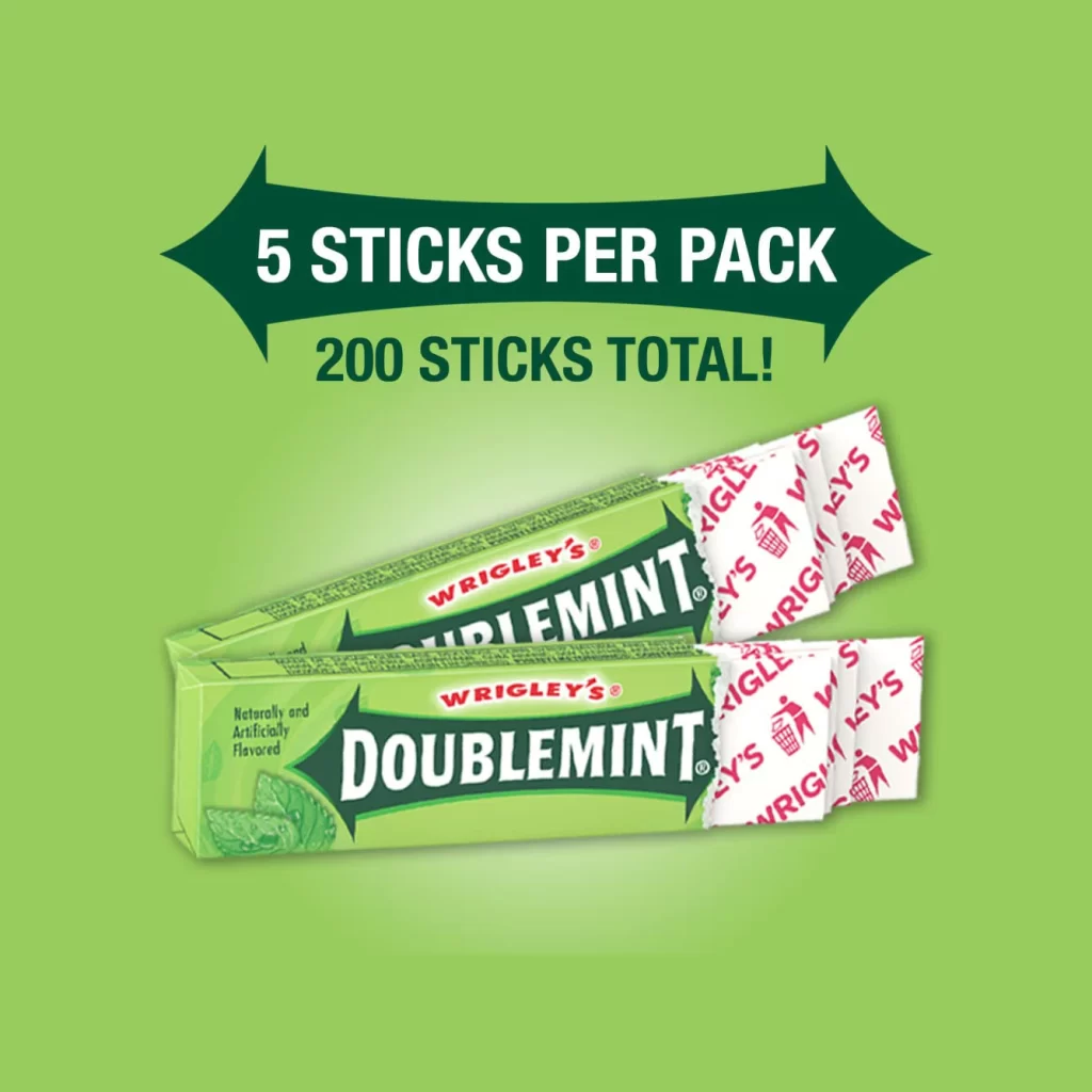
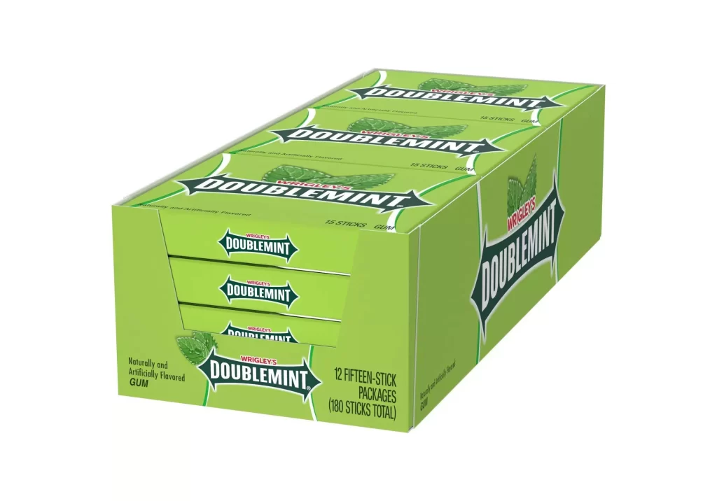
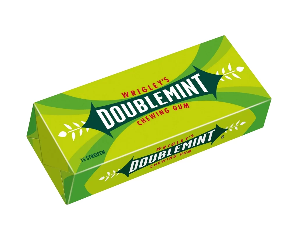
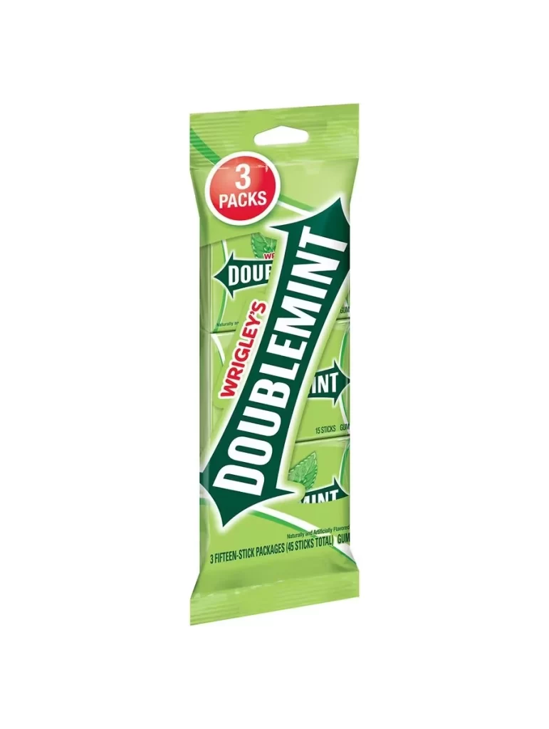
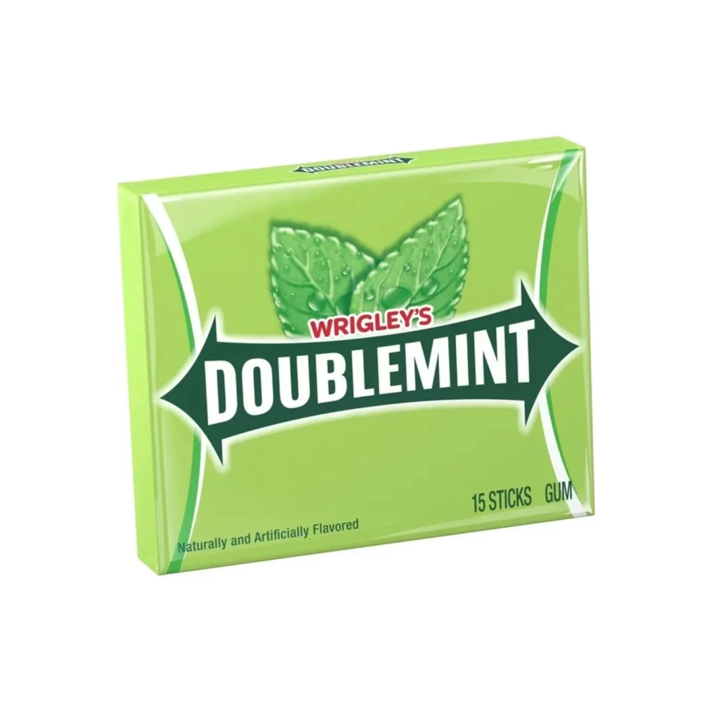
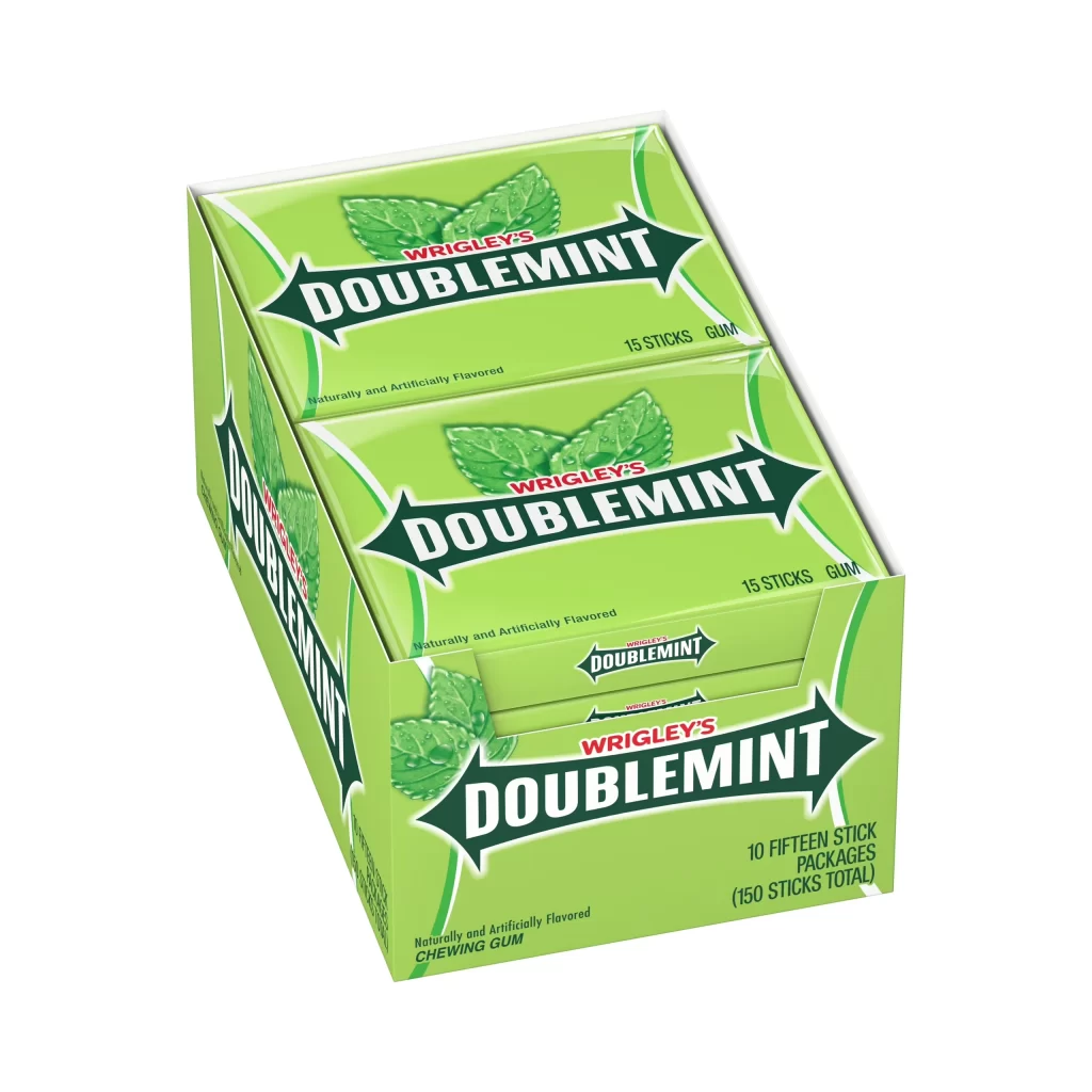
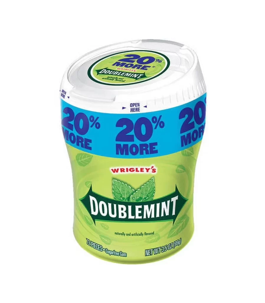
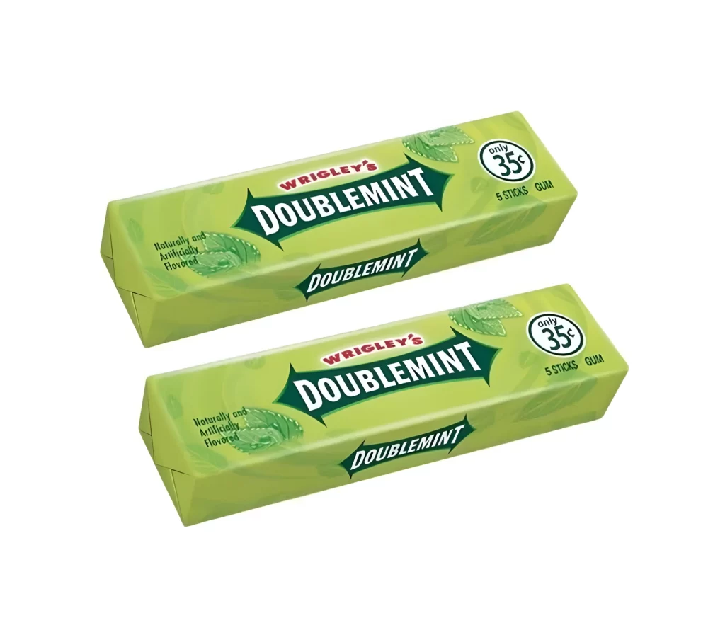
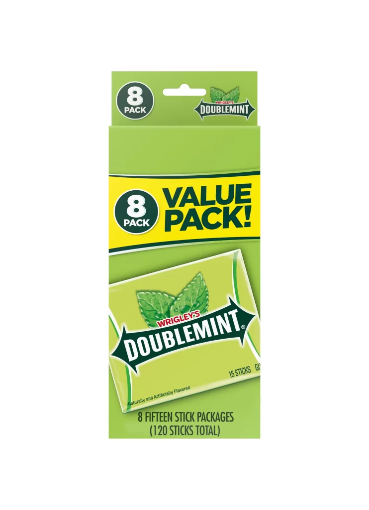
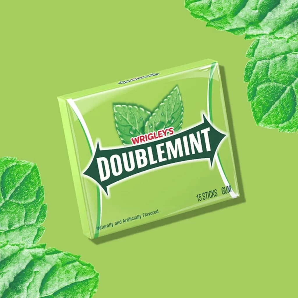
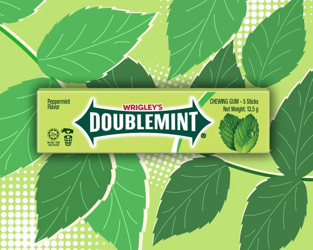
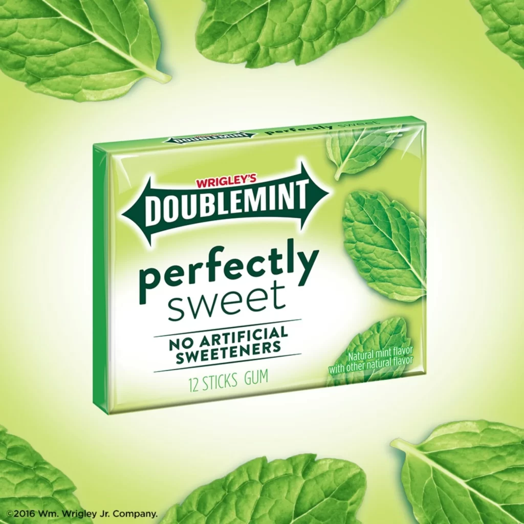
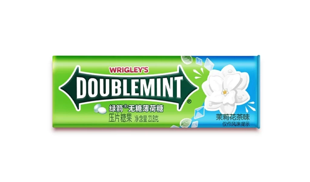
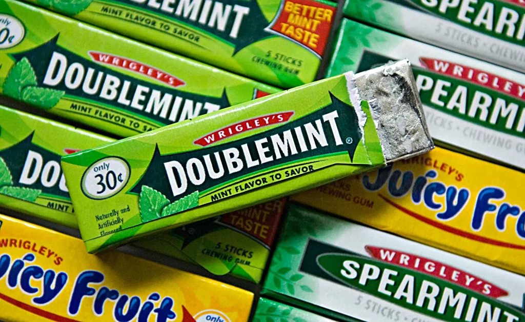
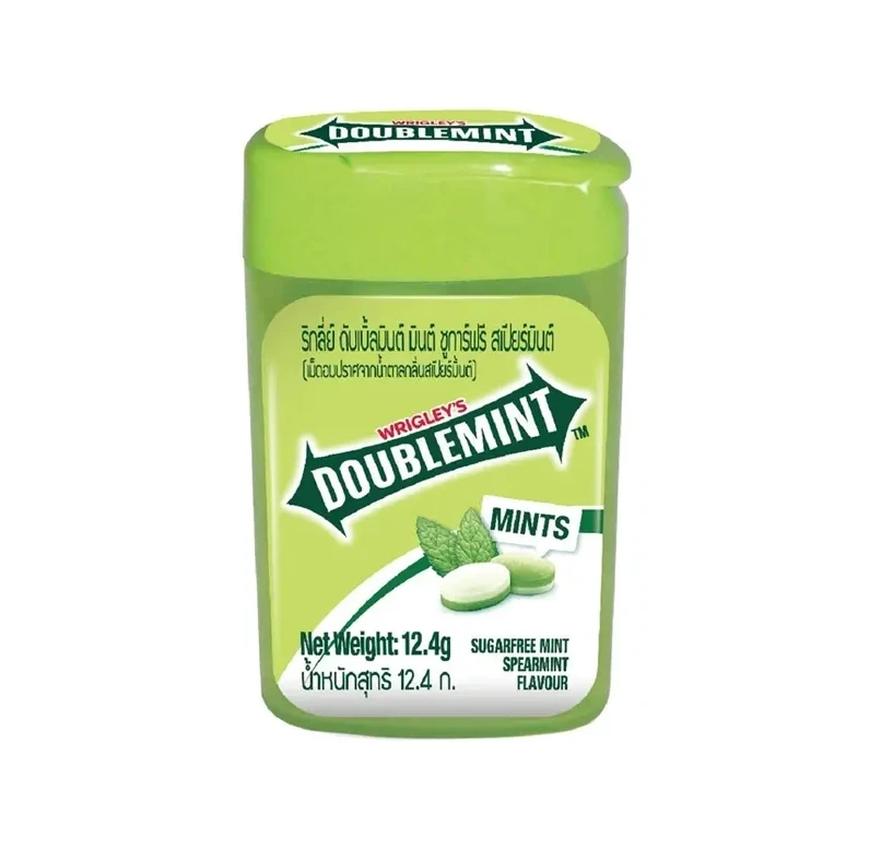
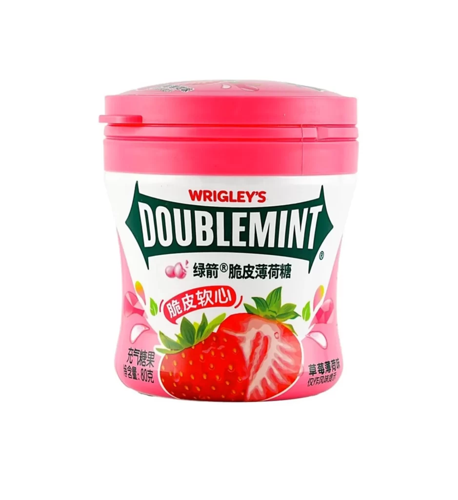
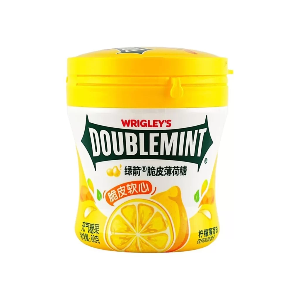
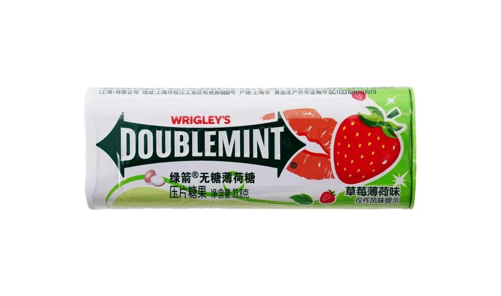
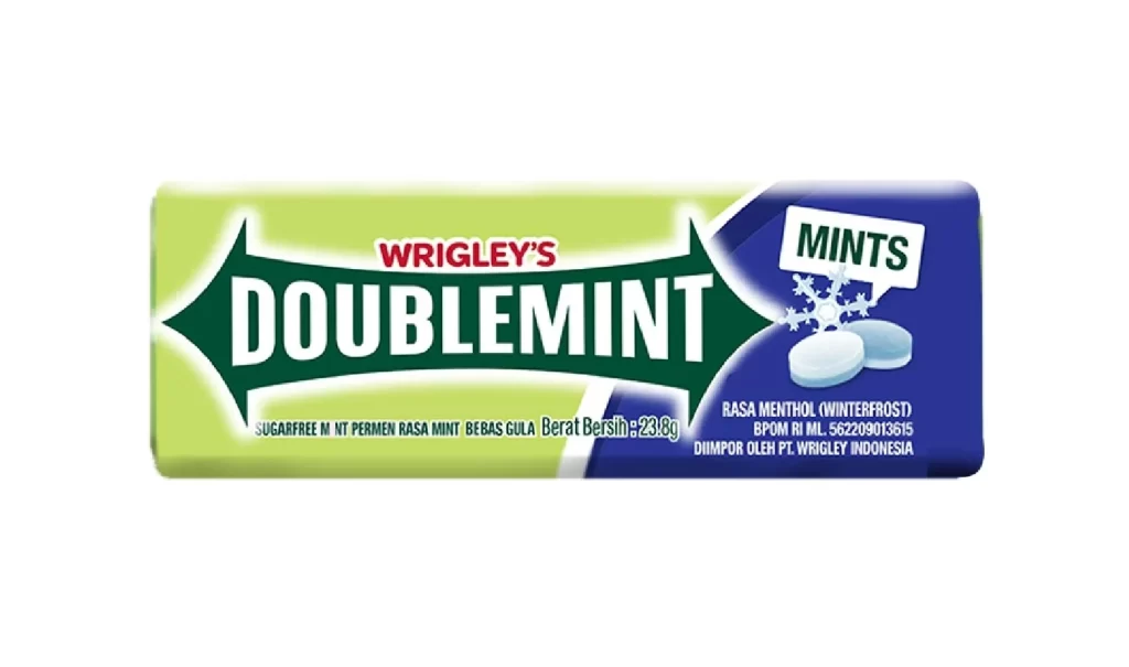
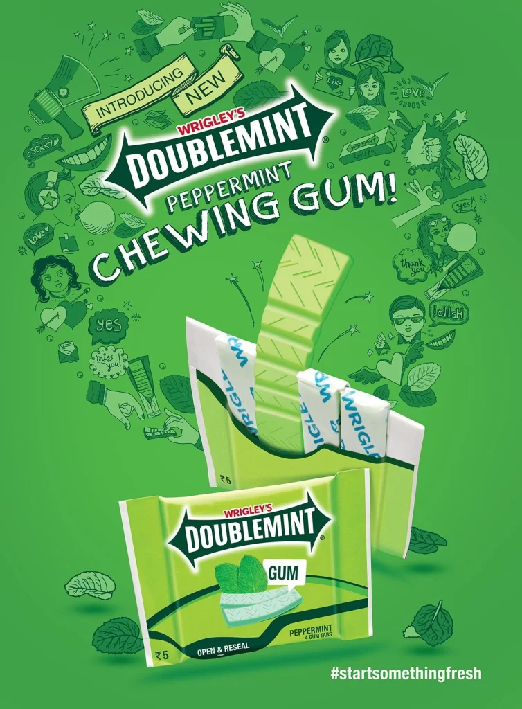
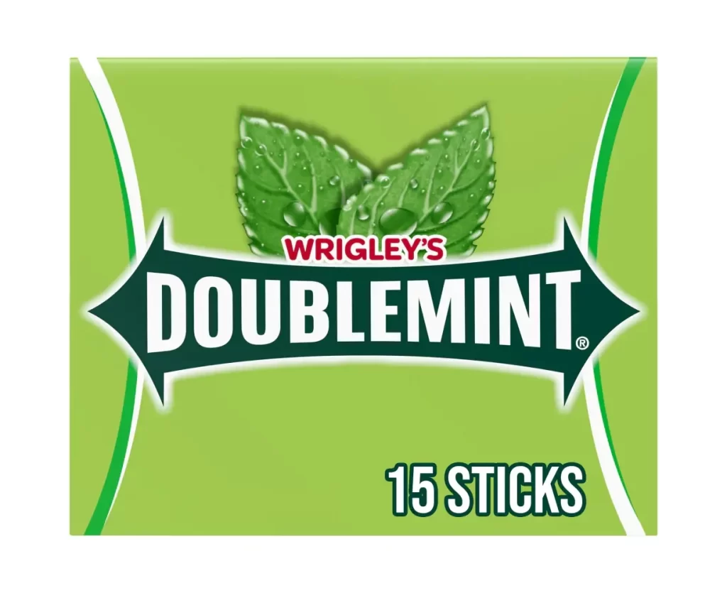
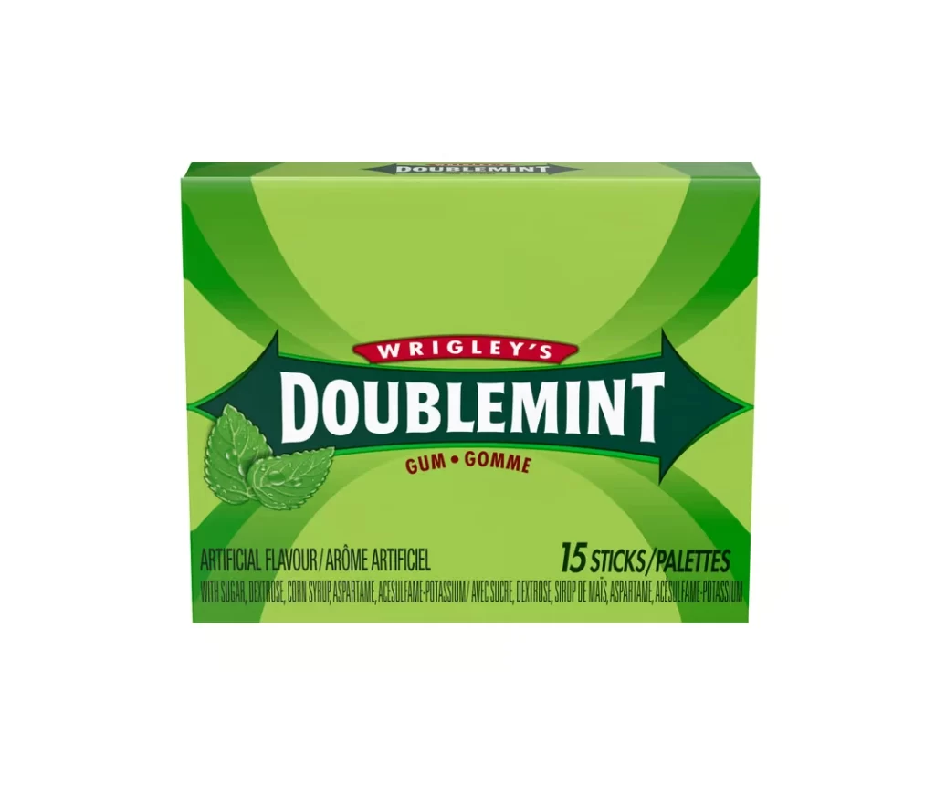
A rectangular package of Wrigley's Doublemint gum presents a direct frontal view on a white surface, featuring a vibrant lime green base accented by darker emerald geometric rays that radiate from the center. A dark teal banner with pointed ends spans the middle, housing the brand name 'WRIGLEY'S' in white serif text within a red oval, and 'DOUBLEMINT' in bold white lettering below. Two realistic mint leaves appear to the left of the banner, while 'GUM • GOMME' sits beneath the product name and ingredient information lines the bottom edge.
Visual interest derives from the dynamic interplay between the bright lime field and the deep green radial pattern, which creates a sense of depth and movement on the flat surface. The symmetrical arrow-shaped banner acts as a strong focal point, anchoring the typography and establishing clear visual hierarchy. Bilingual labeling and the inclusion of detailed ingredient lists indicate this is a retail-ready Canadian market variant, offering specific regional packaging characteristics for study.
Brand historians and packaging analysts might utilize this image to document the specific color palette and typographic choices used in contemporary North American confectionery marketing. 3D environment artists could employ the precise color values and layout to construct accurate digital product mockups for commercial visualization projects. Students of graphic design may examine the composition to understand how traditional branding elements are balanced with modern geometric backgrounds.