Doublemint Mints Chewy Lemonmint Packaging Branding
Topics
Details
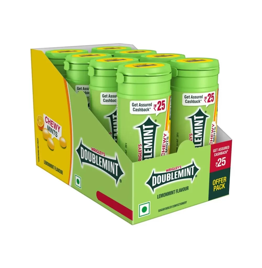
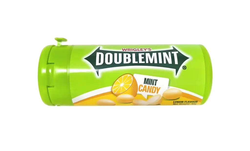
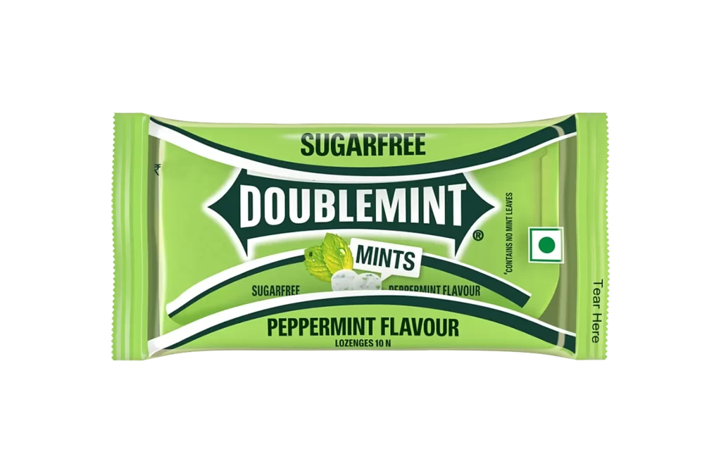
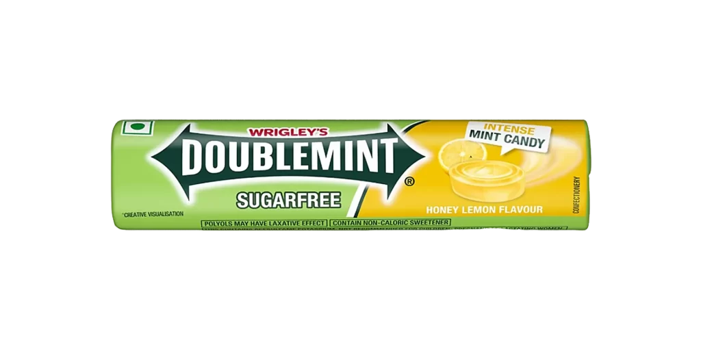
A cylindrical container of vibrant lime-green plastic, capped with a matching flip-top lid featuring a small side tab, displays the Wrigley's Doublemint Chewy Mints Lemonmint Flavour branding. A bold, dark-green arrow-shaped logo dominates the left field, housing 'DOUBLEMINT' in heavy white sans-serif type with 'WRIGLEY'S' running vertically in red to its left. To the right, a sharp yellow panel sweeps upward, showcasing images of lemon-flavored mints and a citrus slice alongside the text 'CHEWY MINTS', while a green square containing a white circle appears at the bottom right corner on a white surface.
Visual tension arises from the juxtaposition of the brand’s traditional arrow motif against the high-energy yellow flavor zone, creating a clear hierarchy between corporate identity and product variant. The specific lemonmint iteration relies on the saturation of the citrus graphics to signal taste expectations, effectively utilizing the cylindrical format’s verticality to guide the eye from the iconic logo down to the flavor-specific imagery. Such a layout demonstrates how established branding systems can accommodate new product lines without sacrificing core recognition markers.
Brand strategists might deconstruct this composition to understand how legacy confectionery labels adapt their visual language for sub-brands or limited-edition flavors. Packaging engineers could examine the spatial distribution of elements on a curved surface to optimize readability and shelf impact. Students of commercial art will find value in analyzing the color psychology behind the green and yellow pairing, particularly how it communicates freshness and zest within the competitive mint category.